
Being able to do a creative painting of a landscape, and painting just a picture of a scene, literally are two entirely different things. One is about art and creation. The other is about technical proficiency. I did a painting in the mountains of Montenegro recently and a student asked a question on the Virtual Art Academy online campus that highlighted some extremely important questions that all artists should think about very carefully. Read on to find out what they said.
The Painting – Montenegro Spring
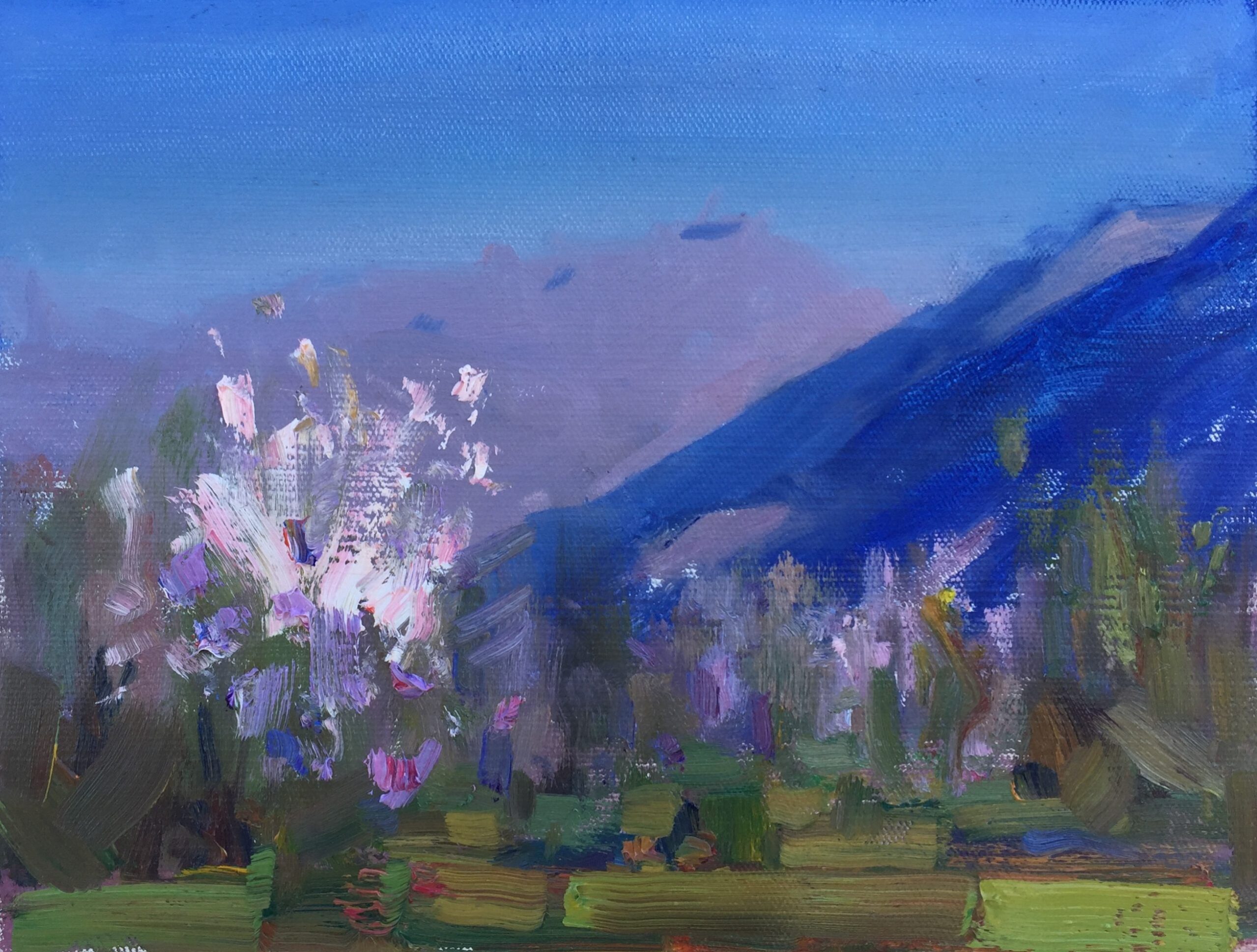
Cat. No. 1406 Springtime In The Mountains, Montenegro – 22m x 29.5cm – Oil on Linen
From My Montenegro Plein Air Painting Journal
I didn’t manage to get out to paint till well after 4pm and then had to drive back up the mountain for a Virtual Art Academy zoom meeting at 6pm. So I only had under an hour left to plan and execute this creative painting. It’s amazing what a tight deadline can do to focus the mind. It turned out better than many I’ve spent three times as long on. Under time pressure you make each stroke count and then leave it so the brushwork is fresh. Craig Nelson used to have this process of teaching figure and portrait under severe time pressure and his system really worked amazingly well. (I can recommend his book and process 60 Minutes to Better Painting)
Student Comments
The more I look at this painting, the more I love it. What I particularly enjoy is the tension you gave, not only in these amazing colors ( this blue…!) but also the tension you bring in the way you treated so differently for example the mountain (pretty economically and flat) in opposition of the luxurious treatment of the blossom tree. This difference in treatment brings a real tension, an excitement to the eyes that keep constantly moving from one place to the other… very beautiful
… Isabelle
I love the colour pairs and play of warm and cool that express light and shadow layered over or in concert with (near and far music) such a strong notan design foundation… FYI, three months ago I would not have been able to recognize and name these things … thank you Barry!
… Marilena
A Good Question, from John
What a delight to open up one’s email first thing in the morning to see these two paintings. I know I’m not supposed to describe them as “beautiful” but they are! The warm and cool intermixed colors vibrate so much they about jump off of my monitor.
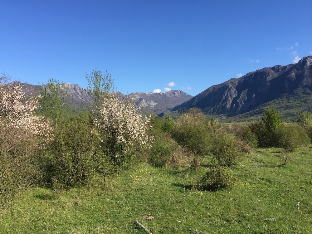
But what strikes me most this morning is that relative to the photograph–other than the direction of the light and a tree and mountain–the colors don’t seem remotely relevant to the colors in the photo. So I ask myself (and you and all of the plein air painters here) why go to all the trouble versus just using a photograph? My question is not meant as sarcasm. Most really good artists seem to do the same (paint outdoors). So there has to be a reason you and they do. I confess to never having done so. And I know I probably won’t really get it or be convinced of the answer until I do. But my question nonetheless.
Is it simply the inspiration and pleasure of experiencing nature first hand? Is it color you see live that doesn’t show in a photograph? It seems the intense blue of the hillside in the second painting couldn’t possibly be what you saw while painting yet it is a huge part of what makes the painting pop. In my ignorance, it seems like it was simply a beautifully executed color study with the actual setting not providing more than the relationship of a tree and mountain–easily gathered from a photo. Yet from hearing plein air painters describe the process, it sounds as if the act of painting on site is crucial to their success.
… John
My Response On Creative Painting
This is an excellent question, and a very deep and important one. I’ve never heard a satisfactory answer to this question. I’m also not 100% sure of the answer. But I do know this. I could never have done this from a photo. I would have either been copying the colors from the photo and the result would have been a little boring, or I would have tried to invent the color and I would have got some key relationships wrong, and the result would not be harmonious and possible not create a good illusion of the place.
Now why was it that I needed the scene when you can see I changed the color so much in my search for a creative painting?
The answer I think is because of the relationships between the saturation and temperature of color spots. I clearly exaggerated the blue hill, but with the knowledge that it would provide a foil for my complementary point of interest. Not actually sure I was thinking of that. I might just have been thinking what will happen when I put pure red ultramarine shade color on a white canvas for maximum saturation and then see what happens (play – which is more and more what I’m after these days).
But whatever the reason, from the moment I put that one large color spot down in that landscape painting, there was only one way I could get the rest of the scene painted and get the relationships of the color spots correct, and I had to observe the actual scene to do that. For example after the blue color spot, I did the sky (a lot of subtle color gradations actually – its not a flat color), there was a fixed value relationship and a fixed temperature difference. Any other color for the sky would have been wrong. Then I did the rear mountain. Again the value of that related to the value of the sky color spot and the deep ultramarine color spot, and so did the saturation (grayer) and temperature (warmer). So that in effect was also determined by that first blue color spot. And so on from one color spot to the next, getting the value change right each time and the temperature/hue relationship correct. A creative painting emerged.
For some reason, its very difficult to see the temperature and saturation changes on a photo, but outdoors it is quite clear to me. It’s not about copying the colors outdoors, its about copying the relationships. The end result depends on your first color spot. Once you’ve committed to that first spot, all the rest follow. Its that choice of first color spot that determines whether the painting will be exciting or not. More often than not I get it wrong. This time I hit a good one.
Some plein air painters copy the colors exactly as they see them when landscape painting and try to match nature up exactly. I tried that, but the end result is generally not very exciting to me. It’s a lot easier to do – you just mechanically match each color spot, but since the result is about the same as a photo, I don’t really see the point. It is much better to paint ten pictures and have one that is exciting and different, than to paint ten predictable paintings that are just like a photo.
In my opinion creative painting is an interpretation of the nature of landscapes yes, but you must observe very carefully the saturation, hue, and value relationships between the different elements or you lose the most important thing of all – the poetry of the place. That’s why abstract painting often doesn’t have much poetry.
Having explained this, I would suggest to any beginner landscape painter that you first learn to match the colors as closely as you can. Then when you have mastered that skill, you can try more creative painting by exaggerating the saturation of one color spot, and then matching the relationships exactly, but not the color.
I hope this is clear. It’s quite an advanced topic.
Great news!
This painting was chosen as a Finalist in the June 2021 Boldbrush Competition. Look out for a feature article on this painting, and Barry John Raybould, in the Informed Collector.
About the Virtual Art Academy Community
We have a vibrant community here at the Virtual Art Academy. This discussion about creative painting is one of the many insightful discussions we have here. Come and join us – unlike spending your time on FaceBook, here you’ll get in depth discussions such as this one on creativity in painting that will take your art to higher and higher levels.
Barry
This discussion is the answer to what I have been looking for for sometime now. This explains why I am not happy with many of my paintings. I am realizing Knowledge of color and their relationships to each other is not a simple thing and requires a background of study and understanding that is extensive. Obtaining that “eye” for what makes a creative painting successful comes from learning and being able to transfer what you know in your mind to the canvas in a creative way that creates the poetry and music that makes it successful. Hard work and study pays off. That painting tells all and you have knocked it out of the ballpark!
I think there is a freedom that I feel when painting outside and somehow that freedom is expressed in my color choices. It is a very different feeling than painting from a photograph in the studio. I am such a beginner I am far from even understanding a lot of what Barry talked about in his response. I hope to understand it better someday.