Add visual abstraction to make your paintings more interesting
Give your work a freshness and a sense of visual abstraction. Watch this quick video segment of me painting in Morocco and read the blog post below for tips on how I do this.
If you want to create visual music in your work, you need to create a mosaic of colors on your painting. Think of it as a quilt or mosaic of colored tiles. To do this, put a brushstroke down and then leave it. Don’t keep modifying the brushstroke until it becomes a blended mush, or looks like a tile that has been broken into lots of bits. If you do that you’ll lose the mosaic and a lot of the quality of visual music in your work that gives it a freshness and a sense of visual abstraction.
If you look at the video closely, you’ll see me putting down a confident brushstroke, then leaving it alone.

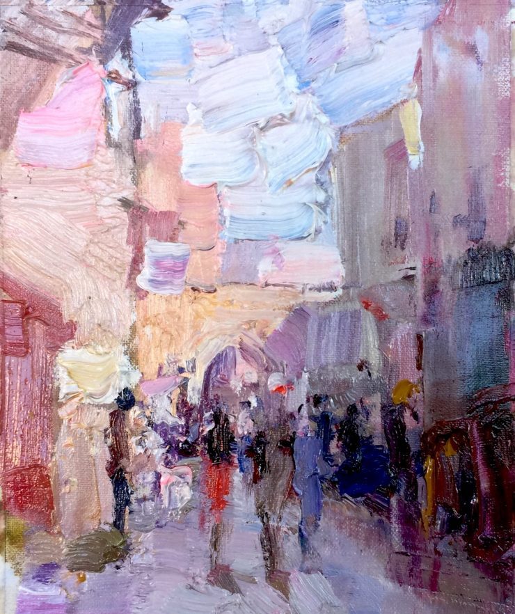
Cat. No. 1314 Marrakesh Alley – 20cm x 15cm – Oil on Canvas
In Marrakesh, Morocco the streets are very narrow and pedestrians have to contend with motorbikes on some of them. You soon learn to walk on the right, and if you don’t the locals remind you so you don’t get squashed!
The light of Morocco is absolutely wonderful. No wonder the 19th century French artists painted there. It’s an incredible place for artists.
The painting for me captures the feeling I had when I was there. But the photo seems to have captured very little of the true feeling. I think this has a lot to do with the photograph not recording the strong reflected light very accurately. But the method I used to paint the shadows and using visual abstraction seems to much better represent the extremely strong reflected shadows in that street.
Update: Thank you to everyone who voted for my painting in the BoldBrush Painting Competition, to make it one of the FAV15% winners.
I love how you capture the emotion of the moment. Beautiful!
I love how you capture the emotion of the moment. Beautiful!
It is such a beautiful painting Barry. I love your brushwork and colour harmony. I also love the idea that you did not mixed your paint thoroughly but leave all the separate colours to see like in your blue sky. Well done!!
Greetings
Barry
Thank you for your demo on how you executed this beautiful painting. I learned from this and only hope I can use it in my work and get rid of old habits. So beautifully done and inspiring.
Would it be better to put the sky in first?? It kind of looks like the sky is coming forward to me.
Thank you,
Suzette
Yes you are quite right Suzette, it is better to put in the sky first in order to prevent it coming forward, just as you say. However in this case I was working very quickly and intuitively. I was dynamically adjusting the composition as I was working. The sky shape was painted at a very late stage as a negative shape to make a big change in the silhouette of the buildings. At that point the whole design suddenly came together and had a some kind of unity and harmony – the brushwork, color, shapes were all working together in unity. I could have repainted the buildings over the sky shape, but if I did that I knew I would probably have destroyed the state of unity I had achieved. So I decided to leave it.
At some point in the painting process you have to start reacting to the paint that is on the canvas, and ignore the scene in front of you. That is the hardest part of painting, and the part I often get wrong. I learned this from the late Rodney Winfield many years ago, a very fine abstract designer.
Although my approach to the learning process is quite analytical, when I actually paint I switch into a completely different brain mode. In this other mode I paint intuitively and usually very quickly. This is when the magic starts to happen and I sometimes get color harmonies and compositions that seemingly come from nowhere. In fact with my best paintings, I never actually know how they happen and they are usually impossible to reproduce and analyze. I had a long discussion about this with my friend Bato recently when he visited me at my studio and found that he shares similar thinking. I watched him paint my vineyard one morning. After a while the painting just went off in an abstract direction, and I had a very hard job of figuring out which shapes in the painting were the vines and grapes! The painting had morphed into an abstract design that although it had been inspired by the landscape, actually ended up with very little reference to the actual colors and shapes that were there (except for the ‘itness’ – another discussion!). I have been trying to encourage my students recently to switch to this more ‘playful’ method of painting when actually working, whilst sticking to the more anaytical approach to learning. You need both.
Thank you for a very good question! I hope you are enjoying the VAA! I see you have been with us many years!