(Get free painting tips and plein air painting techniques sent straight to your inbox or on my social media.)
What is value in art?
Generally, people think a color is something you find across a rainbow, in all its many variants and names, such as red, blue, violet, sage, aubergine, etc. However, color itself has three components: hue, saturation, and, value.
If you want to create beautiful color harmony in your work, your values must be accurate. It is impossible to have good color harmony and design in your paintings if you are not skilled with values. Value in art is one of the 7 elements of art.
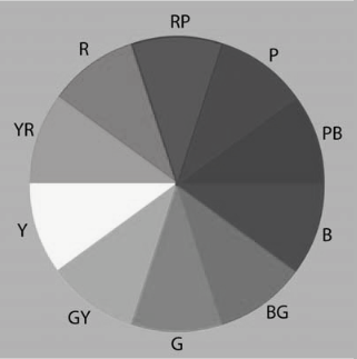
What are the three components of color?
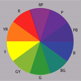
Hue is actually what people refer to as the color, so the terms green, orange, purple, etc are the hue of a color.
Saturation is how intense the hue is, from highly saturated such as yellow, to barely saturated such as ochre.
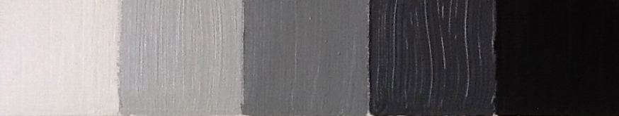
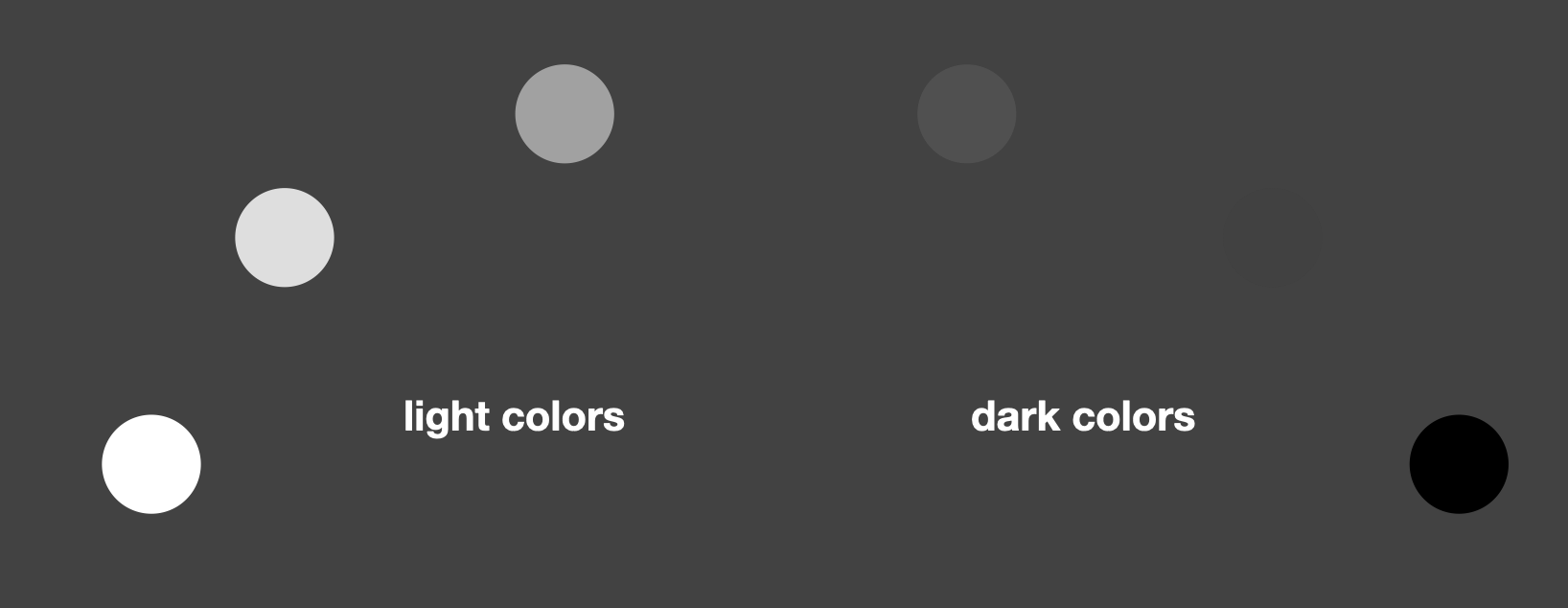
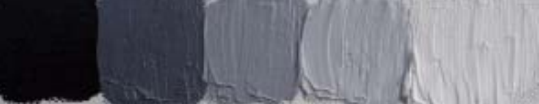
Value in art is how light or dark a color is, and is possibly the most important component of color. For example, black is a dark value, white is a light value, and there are a range of values between the two which we call grays. On the monochrome (color with no hue or saturation) value scale below, you can see the different values of white, light gray, middle gray, dark gray. and black.
What does value in art mean in relation to hue?
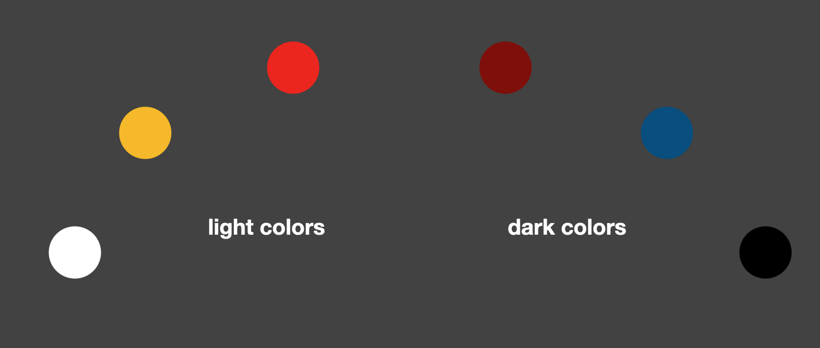
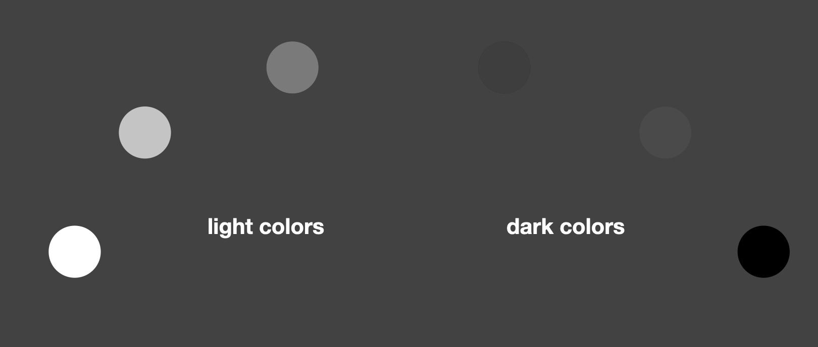
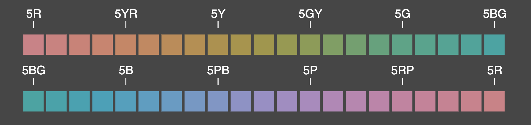
When you convert a full color wheel image to monochrome (black and white) which removes the hue, you can clearly see each one has a different value in art.
Notice how many colors in the color wheel have similar values, despite having very different hues. When placed next to each other these colors would have very little contrast in value and your viewer’s eye may find it difficult to identify which color has more importance in your painting.
Each hue in the spectrum has a dark or light value. Obviously you can see that white is a light value, and black is a dark value, but it is a little more difficult when it comes to determining the value of other hues. Look at these hues, then compare it to the monochrome version below. You can see that the red on the left has a much darker value than you think.
Look what happens if you add the same amount of white to each of the above hues. You would think they would get evenly lighter in value, but look at the monochrome version. Some hues are getting much closer in value, while the blue got slightly darker and has almost disappeared in the monochrome version.
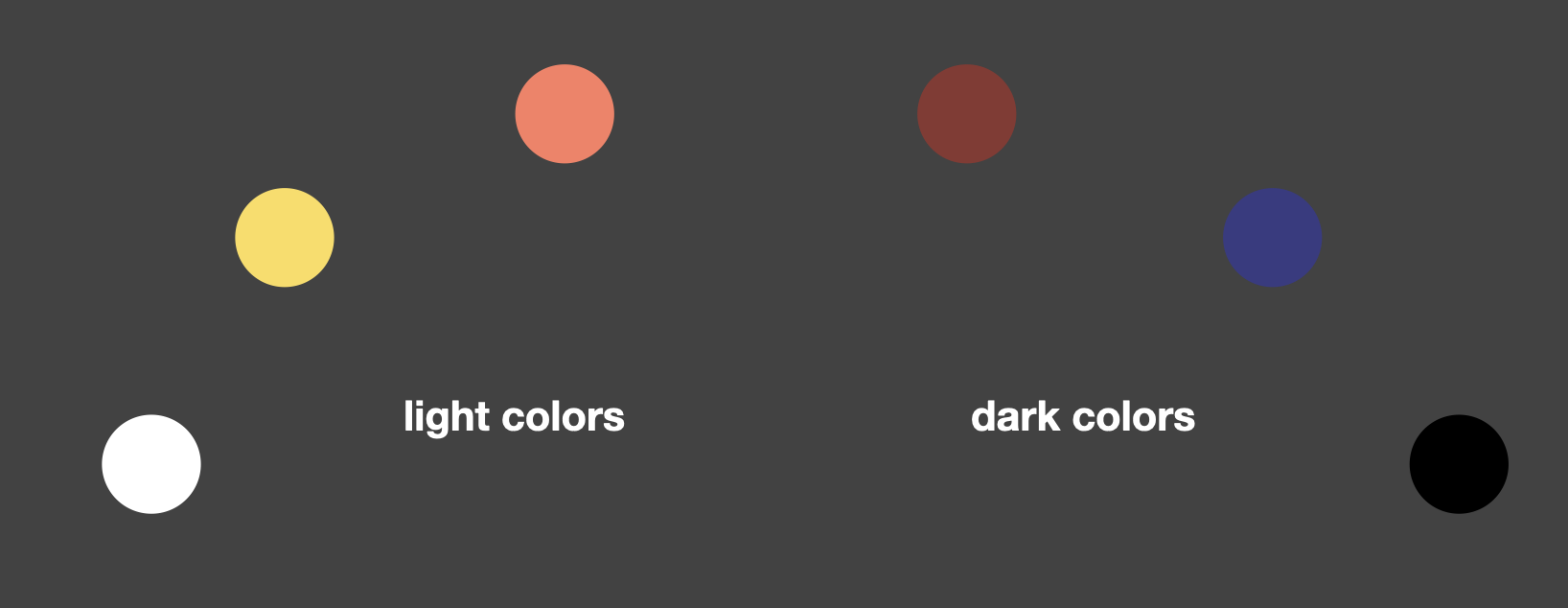
You can have two different colors which appear completely different in hue, but have exactly the same value, like the white and yellow in the above example. There is little value difference between these colors despite the different hues.
What does value in art mean in relation to saturation?
In the diagram below, you can see many hues, all with the same value. Squint and they all blend together. This is because each hue has been blended with black and/or white to make it have the same value as all the other hues on the scale.
Why is value in art important?
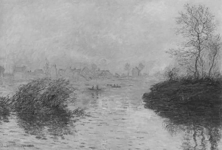
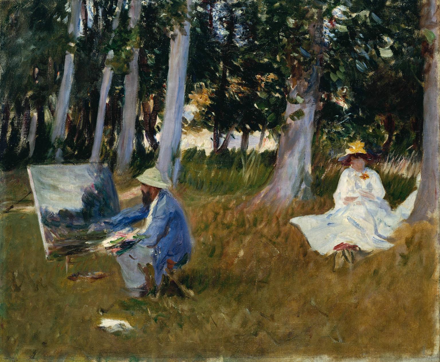
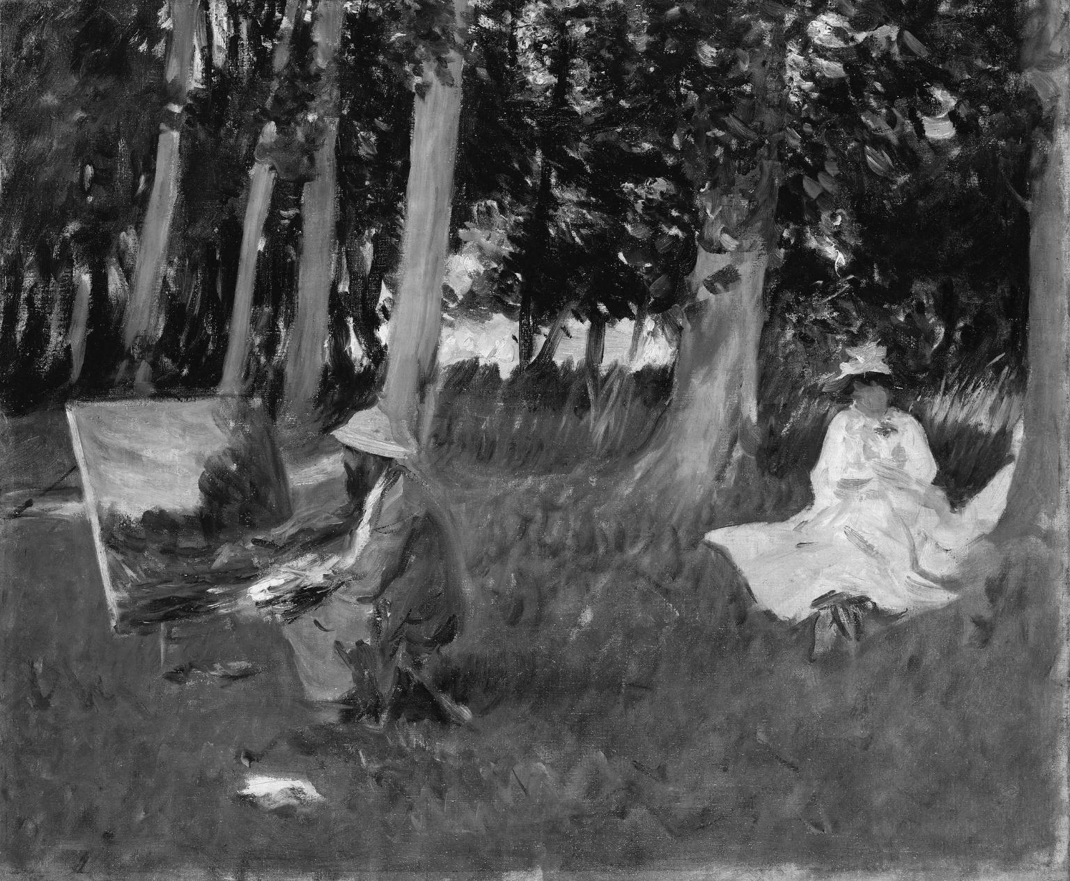
When you convert a photo or an old master painting to monochrome, you can clearly see the values in art. You are only seeing the values without the distraction of hue and saturation. If the image looks good in monochrome, then the values of the image are correct. It does not matter the style or genre of the painting, if the values are not correct it will look wrong.
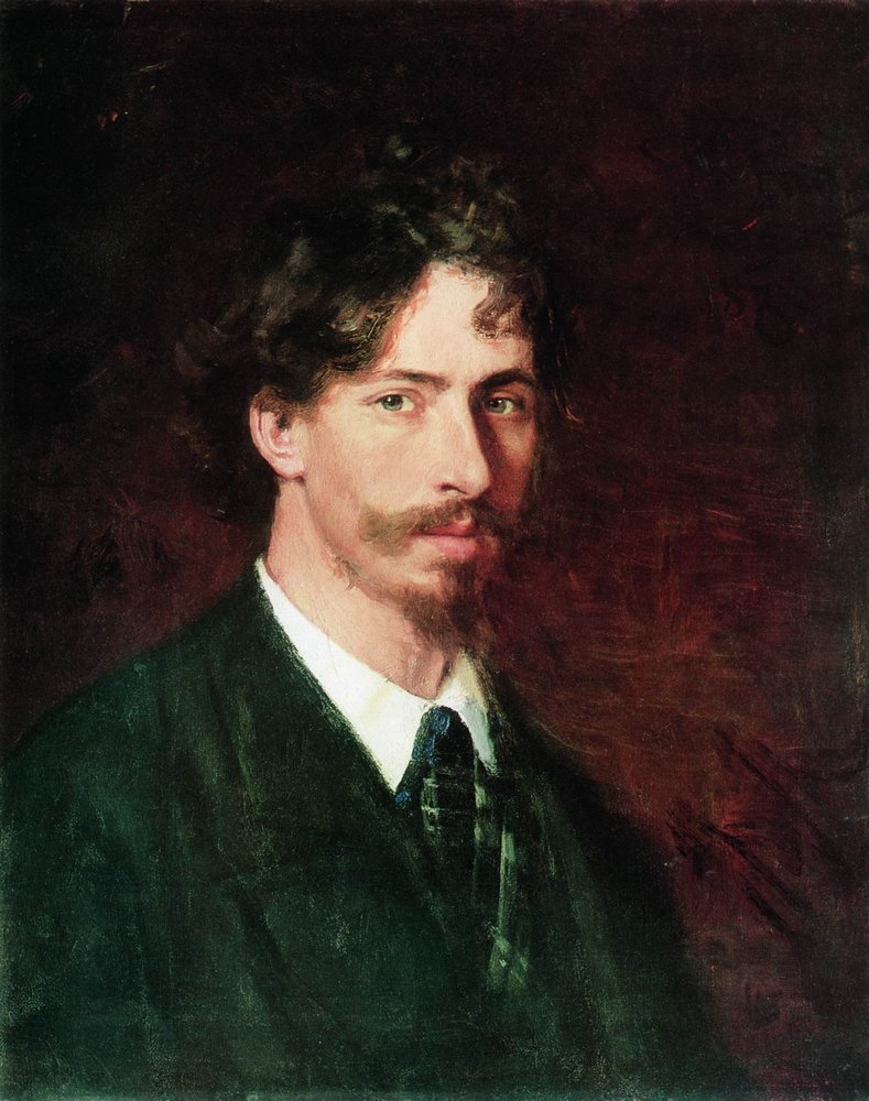
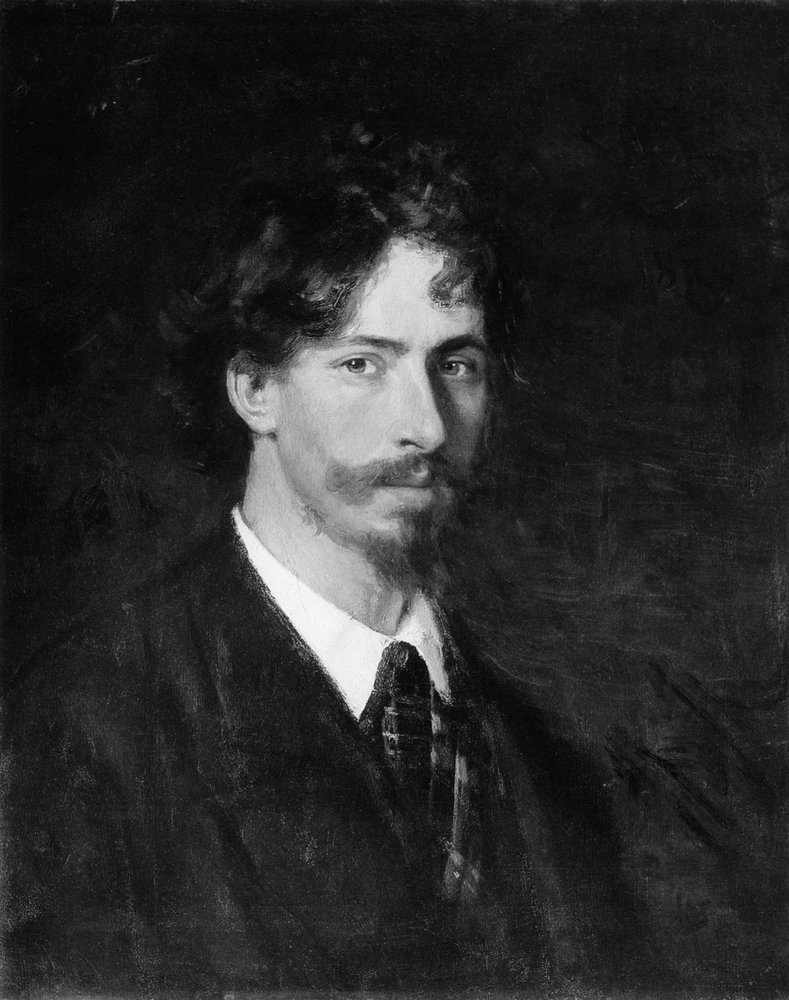
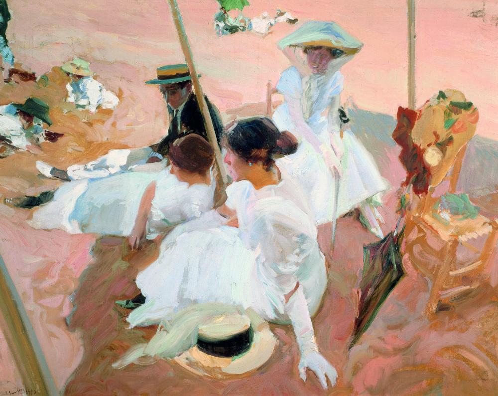
Take a look at these paintings in color and converted to monochrome. Even though Ilya Repin and John SingerSargent used many colors for the skin tones and countryside, the values are so perfect the monochrome versions almost look like a photograph.
How do I achieve a good value range in art?
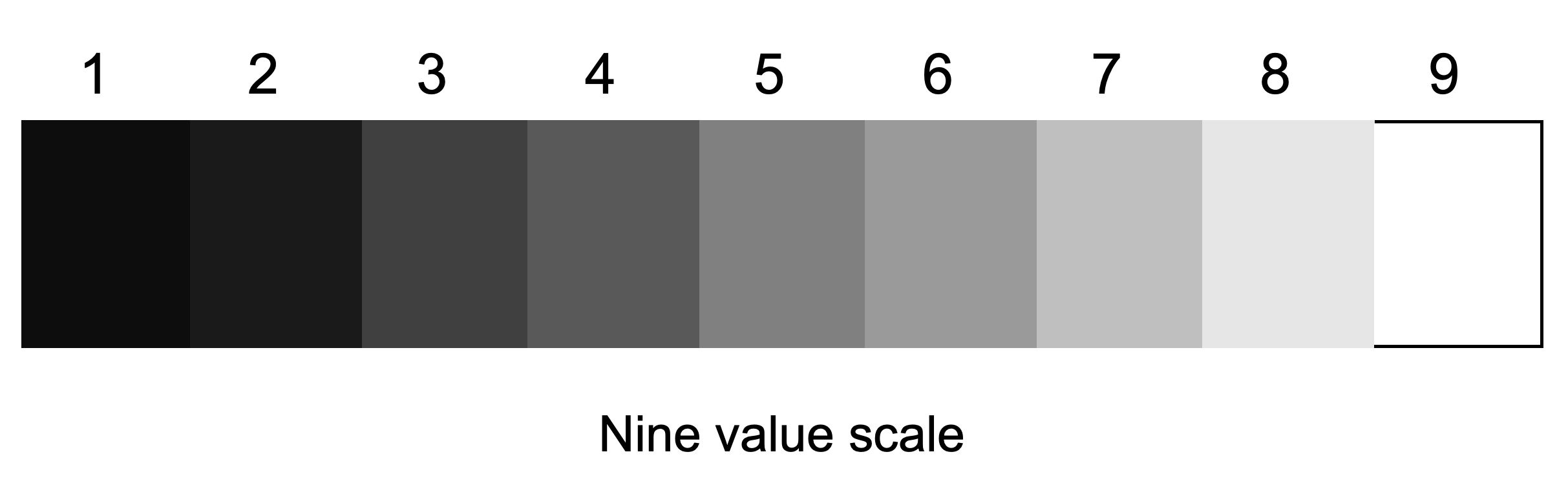
Below is a scale of value in art ranging from 1 to 9:

There are an infinite number of values between white and black, so artists this down so they are only using 1 to 9 values. More than 9 and your painting because chaotic and disjointed. Any color you use in your painting can be compared to one of the values in this limited range.
There is no need to use all 9 values in your painting. If you look carefully at old and contemporary master paintings they generally use a dark value, a light value and a gray value.
Look at these paintings, all different in style but if you squint at them, or turn them to monochrome, you will see they use very few values.
Which is more important, value or hue?
Value in art is important for creating the overall design, and for keeping the viewer’s eye concentrated on the focal point of your subject. More importantly, without a strong knowledge of values you will never be able to accurately capture the scene in front of you, and it will not look realistic. It doesn’t mean that color is not important, it is just secondary to your artwork. As we’ve already seen, paintings can be just as impressive in black white and gray.
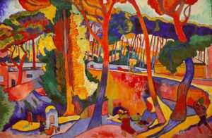
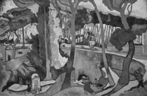
The Fauvism movement of the early 1900s, artists like Derain and Matisse non-naturalistic hues, and refused to use the hue that you usually associate with an object. Look at this painting by Andre Derain. He painted the trunks of the trees in reds, blues, and purples. and the sky in green. However when you convert it to monochrome, it still looks real.
How can you improve your understanding of value in art?
The easiest way to improve your understanding of value in art is to draw using charcoal and graphite, or create studies using only black, white and gray paint. This takes away the complexity of color and forces you to think in terms of light and dark.
If you try to understand painting without forming a solid knowledge base, then you may struggle to truly appreciate the importance of value. Too many beginners dive straight into color, but you will learn how to create better artwork if you start with value. Once you are able to draw and paint with values only, then you’ll be able to create better finished work when you incorporate color.
Three exercises for you to practice using value in art
1. Make your own 5 value scale
Practice mixing grays to create a limited value scale that you can use to compare to color mixes in your paintings.
- On your palette, layout black and white paint.
- Mix a pile of middle gray paint that is about half way between black and white.
Tip: Check to see you have an even step in value between the adjacent piles. If you were not accurate in judging the midway point in step two, you will find your piles are not evenly spaced in value. - Mix some of the black and middle gray to get a pile of dark gray that is about half way between black and middle gray.
- Mix the middle gray and white to get a pile of light gray that is about half way between middle gray and white.Paint five squares using the five values you have just mixed.
Once you have your value scale, find some black and white images and use your five value tool to determine which values there are on the image.
2. Use your value scale to find the value of a patch of paint
- Hold the scale next to the area you want to compare.
- Squint at both the image and the scale.
- Move the value scale to the left and right, until the value and color patch merge as one.
3. Make your own 9 value scale
- Repeat the steps for making a 5 value scale.
- Mix the adjacent piles to make more values. For example, mix black with dark gray to get a medium dark gray. Mix the light gray and white to get a pile of lighter gray paint.
- Do the same for mixing the middle gray and dark gray, and middle gray and light gray paints. You now have a nine-value scale
- Paint nine squares using the values you have just mixed.
Now repeat exercise 2 with your nine value scale. It is not as easy as it looks, but if you cannot accurately match values you will never be able to create a realistic painting.
More tips for beginner oil painters
See this article on oil painting for beginners.
What are oil paints? See wikipedia
Thank You
Thank you for taking the time to read this article. I hope you find it useful. If you would like to get free painting tips by email, please sign up for my free tips newsletter.
If you are interested in a structured approach for learning how to paint, take a look at my online painting classes.
Happy painting!
Barry John Raybould
Virtual Art Academy
What The Students Are Saying
It is wild to see how much I am learning in this course!

I retired last year, and decided I wanted to spend my time in retirement learning how to oil paint. But having never painted before, I wasn’t even sure what to look for in an online painting course. However, I did some searches for “Best Online Oil Painting Courses,” and found several references to VAA.
I signed up for VAA’s ongoing Apprentice Program last October (2023), and I am incredibly glad I did! As a beginner, I didn’t know what I didn’t know, but I didn’t have to: VAA has already mapped it all out for me. It starts out with basic, fundamental stuff, but also teaches me the THINKING that goes in the painting: the composition, my color choices, how to consciously select which darks and lights need to be emphasized, etc.
Bottomline, I am learning how to create paintings that have both visual music and poetry, and it is super fun to see my growth! I cannot recommend this course enough!
Read more “It is wild to see how much I am learning in this course!”
Only online learning program I have ever discovered using a training industry best practice
VAA is the only online learning program I have ever discovered using a training industry best practice of incorporating Knowledge and Skills to support learning a new activity. Every building block (Drawing, Form, Observation, Concept, Notan, Composition, Colour, Brushwork) incorporates a “spiral learning” approach where you are introduced to the Knowledge/Skill at one level and then reintroduced to it again elsewhere in the curriculum. Sure genius.
I’ve attended workshops, read books, and watched YouTube videos — and none of them provide the scaffolded approach to learning the VAA offers. If you are just starting your painting journey, start here. If you are a mid level or advanced painter, start here. There is a sense of community with artists around the globe. You are part of a peer to peer learning process bigger than yourself.
As a result of the VAA, I have been juried into several shows, am represented by a local gallery and have been selling my paintings on a consistent basis. VAA curriculum’s approach will grow your ‘artist’s brush’ and aid you in finding your artistic voice. As your basics improve, your art improves. Henry Hensche said, “There is study and there is performance, and we should not confuse the two, study is done for perceptual development, our performances show us where we are in that development, and we must have both…”. VAA curriculum offers both.
I went through the entire curriculum, did every every exercise, and today review my printed books/exercises on an annual basis to keep myself fresh and ready for my next painting adventure.
Onwards/Sideways,
Jay “jbird” Holobach
https://www.jayholobach.com/
I’m Richard Robinson …. best online art training available on the internet today
In my opinion Barry has created the best online art training available. I found the Virtual Art Academy course of painting lessons many years ago and was so inspired by it that I contacted the author and got to know him personally.
Two Critical Keys
If you are looking (like I did) for the best painting course available there are two key things you should know about the Virtual Art Academy course which make it stand out above the other online painting courses available today:
1. It’s Comprehensive.
It covers ALL the key painting concepts and then goes further, revealing more and more painting insights. Most courses miss a LOT out – this one doesn’t.
2. It’s easy to understand.
All that information could easily become confusing, but each piece is laid out clearly and concisely using Information Mapping® making it a pleasure to learn.
If you can find another painting course which does these 2 things better, please let me know. As I said, I have been searching for many years and continue to do so, so you could save yourself a lot of precious time and money by joining the Virtual Art Academy today.
Read more “I’m Richard Robinson …. best online art training available on the internet today”
A great learning platform

The course has a steady learning curve that keeps revealing itself as you advance

Read more “The course has a steady learning curve that keeps revealing itself as you advance”
It is impossible to fail or gain little through extensive 4 year study at VAA!
Read more “It is impossible to fail or gain little through extensive 4 year study at VAA!”
VAA, the ultimate art course
It is a real course that trains you in a structured way

Read more “It is a real course that trains you in a structured way”
No need to buy expensive art books…. Just do the VAA 4 year course. I still refer to it

Read more “No need to buy expensive art books…. Just do the VAA 4 year course. I still refer to it”
‘Ladder of Learning’ adds to overall positive experience of this awesome course

Read more “‘Ladder of Learning’ adds to overall positive experience of this awesome course”
The small steps are easy to do

This is a far more superior school than anything I have seen being taught at colleges across the country

Building blocks of learning is the best I have seen

Read more “Building blocks of learning is the best I have seen”
I started learning oil painting with VAA from scratch. Just one year later my paintings started to sell

The most comprehensive art instruction I could find anywhere online, and trust me, I had been looking for a long time.

The Virtual Art Academy is simply the most comprehensive art instruction I could find anywhere online, and trust me, I had been looking for a long time.
Even art schools and academies I’ve been exposed to are nowhere near as thorough, VAA is just amazing!
Most paintings I see where the artist clearly has some skill still lack in either the values or notan department, or fall down on composition – it’s baffling that VAA seems to be the only program that goes into detail on this. Therefore, if you are new to painting or an experienced artist, studying with VAA will get you to that next step.
I also find that Barry is always interested in what we students do and is at hand with great advice. Worth every penny, Thank you Barry!!
The course is for beginners, intermediate and advanced artists

Read more “The course is for beginners, intermediate and advanced artists”
Since I started the programme I can see improvements in my composition and use of colour

I have been working through the VAA course for over five years and would highly recommend it to anyone wanting to improve their painting. There is a huge amount of information on the site and it is well presented and regularly updated and added to. When other members have commented on work I have posted I have found it really useful. When I review my work over the time since I started the programme I can see improvements in my composition and use of colour.
Read more “Since I started the programme I can see improvements in my composition and use of colour”
The sky’s the limit

An excellent foundation on so many aspects of painting

When I got word of the course available through Virtual Art Academy, I was very excited for the opportunity to learn what I never knew about painting. VAA has provided me an excellent foundation on so many aspects of painting. The course is organized very logically, provides great examples, diagrams, thorough explanations and worthwhile assignments. I highly recommend this course to anyone with a desire for an in-depth education of art.
Thank you again, Barry, I love this course Jeanne
Read more “An excellent foundation on so many aspects of painting”
comprehensive art education

The most comprehensive, in depth and well-organized painting course available online

Read more “The most comprehensive, in depth and well-organized painting course available online”
The equivalent of a 4 year art education at a fraction of the cost

Read more “The equivalent of a 4 year art education at a fraction of the cost”
Barry gave me a fishing rod so I can catch my own fish

Read more “Barry gave me a fishing rod so I can catch my own fish”
The improvement in my own work reaffirms that I’ve found the right program to develop as an artist

Thank you I never understood this as a thought out concept. I thought it was just something that you do naturally. I’ll never paint or draw the same way again . I would like to find a way to look at my drawings with the hue removed. I assume there are apps that can do this for you.
Take a digital photo of your art then open the photo in a decent digital photo editing app..Use the color adjuster tool in the app to create a monochrome version of your art photo.
For example, I take a photo of my art with my iPad then use the Edit app in the iPad’s photo storage app to create a monochrome copy.
It depends. Is your drawing digital or traditional?
Either way, there is an easy solution to this , however, it is VERY important you do it CORRECTLY, otherwise you won’t see the actual values.
Allow me to explain:
If you use an Apple product, Windows or Android, there are settings for the entire screen to make it fully grayscale (links below). That way you can take a photograph of your art and study the values. Remember to take the photograph in good lightning and have the camera properly focused on the object, to see the values correctly.
However, if you create digital art, or, paste your photograph into your art or editing program, it is VERY important that you do NOT do this:
It’s easy to believe that you can remove the saturation and you will see the proper values, but this is incorrect!
To do it CORRECTLY you can either do the same thing with your screen setting as explained above, OR, create a white layer on top of your drawing and set the overlay setting to “Color”. This works for most Art programs.
For Iphone and ipad: https://osxdaily.com/2015/02/13/grayscale-mode-ios/
Mac: https://www.howtogeek.com/449389/how-to-enable-grayscale-on-your-mac/#:~:text=If%20your%20computer%20is%20running,black%2Dand%2Dwhite%20view.
Windows: https://www.technipages.com/enable-greyscale-mode-for-windows-pc
Android: https://techcult.com/enable-grayscale-mode-on-android/
—
If you have followed the steps necessary for you, congratulations! You will now be able to study your colorful drawing with the correct values in grayscale. Enjoy!