(Get free painting tips and plein air painting techniques sent straight to your inbox or on my social media.)
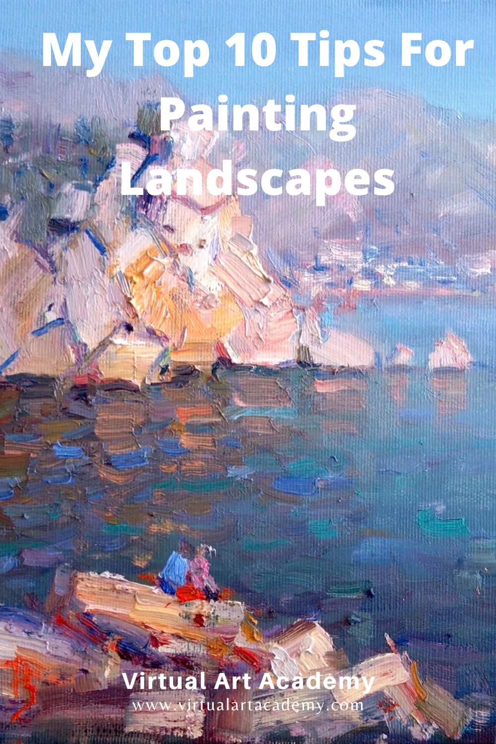
My Top 10 Tips For Painting Landscapes
Here are my top ten tips for painting landscapes in oils, acrylics, or watercolor that will transform your work to a new and higher level.
Please share this guide using the social media buttons
Thank you!
Barry
Landscape Painting Tip #1: Use Chromatic Perspective To Create Depth And A Sense Of Distance In Your Landscapes
When painting landscapes, you can create emotion in your viewer by evoking a sense of the vastness and expanse of the landscape. Here is a key tip for how to do that.
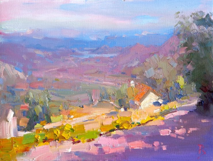
One of the important ways you can create a sense of depth, or atmospheric perspective, in your landscape paintings is to follow the principle of chromatic perspective.
This means that the colors in the landscape change from the foreground to the distance. In the foreground colors are more saturated or intense. Artists sometimes refer to these colors as high chroma colors. For example, you might see bright reds and yellows in the foreground of your landscape painting.
But in the far distance of your landscape, the colors will be very different. You will only see muted grays, or colors with low saturation, or low chroma. When painting landscapes use this change in saturation to create a feeling of depth.
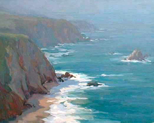
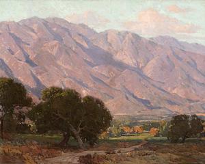
The above landscape painting of the Big Sur coastline in California was done by the author of the Virtual Art Academy® Apprentice Program early in his career. It won a top award at the Carmel Plein Air Painting Competition, an event attended by America’s top plein air painters. A key factor in its success was the careful gradation of saturation in the colors from the foreground cliffs to the background cliffs. It was this that to a great extent created the painting’s mood. Painting landscapes is often just about following some basic principles that anyone can learn, such as this one.
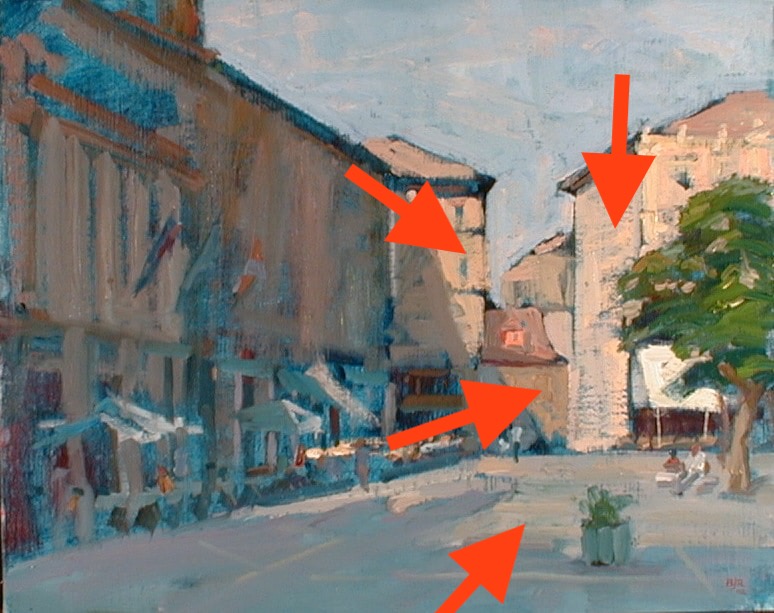
Landscape Painting Tip #2. Show Directing Lines.
When painting landscapes, use techniques to move the viewer’s eye into a landscape. In this way you can make your landscape paintings much more engaging. One way of doing this is to use directing lines. Directing lines are lines you use when painting landscapes that direct the viewer’s eye into the distance. You can use fences, thin objects such as a log or stick lying on the ground, or the edges of buildings in perspective to do this.
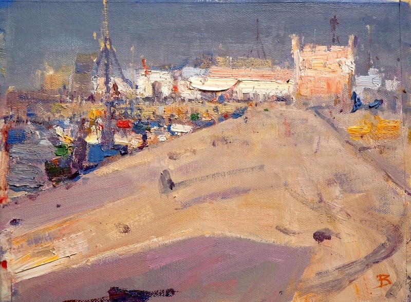
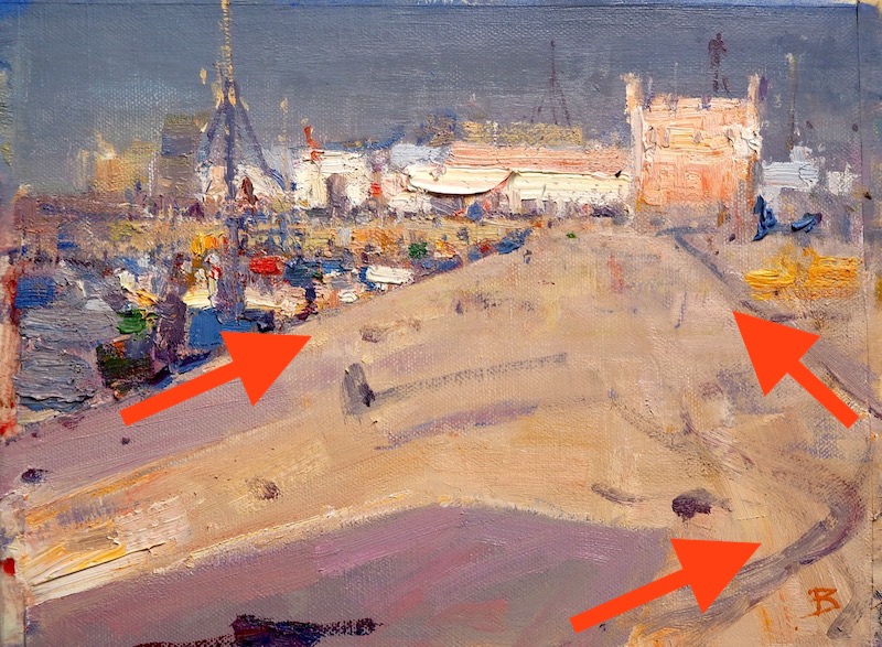
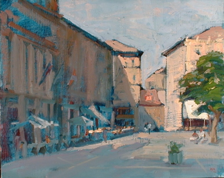
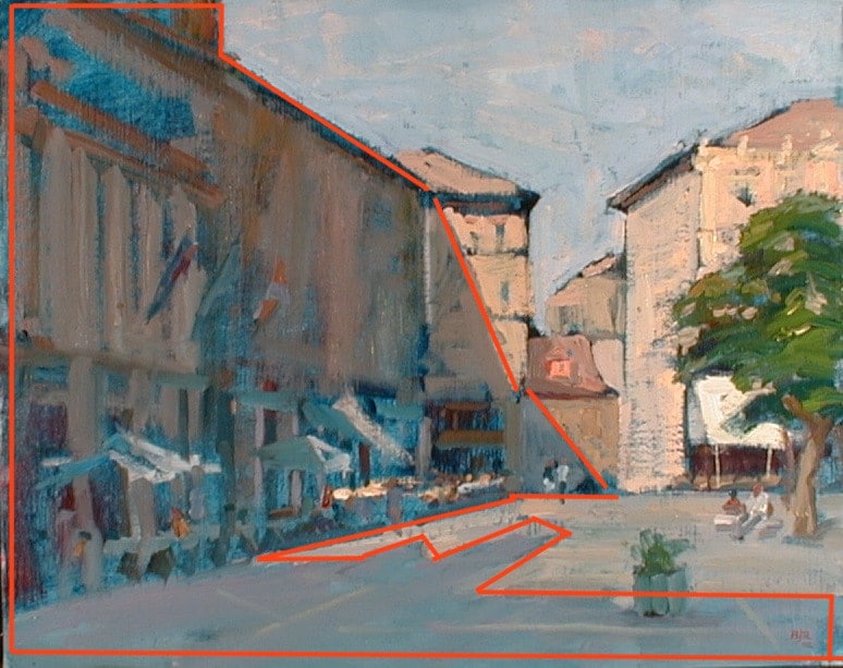
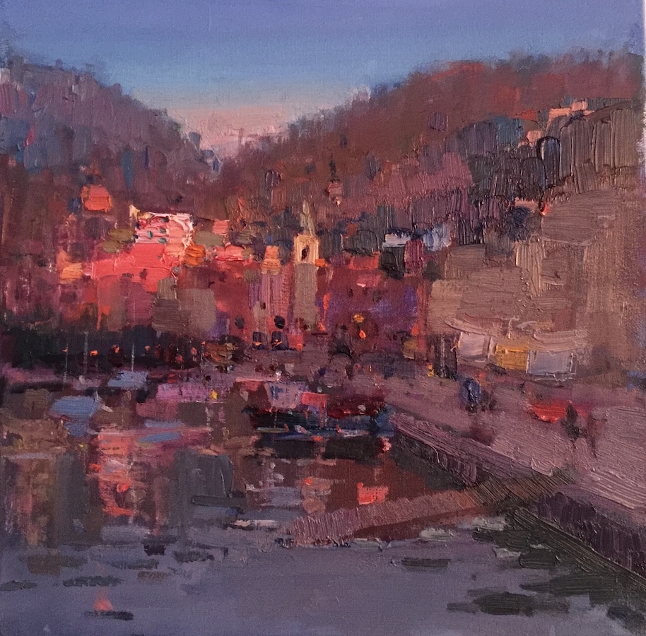
In this landscape painting I did in Essaouira, Morocco, I used the edge of the harbor, the track marks on the road, and the edges of the shadow lines in order to draw the viewer’s gaze into the distance. This gives the landscape painting a feeling of depth and distance.
Landscape Painting Tip #3: Use A Dominant Value
When students are painting landscapes, they often fail because the pattern of lights and darks are too confused or too complex.
One of the most important principle in designing the distribution of lights and darks in a landscape is the concept of a dominant value. The idea behind this principle of design is that more than half of the area of your painting should be either gray, white (or almost white), or black (or a very dark gray). Typically most of my landscape paintings are painted in middle value grays, with a few dark shapes and light shapes to add interest to the design.
Follow his principle when painting landscapes and you will see a major improvement in your work.
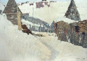
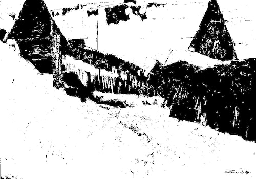
This is a beautiful landscape painting “Old Ladoga” by Nikolai Efimovich Timkov , is an excellent example of a dominant white painting. It is this structure that makes this painting so powerful.
There is a whole body of knowledge known as notan on this topic. For more information on applying the ideas of notan when painting landscapes, see my online painting classes curriculum.
Landscape Painting Tip #4: Create A Clear Light And Shade Pattern
It is very important when painting landscapes that you make the light and shade patterns very clear. A clear light and shade pattern will explain how light is hitting the parts of your landscape and give your landscape paintings a sense of having three dimensions.
If you do not do this clearly, you may find that things in your landscape appear to be in one flat plane.
How to create a light and shade pattern in your landscape paintings when painting landscapes
To create this sense of three dimensions, or ‘form’ when painting landscapes, follow these steps:
Total Time: 20 minutes
Step 1: Find shadow pattern
Find the dark pattern that is created by the shadowed side of objects or by the shadows they cast on the ground. Paint these shapes using a color that has the same value as a dark gray or middle value gray.
Step 2: Assign parts of the landscape to the light or to the shade
When painting landscapes, look for all the things that are in the light, and paint them using colors that have the same value as a light gray. These items are all in the light. Keep these values distinctly separate from the shadow values.
In the above painting I did in Segovia, Spain, you can clearly see the patterns of the buildings in the light and the buildings in the shadows as well as the shadows they cast on the ground.
Landscape Painting Tip #5: Keep Your Shapes Simple
Good shape design is at the heart of all great landscape paintings. But this can be difficult when painting landscapes, as many natural forms such as trees are very confusing. You can simplify your shapes, for example when you have a lot of trees together, by treating them as one big shape, and not as a lot of individual separate shapes.
In this painting you can see that I treated all of the distant mountains as one large shape. I made the details in that shape very subtle. In this way I avoided breaking up the painting into a lot of small and confusing shapes.
Landscape Painting Tip #6: Do Not Use Too Many Colors
Knowing how many colors to use is a big challenge for the beginner when painting landscapes. If you use too many colors, unless you are very experienced, you can very quickly find yourself in a confusing mess. A good tip is to use a limited palette of just four colors plus white. I suggest you use cadmium red dark, ultramarine blue, mars black (or ivory black, and yellow ochre. This is a fairly muted palette of colors that will harmonize very nicely. You will find that even with this limited number of tube colors that you can mix an amazing number of subtle color changes.
When you are ready to tackle more colors, you can use what is called a full spectrum palette. I describe how to use this in detail in my Apprentice Program.
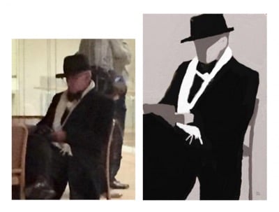
Landscape Painting Tip #7: Get The Light Shade Color Pairs Accurate
When painting landscapes you will often find yourself painting an object that is partly in the light and partly in the shade.
This is a wonderful opportunity to paint color pairs. By color pairs, I mean the two colors you see when light falls partly on an object, leaving part of it in shadow. These two colors have a very fixed relationship. If you get the relationship right, these two colors create a perfect color harmony. It will also give your painting a strong feeling of light. Get it wrong though, and you will lose both of these benefits.
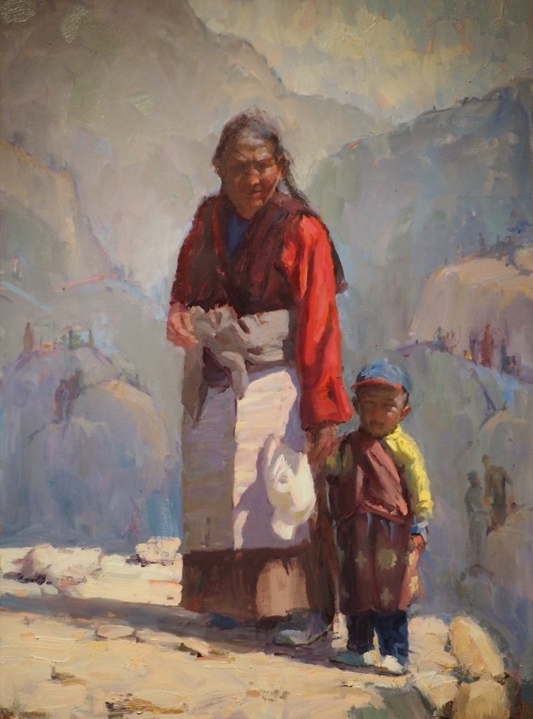
In the above painting, that I did in 2013, you can see the color pairs in the traditional shirt and apron worn by the woman, and in the clothes and baseball cap of the young Tibetan boy. I was contrasting the old and new in this painting and raising questions about the survival of traditional values in our modern world.
There is only one reliable and efficient way to get the skills you need to get this right. The method is called block studies. A variant on this is the Italian Window exercise, a method I invented in a piazza of Italy drinking a cappuccino!
You can learn more about these methods in lessons A10 and C03 of the Virtual Art Academy® Apprentice Program.
Landscape Painting Tip #8: Do A Four-Value Study
To make best use of your time I strongly recommend you do a four-value study. This is particularly important when working on larger paintings in the studio. A four-value study will save you hours of time and help you find the best composition when painting landscapes, before you start your large painting.
Here are some four-value studies done by Virtual Art Academy students.
A four-value study is a small painting you do just using black and white (or almost black and almost white), plus a light gray and a dark gray.
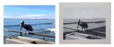
By doing this type of study when painting landscapes, you can work out issues such as space division and notan. These are the two most common issues that make beginners’ paintings fail.
You will learn much more about four-value studies in lesson B05 of the Virtual Art Academy® Apprentice Program.
Landscape Painting Tip #9: Focus On Just One Idea
If you do a painting of a road leading up to a country cottage with a horse in the field and a big mountain in the distance, your viewer will not know what to focus on. Make sure your picture has one clear idea. In the case I just mentioned, you could focus on the great size of a majestic mountain looming over the small man-made house, emphasizing how small man’s efforts are in comparison to the grandeur of nature.
Alternatively you could focus on the horses, telling the story of their tranquil life in a luscious green field, and evoking a sense of the countryside, and maybe showing us the beauty of the warm red tones of the sun falling on the horse’s coat as the sun sets.
This is the emotional side of painting landscapes that I call ‘Visual Poetry’. This is a modern concept for critiquing art that we use in the Virtual Art Academy.
If you crop your scene to encompass the part of the view you want to paint, you will have a much stronger design.
Landscape Painting Tip #10: Use A Variety Of Brushstrokes
You can greatly improve the quality and interest in your landscape paintings by using a variety of different brushstrokes.
Here are some ideas:
- Use different sized brushes, at least one very large and one very small.
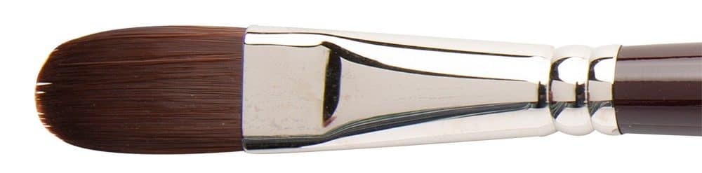
- Use different parts of the brush. You can use the narrow edge of the brush for small shapes, and the wide side for your larger shapes. A filbert brush is especially good for this.
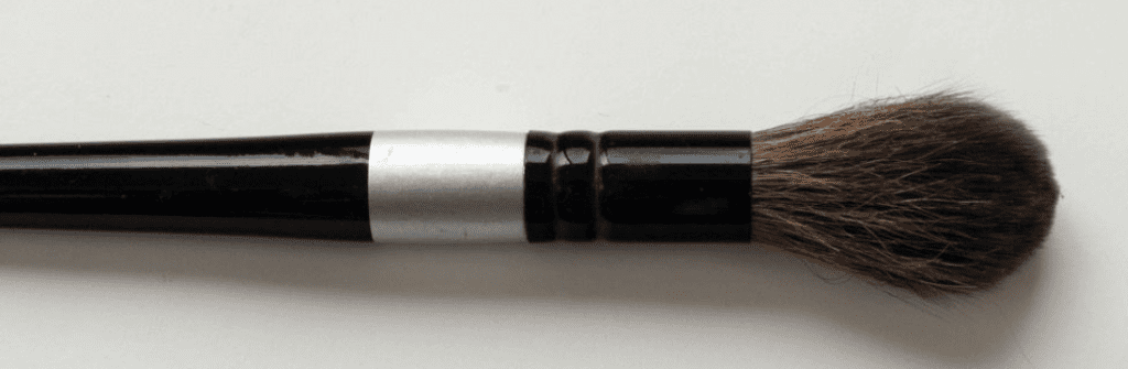
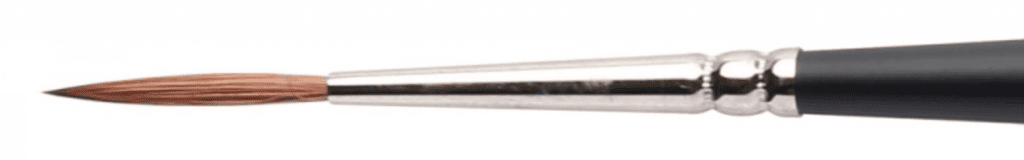
- Use different types of brushes. For example in addition to regular filberts or flats, try using a mop brush or a rigger.
I call this important idea the ‘Near Music’ of a painting. You can read more about it in my course notes on Brushwork in the Virtual Art Academy Apprentice Program.
For More Information on Landscape Paintings
For more information, see:
- Background to landscape painting on Wikipedia
Thank You
Thank you for taking the time to read this article. I hope you find it useful. If you would like to get free painting tips by email, please sign up for my free tips newsletter.
If you are interested in a structured approach for learning how to paint, take a look at my online painting classes.
Happy painting!
Barry John Raybould
Virtual Art Academy
What The Students Are Saying
The equivalent of a 4 year art education at a fraction of the cost

This is a great course for anyone who is serious about improving their painting. I have been a student here for several years. When I am finished, I will have the equivalent of a 4 year art education at a fraction of the cost. I can do the lessons anywhere and at my own pace.… Read more “The equivalent of a 4 year art education at a fraction of the cost”
The sky’s the limit

This course was exactly what I’d been looking for as a recent “empty-nester.” The Virtual Art Academy coursework taught me not only HOW to paint well, but also how to SEE to observe a scene more closely to interpret it effectively in paint, and what to look for to create an interesting composition. It helped… Read more “The sky’s the limit”
The course is for beginners, intermediate and advanced artists

I joined VAA in 2014, it seemed a perfect fit in content, ease of access and cost. It turned out to be all of this and much more. The wealth of information on all practical aspects of painting is invaluable and I think incomparable to anything else out there. The course structure is such that… Read more “The course is for beginners, intermediate and advanced artists”
It is impossible to fail or gain little through extensive 4 year study at VAA!
I would recommend taking VAA study to everyone who seriously strive of becoming exceptionally skilled professional artist. It gives more than you can ever imagine! The lessons structured in the best possible way that lead to understanding and skills you never acquired before which are so important in art. It is impossible to fail or… Read more “It is impossible to fail or gain little through extensive 4 year study at VAA!”
Building blocks of learning is the best I have seen

I joined 5 years ago when I didn’t know anything about oils, painting, composition, or drawing. Barry’s way of teaching is extremely well versed in many aspects of painting. His building blocks of learning is the best I have seen. The academy is designed well and the community of fellow students is engaging and friendly.… Read more “Building blocks of learning is the best I have seen”
‘Ladder of Learning’ adds to overall positive experience of this awesome course

The VAA course is built on four main building blocks including PROCESS, REALISM, MUSIC AND POETRY. These are further divided into topics that are continuously developed throughout the curriculum. Drawing, Form, Observation, Colour, Brushwork, Notan, Composition and Poetry are all thoroughly taught. Working on-line we meet students from all around the world, interacting with them… Read more “‘Ladder of Learning’ adds to overall positive experience of this awesome course”
Since I started the programme I can see improvements in my composition and use of colour

My painting “Primitive Pots” recently won the award given by the Royal Institute of Painters in Watercolour at the recent selected exhibition of the Society of East Anglian watercolourists. I have been working through the VAA course for over five years and would highly recommend it to anyone wanting to improve their painting. There is… Read more “Since I started the programme I can see improvements in my composition and use of colour”
No need to buy expensive art books…. Just do the VAA 4 year course. I still refer to it

I finished the VAA course a few years ago, but always refer to the notes, rereading the course many times. This is not a course the day you are finished, you are done. No, you keep practising the assignments getting better and better over time. When I look back at my work when I had just… Read more “No need to buy expensive art books…. Just do the VAA 4 year course. I still refer to it”
This is a far more superior school than anything I have seen being taught at colleges across the country

This is a far more superior school than anything I have seen being taught at colleges across the country and have learned much more from the Virtual Art Academy® than from any art course I have ever taken! I cannot begin to tell how the Virtual Art Academy has improved my observation of potential compositions… Read more “This is a far more superior school than anything I have seen being taught at colleges across the country”
The course has a steady learning curve that keeps revealing itself as you advance

The course is working great, the lessons are set out so well that every week I can see growth. In following the program it’s given me direction, and the information in the lesson plans are of a professional level. There is no way I would have tracked down the information by myself, and being in… Read more “The course has a steady learning curve that keeps revealing itself as you advance”
Barry gave me a fishing rod so I can catch my own fish

After weeks and even months of searching YouTube, “googling” and spending a fortune on art instructional books I finally came across the Virtual Art Academy®. When it comes to purchasing online I am always very careful how I spend my money. Especially when I already spent a small fortune on art books. They always seemed… Read more “Barry gave me a fishing rod so I can catch my own fish”
It is a real course that trains you in a structured way

The questions you ask yourself are,”Will it be worth the cost?” and “Will it be truly useful?”. After a couple of weeks working on/in Virtual Art Academy®, I can say that the amount of work it represents – by Barry – is incredible! The information presented alone is more than worth the price and, yes,… Read more “It is a real course that trains you in a structured way”
I’m Richard Robinson …. best online art training available on the internet today
Hi I’m Richard Robinson. I’ve been a professional painter since 2001. My claim to fame is only that I’m making a living as an artist and doing pretty well – something which I hear is not so easy to do, and I guess it does take a lot of work, but it’s work that I… Read more “I’m Richard Robinson …. best online art training available on the internet today”
The most comprehensive, in depth and well-organized painting course available online

After a thorough research, my personal conclusion is that the Virtual Art Academy (VAA) is, by wide margin, the most comprehensive, in depth and well-organized painting course available in the internet. Unlike most tutorials and color mixing recipes commonly found online, VAA’s philosophy is rather to provide the students with detailed information about all aspects… Read more “The most comprehensive, in depth and well-organized painting course available online”
An excellent foundation on so many aspects of painting

I never had formal training in painting and my style has always been very realistic, slow and not at all artistic, just a copy of a photograph. When I got word of the course available through Virtual Art Academy, I was very excited for the opportunity to learn what I never knew about painting. VAA… Read more “An excellent foundation on so many aspects of painting”
The small steps are easy to do

I am extremely impressed with the process that Barry has developed for VAA. Learning to paint can be intimidating, but when broken into many small projects it is very do-able. I just did my first live model painting session- a 5 hour, one day session. Thanks to VAA, I was able to break the painting… Read more “The small steps are easy to do”
The improvement in my own work reaffirms that I’ve found the right program to develop as an artist

I have been a student of VAA since 2011. I had been searching for an online art program that could assist in helping me develop as an artist. VAA is a complete program for beginners as well as advanced students of art. The course is well structured and takes you step by step so you… Read more “The improvement in my own work reaffirms that I’ve found the right program to develop as an artist”
I started learning oil painting with VAA from scratch. Just one year later my paintings started to sell

The Virtual Art Academy program is really comprehensive and gave me all the information and directives to learn painting in one package. The material is very well organized, just beautiful to look at and motivating to carry through. The online campus is a wonderful place to meet other artists and receive critical feedback on my… Read more “I started learning oil painting with VAA from scratch. Just one year later my paintings started to sell”
The most comprehensive art instruction I could find anywhere online, and trust me, I had been looking for a long time.

I joined 2 years ago with my daughter. We have both learnt so much and have enjoyed our VAA time together. My daughter is now 13 and already produces amazing paintings. The Virtual Art Academy is simply the most comprehensive art instruction I could find anywhere online, and trust me, I had been looking for… Read more “The most comprehensive art instruction I could find anywhere online, and trust me, I had been looking for a long time.”
Only online learning program I have ever discovered using a training industry best practice
Before repurposing my vocation into avocation, I spent 20 years in the corporate world as an instructional designer and performance consultant creating training curricula for diverse clientele from NASA to General Motors. I know curriculum development and how to guide a learner from beginning to certification. VAA is the only online learning program I have… Read more “Only online learning program I have ever discovered using a training industry best practice”
comprehensive art education

I wanted to get a comprehensive art education with the freedom to work at my own pace. I’m several years into the curriculum and I feel like my work has drastically improved. I’ve found holes in my knowledge that I didn’t know I had. Critiquing other students posts and reading their feedback to mine has… Read more “comprehensive art education”
It is wild to see how much I am learning in this course!

Five star rating from me for Virtual Art Academy (VAA)! I retired last year, and decided I wanted to spend my time in retirement learning how to oil paint. But having never painted before, I wasn’t even sure what to look for in an online painting course. However, I did some searches for “Best Online… Read more “It is wild to see how much I am learning in this course!”
A great learning platform

I have been working my way through the Virtual Art Academy for almost a year now, and cannot recommend it highly enough. The Workshops are thorough, structured and substantive. There is a logical and step by step progression that makes the learning process so much easier, with new concepts being introduced and then practiced along… Read more “A great learning platform”
VAA, the ultimate art course
Although still a novice, the Virtual Art Academy has taught me the skills needed, not only to produce reasonably good art but has given me an understanding of the complexities of art. All the basics of art, as well as composition and studies of master artists are covered in the course. No reason not to… Read more “VAA, the ultimate art course”
What I learned from 10 years with VAA
The VAA gives you a really solid foundation for learning and improving how to paint. When you’re frustrated with your work, it’s not getting accepted into exhibitions, you’re not selling and you’re just not happy with what you produce the VAA is the answer. It is explained easily with examples and exercises. It does mean… Read more “What I learned from 10 years with VAA”
It’s wonderful you maintain communication with your students, present and former. Thank you for your generosity. After this pandemic is conquered I hope to take your workshops in Europe. It will a wonderful way to celebrate life again.
Gracias por recordármelo después de años un saludo
Thank you for sharing this knowledges,
Csaba
Thank you Barry – marvelous!
Great tips I love it 🙂 Definitely will use it in my next works 💖
Fantastic thanks Barry
Thank you very much a reminder after years. So tricky and helpful to create a masterpiece.