(Get free painting tips and plein air painting techniques sent straight to your inbox or on my social media.)
Reflected Light
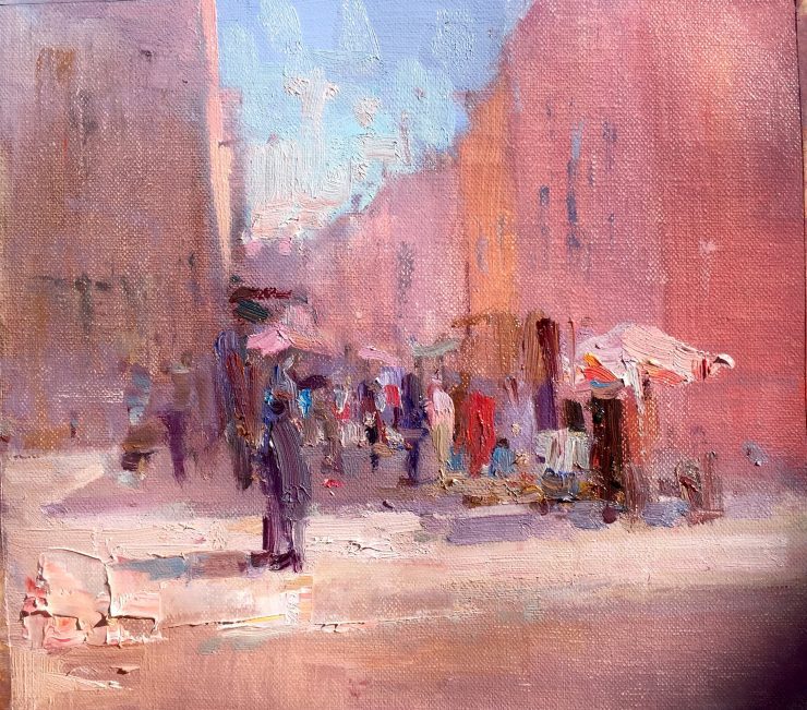
The light on this street in Marrakesh was incredible. The shadows seemed to glow as if they had some magic light source. It seemed so intense. But how to paint light? That was my challenge in this painting: how to paint the light. Here are two useful tips I discovered.
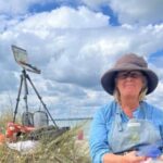
Above is some video I took of the experience of creating the painting below. The video is a bit long and unedited, but will give you an idea of the reality of what I was dealing with, as well as showing you some of the progression of my painting. Hopefully it will give you some ideas for how to paint light.
Cat. No. 1319 Arset el Mellak, Marrakesh – 22cm x 30cm – Oil on Linen
How To Paint Light Tip No. 1 The Washes
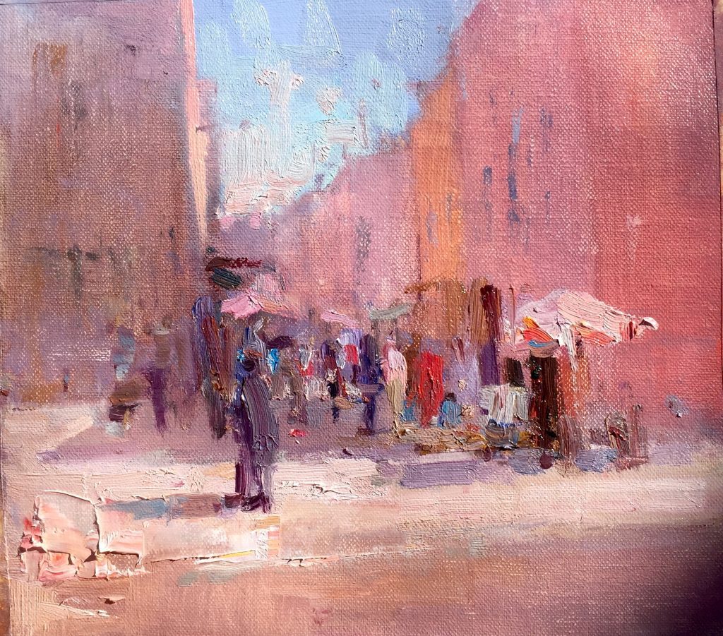
This is somewhere in the early process of how I started the painting. I was using transparent oil washes. I started off using pure pigments thinned with odorless mineral spirits in an almost a watercolor-like technique. And only later moved to more opaque pigment by adding titanium white to my colors. At this point I was exploring how to paint light in the shadowed street in the background before attempting any detail. The effect of all these washes was to create a multi-colored imprimatura.
How To Paint Light Tip No. 2: Ignore the Photograph
There was no way to capture the feeling and effect of this light in a photograph. You had to be there to see it. If you look at this photograph you don’t get the proper feeling of light. This is because the shadowed area of the street is quite dark in the photograph.
In reality, when you are actually there, the iris of your eyes adjusts to the shadows to let in more light, and the extremely strong reflected light makes the shadows appear much lighter and saturated in color. Actually the painting captured the feeling quite well. The photograph does not come anywhere close.
So in order to paint light you need to have some plein air experience so that you know how to interpret a photograph.
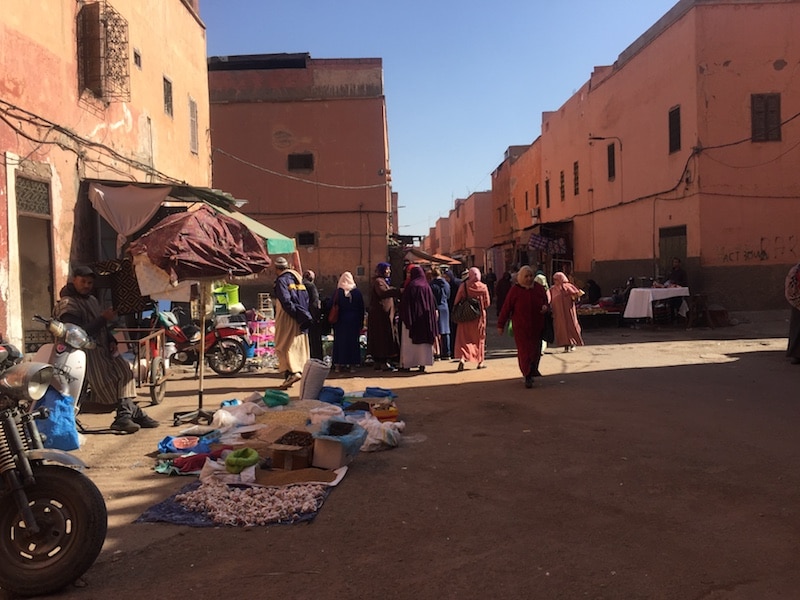
Above is a photo of the actual scene I was painting.
The Dynamic Range Camera Problem
In order to learn how to paint light, if you work from photographs you need to understand the dynamic range camera problem.
The problem with photography
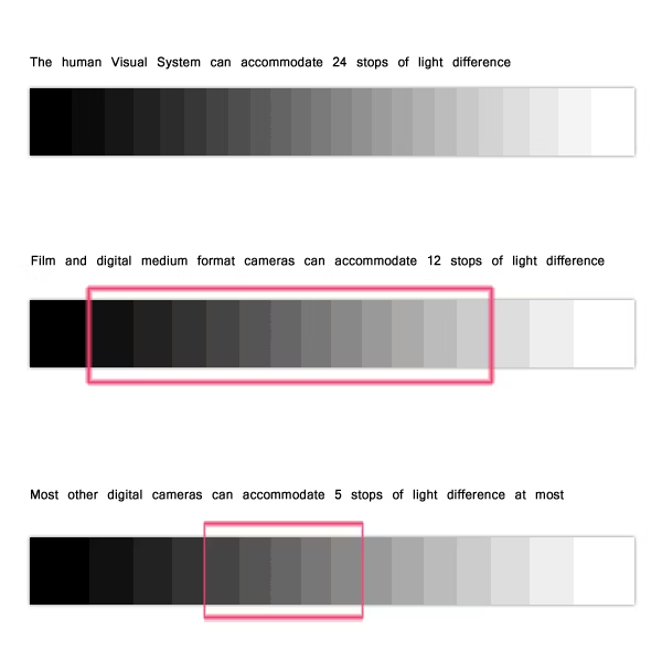
When we look at shadows, our eyes adjust to let in more light (our pupils dilate). This means that we can see color in shadows. When we look back at a bright light, our eyes adjust to block some of the light so we can better see the light areas.
However, the camera has a limited dynamic range compared with the human eye. Each time you take a photograph of a scene that has areas that are very dark and areas that are in bright sunlight you can either:
- get the shadow colors accurate, but the areas in bright sunlight will be ‘washed out’. That is to say they will appear white and have no color in them, when in reality they would have a definite color and hue and a much higher saturation, or
- get the bright light colors accurate, but at the same time the areas in the shadows will appear black. They will have no color in them, when in reality they would be a gray color with a definite hue.
The solution
There is not much you can do about this problem, which is why plein air paintings are so much livelier and real than studio paintings made from photographs. Some suggestions are:
- use a high end camera with a high dynamic range
- use the HDR setting on your camera or smart phone
- take two photographs, one exposed for the darks and the other exposed for the lights
- if you take only one photograph, under expose it a bit so that the lights retain their color. You can then use computer software to retrieve the colors in the shadows. You cannot do it the other way around. If you expose for the darks and the whites are ‘washed out’, you cannot retrieve them in software.
- use the Zone System.
What the eye can see
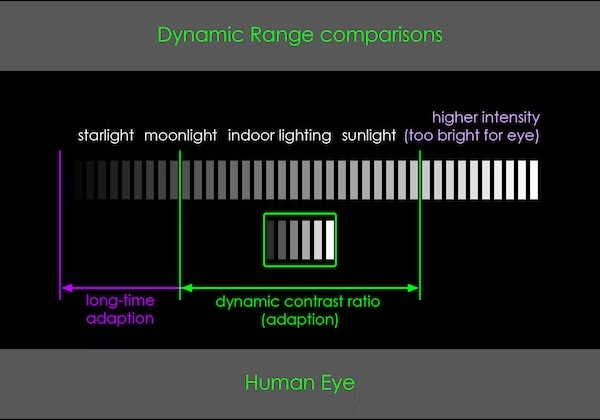
What the camera can see relative to the human eye
Implications for color matching
Now this is where things get complicated.
Painting indoors
When painting indoors in a room that has no direct sunlight, matching colors is relatively easy. The same amount of light falls on the subject as your painting.
This means you can hold patches of paint up to your subject to check they are the same as the color spot on your subject (usually a still life, but it could be a portrait). Since the same amount of light is falling on your subject as is falling on your painting, you will very easily be able to match the colors and achieve a very highly realistic still life painting. This is the trick that methods such as ‘The Carder Method’ (now marketed as something else), and a lot of painting courses on the internet use. Easy stuff!
Painting plein air
This method completely falls apart when painting plein air. The reason is because of this common painting rule:
You will perceive a black object that has light falling on it to be lighter in value than you perceive a white object in the shadow.
(Some artists phrase this rule as: “the darkest dark in the lights is always lighter than the lightest light in the darks”)
In other words black can be lighter than white!
Conversely:
You will perceive a white object that is in the shadow to be darker in value than a black object that has light falling it”.
(Some artists phrase this rule as: “the lightest light in the darks is always darker than the darkest dark in the lights”)
This means that if your painting is either all in the shadow or all in the light, and your subject is half in shadow and half in light, the system of matching swatches of color with your subject cannot work. So that nice simple method of color matching completely falls apart.
In other words white can be darker than black!
This is why a lot of really good still life painters have major problems when they paint outdoors. Their color matching technique no longer works outdoors.
For more information
For more detailed information on color see the advanced color lessons in the Apprentice Program.
Thank You
Thank you for taking the time to read this article. I hope you find it useful. If you would like to get free painting tips by email, please sign up for my free tips newsletter.
If you are interested in a structured approach for learning how to paint, take a look at my online painting classes.
Happy painting!
Barry John Raybould
Virtual Art Academy
What The Students Are Saying
The equivalent of a 4 year art education at a fraction of the cost

This is a great course for anyone who is serious about improving their painting. I have been a student here for several years. When I am finished, I will have the equivalent of a 4 year art education at a fraction of the cost. I can do the lessons anywhere and at my own pace.… Read more “The equivalent of a 4 year art education at a fraction of the cost”
The sky’s the limit

This course was exactly what I’d been looking for as a recent “empty-nester.” The Virtual Art Academy coursework taught me not only HOW to paint well, but also how to SEE to observe a scene more closely to interpret it effectively in paint, and what to look for to create an interesting composition. It helped… Read more “The sky’s the limit”
The course is for beginners, intermediate and advanced artists

I joined VAA in 2014, it seemed a perfect fit in content, ease of access and cost. It turned out to be all of this and much more. The wealth of information on all practical aspects of painting is invaluable and I think incomparable to anything else out there. The course structure is such that… Read more “The course is for beginners, intermediate and advanced artists”
It is impossible to fail or gain little through extensive 4 year study at VAA!
I would recommend taking VAA study to everyone who seriously strive of becoming exceptionally skilled professional artist. It gives more than you can ever imagine! The lessons structured in the best possible way that lead to understanding and skills you never acquired before which are so important in art. It is impossible to fail or… Read more “It is impossible to fail or gain little through extensive 4 year study at VAA!”
Building blocks of learning is the best I have seen

I joined 5 years ago when I didn’t know anything about oils, painting, composition, or drawing. Barry’s way of teaching is extremely well versed in many aspects of painting. His building blocks of learning is the best I have seen. The academy is designed well and the community of fellow students is engaging and friendly.… Read more “Building blocks of learning is the best I have seen”
‘Ladder of Learning’ adds to overall positive experience of this awesome course

The VAA course is built on four main building blocks including PROCESS, REALISM, MUSIC AND POETRY. These are further divided into topics that are continuously developed throughout the curriculum. Drawing, Form, Observation, Colour, Brushwork, Notan, Composition and Poetry are all thoroughly taught. Working on-line we meet students from all around the world, interacting with them… Read more “‘Ladder of Learning’ adds to overall positive experience of this awesome course”
Since I started the programme I can see improvements in my composition and use of colour

My painting “Primitive Pots” recently won the award given by the Royal Institute of Painters in Watercolour at the recent selected exhibition of the Society of East Anglian watercolourists. I have been working through the VAA course for over five years and would highly recommend it to anyone wanting to improve their painting. There is… Read more “Since I started the programme I can see improvements in my composition and use of colour”
No need to buy expensive art books…. Just do the VAA 4 year course. I still refer to it

I finished the VAA course a few years ago, but always refer to the notes, rereading the course many times. This is not a course the day you are finished, you are done. No, you keep practising the assignments getting better and better over time. When I look back at my work when I had just… Read more “No need to buy expensive art books…. Just do the VAA 4 year course. I still refer to it”
This is a far more superior school than anything I have seen being taught at colleges across the country
This is a far more superior school than anything I have seen being taught at colleges across the country and have learned much more from the Virtual Art Academy® than from any art course I have ever taken! I cannot begin to tell how the Virtual Art Academy has improved my observation of potential compositions… Read more “This is a far more superior school than anything I have seen being taught at colleges across the country”
The course has a steady learning curve that keeps revealing itself as you advance

The course is working great, the lessons are set out so well that every week I can see growth. In following the program it’s given me direction, and the information in the lesson plans are of a professional level. There is no way I would have tracked down the information by myself, and being in… Read more “The course has a steady learning curve that keeps revealing itself as you advance”
Barry gave me a fishing rod so I can catch my own fish

After weeks and even months of searching YouTube, “googling” and spending a fortune on art instructional books I finally came across the Virtual Art Academy®. When it comes to purchasing online I am always very careful how I spend my money. Especially when I already spent a small fortune on art books. They always seemed… Read more “Barry gave me a fishing rod so I can catch my own fish”
It is a real course that trains you in a structured way

The questions you ask yourself are,”Will it be worth the cost?” and “Will it be truly useful?”. After a couple of weeks working on/in Virtual Art Academy®, I can say that the amount of work it represents – by Barry – is incredible! The information presented alone is more than worth the price and, yes,… Read more “It is a real course that trains you in a structured way”
I’m Richard Robinson …. best online art training available on the internet today
Hi I’m Richard Robinson. I’ve been a professional painter since 2001. My claim to fame is only that I’m making a living as an artist and doing pretty well – something which I hear is not so easy to do, and I guess it does take a lot of work, but it’s work that I… Read more “I’m Richard Robinson …. best online art training available on the internet today”
The most comprehensive, in depth and well-organized painting course available online

After a thorough research, my personal conclusion is that the Virtual Art Academy (VAA) is, by wide margin, the most comprehensive, in depth and well-organized painting course available in the internet. Unlike most tutorials and color mixing recipes commonly found online, VAA’s philosophy is rather to provide the students with detailed information about all aspects… Read more “The most comprehensive, in depth and well-organized painting course available online”
An excellent foundation on so many aspects of painting

I never had formal training in painting and my style has always been very realistic, slow and not at all artistic, just a copy of a photograph. When I got word of the course available through Virtual Art Academy, I was very excited for the opportunity to learn what I never knew about painting. VAA… Read more “An excellent foundation on so many aspects of painting”
The small steps are easy to do

I am extremely impressed with the process that Barry has developed for VAA. Learning to paint can be intimidating, but when broken into many small projects it is very do-able. I just did my first live model painting session- a 5 hour, one day session. Thanks to VAA, I was able to break the painting… Read more “The small steps are easy to do”
The improvement in my own work reaffirms that I’ve found the right program to develop as an artist

I have been a student of VAA since 2011. I had been searching for an online art program that could assist in helping me develop as an artist. VAA is a complete program for beginners as well as advanced students of art. The course is well structured and takes you step by step so you… Read more “The improvement in my own work reaffirms that I’ve found the right program to develop as an artist”
I started learning oil painting with VAA from scratch. Just one year later my paintings started to sell

The Virtual Art Academy program is really comprehensive and gave me all the information and directives to learn painting in one package. The material is very well organized, just beautiful to look at and motivating to carry through. The online campus is a wonderful place to meet other artists and receive critical feedback on my… Read more “I started learning oil painting with VAA from scratch. Just one year later my paintings started to sell”
The most comprehensive art instruction I could find anywhere online, and trust me, I had been looking for a long time.

I joined 2 years ago with my daughter. We have both learnt so much and have enjoyed our VAA time together. My daughter is now 13 and already produces amazing paintings. The Virtual Art Academy is simply the most comprehensive art instruction I could find anywhere online, and trust me, I had been looking for… Read more “The most comprehensive art instruction I could find anywhere online, and trust me, I had been looking for a long time.”
Only online learning program I have ever discovered using a training industry best practice
Before repurposing my vocation into avocation, I spent 20 years in the corporate world as an instructional designer and performance consultant creating training curricula for diverse clientele from NASA to General Motors. I know curriculum development and how to guide a learner from beginning to certification. VAA is the only online learning program I have… Read more “Only online learning program I have ever discovered using a training industry best practice”
comprehensive art education
I wanted to get a comprehensive art education with the freedom to work at my own pace. I’m several years into the curriculum and I feel like my work has drastically improved. I’ve found holes in my knowledge that I didn’t know I had. Critiquing other students posts and reading their feedback to mine has… Read more “comprehensive art education”
It is wild to see how much I am learning in this course!

Five star rating from me for Virtual Art Academy (VAA)! I retired last year, and decided I wanted to spend my time in retirement learning how to oil paint. But having never painted before, I wasn’t even sure what to look for in an online painting course. However, I did some searches for “Best Online… Read more “It is wild to see how much I am learning in this course!”
A great learning platform

I have been working my way through the Virtual Art Academy for almost a year now, and cannot recommend it highly enough. The Workshops are thorough, structured and substantive. There is a logical and step by step progression that makes the learning process so much easier, with new concepts being introduced and then practiced along… Read more “A great learning platform”
VAA, the ultimate art course
Although still a novice, the Virtual Art Academy has taught me the skills needed, not only to produce reasonably good art but has given me an understanding of the complexities of art. All the basics of art, as well as composition and studies of master artists are covered in the course. No reason not to… Read more “VAA, the ultimate art course”
What I learned from 10 years with VAA
The VAA gives you a really solid foundation for learning and improving how to paint. When you’re frustrated with your work, it’s not getting accepted into exhibitions, you’re not selling and you’re just not happy with what you produce the VAA is the answer. It is explained easily with examples and exercises. It does mean… Read more “What I learned from 10 years with VAA”
Barry, when you say ‘pure pigments’, do you mean the oil colours on the palette, thinned down, or powdered pigments you hide somewhere?
I started off with oil colors on the palette, without any white added. Later on I added white into the mix.
Thanks for a great video, Barry. I like the fact that it is un-edited- it made me chuckle on several occasions, seeing what you were dealing with with people coming and going and the scene changing all the time. I haven’t been game to paint in a similar situation just yet, preferring to find more isolated locations. But , I’m building up to it.
You have really nailed the reflected glow and warmth on the buildings and the feeling of hustle and bustle.
I was also interested to see your palette. You certainly put out a lot of each colour. What do you do with the paint left on your palette at the end of a session/day? ( many of which seem not to be used at all for this painting.)
Congratulations on making such a beautiful painting.
I put plastic wrap over the palette and press it around all the piles of paint to exclude the air. This stops the paint drying out.
At home I then put the whole palette in the freezer to further reduce the drying of the paint.
But as you noticed, in Morocco I didn’t use these grays as much as I normally do. This is because the colors were so intense. Sometimes you need to adjust your working methods according to the subject and atmosphere, as I certainly have been doing with these North African painting series.
Excellent information about light. I never knew this but it makes so much sense.
What is your opinion of the the carder method? Or mark carders way of teaching in general?
That is a very good question Yvon. The answer is a bit complex.
The Carder method and similar methods taught in many classical ateliers, are very good for helping you make an accurate copy of a still life setup or a model in the studio. The process is fairly mechanical and can be learned with a bit of practice and can produce good results if what you want is an accurate copy of what you see in front of you.
However there are serious limitations with it from an artistic point of view.
The first major problem is that the Carder method use a method of drawing called sight-sizing. Sight-sizing constrains you to making an exact copy of what you see in front of you. But if you simply copy what is in front of you, you will end up with a painting that is no more artistic than just taking a snapshot with a camera.
To make a good composition you need to re-organize the chaotic shapes of nature into interesting and varied patterns. Organizing nature into these patterns is what the ‘art’ in painting is all about.
So what you need to learn instead is how to see relationships. That is the best way to learn to draw. Then you you can easily move mountains, re-arrange trees, and create something far more interesting than what is actually out there.
Secondly, these methods rely on something called a color isolator. There are two problems with this tool. Using a color isolator to create an exact match between a colors in a still life setup and your paints, works fine in the low lighting levels typically found in the studio.
But it runs into major problems when you try to use this method outdoors. In the studio, the level of light coming off the lit and shaded parts of your subject is about the same as the level of light reflecting of the painted light and shade areas on your painting. So you can use a color isolator to make sure the colors on your painting and the colors in the scene are identical.
Outdoors things are totally different. You can put your painting in the shade and use the color isolator to match the shadows in your painting with the shadow color in the scene. So far so good. But as soon as you try to do that with the light parts of the scene you find that it is impossible. The light coming from a bright sky is far greater than the the light coming from the lightest part of your painting in the shade and so you simply cannot match the colors – the lightest part of the painting always appears far too dark.
But there is a second problem as well. Again, in methods such as the Carder method and similar methods, they teach you to copy exactly the colors of nature. This means you cannot gray colors down, or increase the saturation to create a more interesting color harmony. This tends to result in rather boring paintings from a color point of view. What you really need to do when painting outdoors is to learn how to see color temperature and value relationships and then exaggerate them to create a more artistic and creative effect.
Also if you create the feeling of light you need to change the colors you see. If you just copy the colors, the painting will just feel dull.
So the bottom line is that these methods produce rather mechanical results that are an accurate copy of nature, but without any significant degree of artistic interpretation. In essence you are learning a craft and if you rely on these methods like a crutch, you will be quite handicapped when it comes to the more creative side of painting.
Thank you sir for the response. That’s why I’m trying to learn your method. I guess I find it more “loose”. Artistic? Individualistic? Not trying to make a Painting look like a photograph…..I must say there are things that I’m having trouble with. The concept of notan, and squinting…..I guess it will all come together
Yes like most things that are worthwhile, it takes some time to learn and practice the skills, but eventually you will get there. It just takes a patient commitment to work on it, and to gradually build up the skills you need one by one. Good luck!
Hi Barry. Sorry to bother you again. Lesson A10. You place pints on your palette but don’t specify what colours. Can you elaborate please?
All of the colors and all of the palettes are detailed in the Virtual Art Academy eLibrary: Color Unit Two (type color unit in the search box to find it).
There is also a tool here to help you select the right palette: https://www.virtualartacademy.com/how-to-choose-oil-colors-tool/. If you click the top right … menu and look for Free Guides, you will find the tool.
I hope this helps you.
Barry
Beautiful work.
The colors are so rich and at the same time natural. The play of colors in shadows and the lights makes this painting sing.
One question if you use zinc white for under layers or you keep to titanium white.
I use titanium white, but in a very thin wash to keep it transparent.
I think it was good to start with warm imprimatura colors. It helped establish the warmth of the atmosphere. And also I agree not to depend on photographs but go with your gut feeling of what you want to convey. Good job, Barry!
Really useful! Thank you, Barry!