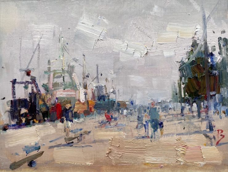
While I was in Ireland at a plein air painting festival, I wanted to paint the Wexford boats at the wharf. I loved all the interesting shapes of the fishing boats and the confusion of masts and rigging. Trying to simplify it and turn it into a painting was a challenge, particularly since there was a very strong wind blowing that threatened to blow my whole painting setup over unless I kept one hand on my easel!
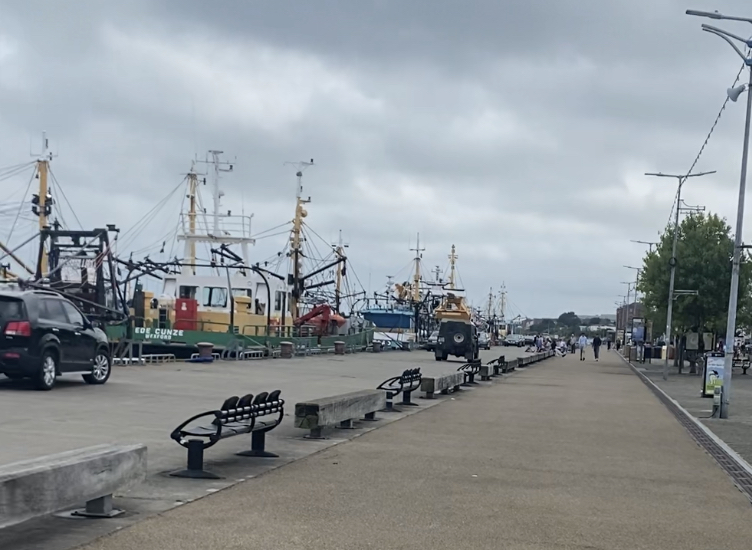
Photographic Reference for the painting
As you can see from the photograph, the scene is very confused. Any attempt to copy all the detail would fail artistically. So I needed a strategy for how to deal with it.
Techniques and principles I used in this painting
The overall idea was to create a design based on setting off a few color accents against a field of gray. My plan was to turn the confusion of the wharf into an abstract pattern of interesting shapes using a variety of brushstrokes that were suggestive of the boats, but not a literal description. Suggestion is a key part of the aesthetic experience of a painting. The viewer enters into the work, using their own imagination to construct its meaning. If you give the viewer all of the detail up-front, the viewer has nothing to think about, and consequently gets bored. This is a very general concept in painting, and explains why master artists such as Monet and JMW Turner, to cite two well known examples, turned more and more to abstraction later on in their careers as their confidence to capture their subject matter expressively increased.
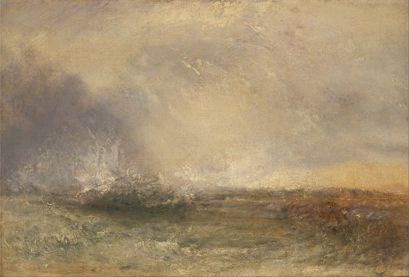
Suggestive value transitions and edges used by Turner, to suggest a storm
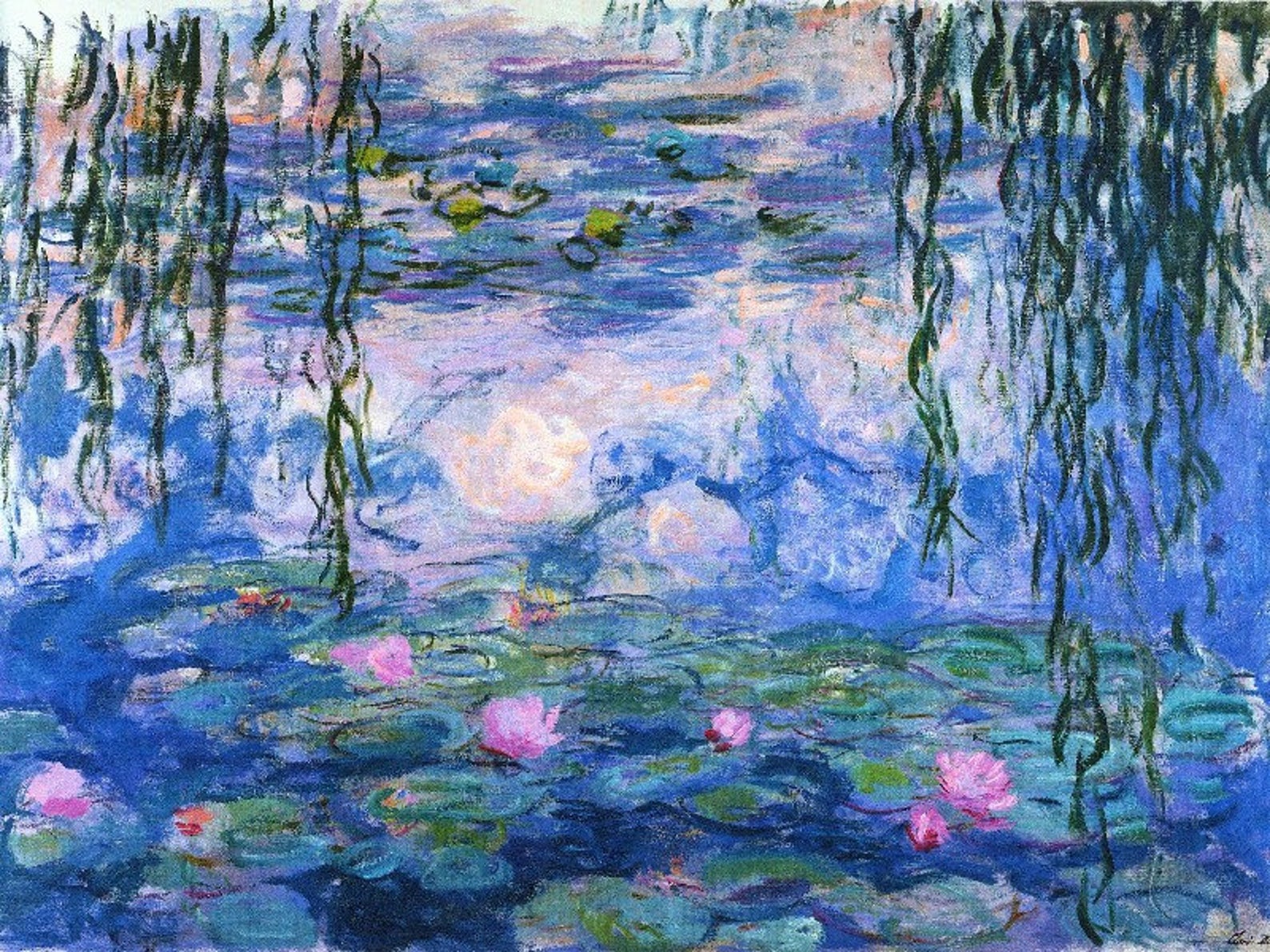
Suggestive brushwork used by Monet, focusing on a complementary color harmony
The basic color harmony I used in Wexford Boats was a dominant cool blue gray with complementary accents. I contrasted the flat areas of cool grays with thick impasto brushwork for the boats in the center of interest, using a combination of lines and masses in my brushwork.
If you look at the wharf, there is a very subtle graying and cooling of the gray in the distance in order to create a sense of distance. I also used calligraphy in the brushwork to enhance this effect. The idea was to create a sense of reality, by creating a sense of space in the painting in spite of its overall abstract character.
Available for sale. Please contact me and quote the catalog number.
Online painting classes
Here are the online painting classes in the Virtual Art Academy® Apprentice Program that go into the details of all the techniques I used in this painting:
- B07 How To Make Grays
- B11 What Are Complements?
- C09 Focal Point And Focal Area
- D08 Atmospheric Value Changes
- D09 Atmospheric Hue Changes
- F06 Thick & Thin
- G07 Planes of the Light & Shade
- H02 Brushwork in Focal Areas
- H07 Contrast of Brushwork
- H11 Complementary Color Harmony
Thank You
Thank you for taking the time to read this article. I hope you find it useful. If you would like to get free painting tips by email, please sign up for my free tips newsletter.
If you are interested in a structured approach for learning how to paint, take a look at my online painting classes.
Happy painting!
Barry John Raybould
Virtual Art Academy
What The Students Are Saying
A great learning platform

The sky’s the limit

The course has a steady learning curve that keeps revealing itself as you advance

Read more “The course has a steady learning curve that keeps revealing itself as you advance”
It is impossible to fail or gain little through extensive 4 year study at VAA!
Read more “It is impossible to fail or gain little through extensive 4 year study at VAA!”
The equivalent of a 4 year art education at a fraction of the cost

Read more “The equivalent of a 4 year art education at a fraction of the cost”
‘Ladder of Learning’ adds to overall positive experience of this awesome course

Read more “‘Ladder of Learning’ adds to overall positive experience of this awesome course”
The course is for beginners, intermediate and advanced artists

Read more “The course is for beginners, intermediate and advanced artists”
The most comprehensive, in depth and well-organized painting course available online

Read more “The most comprehensive, in depth and well-organized painting course available online”
I’m Richard Robinson …. best online art training available on the internet today

In my opinion Barry has created the best online art training available. I found the Virtual Art Academy course of painting lessons many years ago and was so inspired by it that I contacted the author and got to know him personally.
Two Critical Keys
If you are looking (like I did) for the best painting course available there are two key things you should know about the Virtual Art Academy course which make it stand out above the other online painting courses available today:
1. It’s Comprehensive.
It covers ALL the key painting concepts and then goes further, revealing more and more painting insights. Most courses miss a LOT out – this one doesn’t.
2. It’s easy to understand.
All that information could easily become confusing, but each piece is laid out clearly and concisely using Information Mapping® making it a pleasure to learn.
If you can find another painting course which does these 2 things better, please let me know. As I said, I have been searching for many years and continue to do so, so you could save yourself a lot of precious time and money by joining the Virtual Art Academy today.
Read more “I’m Richard Robinson …. best online art training available on the internet today”
Building blocks of learning is the best I have seen

Read more “Building blocks of learning is the best I have seen”
I started learning oil painting with VAA from scratch. Just one year later my paintings started to sell

It is a real course that trains you in a structured way

Read more “It is a real course that trains you in a structured way”
The small steps are easy to do

It is wild to see how much I am learning in this course!

I retired last year, and decided I wanted to spend my time in retirement learning how to oil paint. But having never painted before, I wasn’t even sure what to look for in an online painting course. However, I did some searches for “Best Online Oil Painting Courses,” and found several references to VAA.
I signed up for VAA’s ongoing Apprentice Program last October (2023), and I am incredibly glad I did! As a beginner, I didn’t know what I didn’t know, but I didn’t have to: VAA has already mapped it all out for me. It starts out with basic, fundamental stuff, but also teaches me the THINKING that goes in the painting: the composition, my color choices, how to consciously select which darks and lights need to be emphasized, etc.
Bottomline, I am learning how to create paintings that have both visual music and poetry, and it is super fun to see my growth! I cannot recommend this course enough!
Read more “It is wild to see how much I am learning in this course!”
Only online learning program I have ever discovered using a training industry best practice
VAA is the only online learning program I have ever discovered using a training industry best practice of incorporating Knowledge and Skills to support learning a new activity. Every building block (Drawing, Form, Observation, Concept, Notan, Composition, Colour, Brushwork) incorporates a “spiral learning” approach where you are introduced to the Knowledge/Skill at one level and then reintroduced to it again elsewhere in the curriculum. Sure genius.
I’ve attended workshops, read books, and watched YouTube videos — and none of them provide the scaffolded approach to learning the VAA offers. If you are just starting your painting journey, start here. If you are a mid level or advanced painter, start here. There is a sense of community with artists around the globe. You are part of a peer to peer learning process bigger than yourself.
As a result of the VAA, I have been juried into several shows, am represented by a local gallery and have been selling my paintings on a consistent basis. VAA curriculum’s approach will grow your ‘artist’s brush’ and aid you in finding your artistic voice. As your basics improve, your art improves. Henry Hensche said, “There is study and there is performance, and we should not confuse the two, study is done for perceptual development, our performances show us where we are in that development, and we must have both…”. VAA curriculum offers both.
I went through the entire curriculum, did every every exercise, and today review my printed books/exercises on an annual basis to keep myself fresh and ready for my next painting adventure.
Onwards/Sideways,
Jay “jbird” Holobach
https://www.jayholobach.com/
An excellent foundation on so many aspects of painting

When I got word of the course available through Virtual Art Academy, I was very excited for the opportunity to learn what I never knew about painting. VAA has provided me an excellent foundation on so many aspects of painting. The course is organized very logically, provides great examples, diagrams, thorough explanations and worthwhile assignments. I highly recommend this course to anyone with a desire for an in-depth education of art.
Thank you again, Barry, I love this course Jeanne
Read more “An excellent foundation on so many aspects of painting”
Since I started the programme I can see improvements in my composition and use of colour

I have been working through the VAA course for over five years and would highly recommend it to anyone wanting to improve their painting. There is a huge amount of information on the site and it is well presented and regularly updated and added to. When other members have commented on work I have posted I have found it really useful. When I review my work over the time since I started the programme I can see improvements in my composition and use of colour.
Read more “Since I started the programme I can see improvements in my composition and use of colour”
Barry gave me a fishing rod so I can catch my own fish

Read more “Barry gave me a fishing rod so I can catch my own fish”
comprehensive art education

This is a far more superior school than anything I have seen being taught at colleges across the country

The improvement in my own work reaffirms that I’ve found the right program to develop as an artist

The most comprehensive art instruction I could find anywhere online, and trust me, I had been looking for a long time.

The Virtual Art Academy is simply the most comprehensive art instruction I could find anywhere online, and trust me, I had been looking for a long time.
Even art schools and academies I’ve been exposed to are nowhere near as thorough, VAA is just amazing!
Most paintings I see where the artist clearly has some skill still lack in either the values or notan department, or fall down on composition – it’s baffling that VAA seems to be the only program that goes into detail on this. Therefore, if you are new to painting or an experienced artist, studying with VAA will get you to that next step.
I also find that Barry is always interested in what we students do and is at hand with great advice. Worth every penny, Thank you Barry!!
No need to buy expensive art books…. Just do the VAA 4 year course. I still refer to it

Read more “No need to buy expensive art books…. Just do the VAA 4 year course. I still refer to it”
VAA, the ultimate art course


