(Get free painting tips and plein air painting techniques sent straight to your inbox or on my social media.)
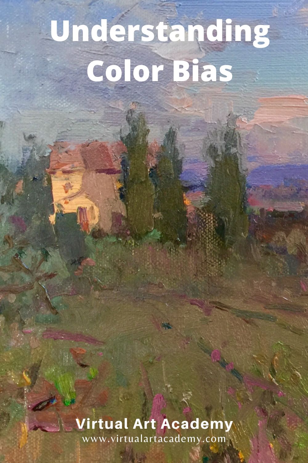
What is color bias?
Understanding how color bias affects color mixing will make the difference between how to mix a color that is vivid and saturated, or ending up with a lower saturated or dull color. To get the brightest mixtures, choose base colours with a similar bias, meaning those that “lean” toward each other on the colour wheel.
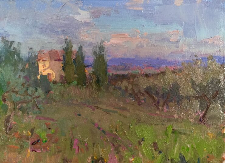
For example, although you mix yellow and blue to make green, you have to understand which yellow mixed with which blue will produce the cleanest, brightest green. This is where colour bias comes in. To get the brightest green, choose a blue that has a yellow bias and a yellow that has a blue bias. This ensures the mixture contains only two colours: blue and yellow. Mixing primary colours with the same secondary bias will provide you vivid and pure mixes. In this case you would mix Cerulean Blue or Pthalo Blue (both have a yellow bias) with Cadmium Lemon or Lemon Yellow (both have a blue bias).
On the other hand, if you chose a blue with a red bias instead of a yellow bias, you would introduce a third colour, red, to your mixture. Red is the opposite or complement of blue, so it will make a muddy color. For example, Ultramarine Blue has a red bias and so does Cadmium Yellow, so you will get an earthier version of green because you have unwittingly added red.
Color bias or color temperature?
Colour bias is also sometimes referred to as colour temperature – whether the colour is “warm” or “cool”. It is a good practice to organize your painting palette from warm to cool. You can also arrange each color group from warm to cool, and then follow the order of colors you see on the color wheel. If you are an absolute beginner, lay out your palette like this:
This warm/cool primary palette uses the three primary colors of the triadic color wheel (red, yellow, blue) but uses two of each primary, a warm bias and a cool bias. It is a good palette layout for beginners since you can mix most colors easily. After a time you will know automatically where your cool and warm bias colors are.
How do I know what colors to mix?
When your learn how to mix a color, you need to keep in mind the color bias for the mix you want to create. This is very important when mixing the secondary colors: orange, purple, and green.
For example, for vivid orange both the red and yellow must have a warm color bias. To create a less saturated/lower hue or dull orange (brown) mix a yellow with a warm color bias (red) and a red with a cool color bias (blue), or a yellow with a cool color bias (blue), and a red with a warm color bias (yellow).
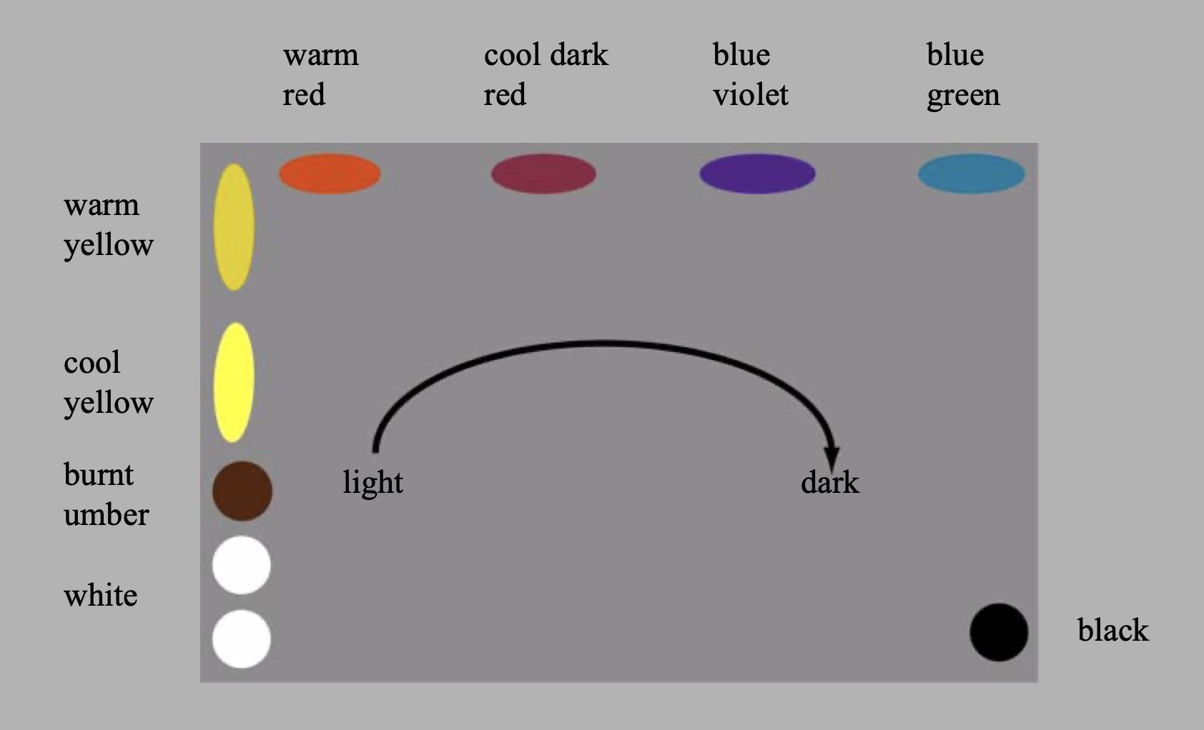
The concept of warm and cool color bias has been written about for hundreds of years. Many theories start with the six point color wheel (three primary colors and three secondary colors). A dividing line splits the wheel into warm and cool. The line varies based upon the reasoning of the theorist. Regardless, the general idea is that warm colors are yellow, orange and red; the cool colors are magenta, blue, and green.
To identify color temperature you’ll need to learn how to see and identify warm and cool colors. Some colors are easy to discern, but looking at so many colors in so many brands “color temperature” can get tricky. In the world of paint, each color has a warm and cool green, blue, red, yellow, earth color, and then the addition of black and white. Comparing a warm red to a cool red and then compare those to a third color, you should be able to see if it’s yellower, bluer, or in between the first two reds. Once you begin to “see” the differences it becomes easy to identify any color. This may take some time, so do a lot of practice mixing colors before you start painting. It will save a lot of time and wasted paint in the long term!
Here is a website to help you determine if your color bias is warm or cool. It is worth printing it out to hang in your studio, or laminate it and take it on plein air painting trips. Beginners can ignore most of the columns to start with, just concentrate on the Hue/Temp column. As you get more skilled, look at the other columns to give you more insight into the bias of each paint tube.
https://gamblincolors.com/color-temperature-list/
I hope this article on color bias has been helpful. Happy mixing!
Thank You
Thank you for taking the time to read this article. I hope you find it useful. If you would like to get free painting tips by email, please sign up for my free tips newsletter.
If you are interested in a structured approach for learning how to paint, take a look at my online painting classes.
Happy painting!
Barry John Raybould
Virtual Art Academy
What The Students Are Saying
VAA, the ultimate art course
Barry gave me a fishing rod so I can catch my own fish

Read more “Barry gave me a fishing rod so I can catch my own fish”
I’m Richard Robinson …. best online art training available on the internet today

In my opinion Barry has created the best online art training available. I found the Virtual Art Academy course of painting lessons many years ago and was so inspired by it that I contacted the author and got to know him personally.
Two Critical Keys
If you are looking (like I did) for the best painting course available there are two key things you should know about the Virtual Art Academy course which make it stand out above the other online painting courses available today:
1. It’s Comprehensive.
It covers ALL the key painting concepts and then goes further, revealing more and more painting insights. Most courses miss a LOT out – this one doesn’t.
2. It’s easy to understand.
All that information could easily become confusing, but each piece is laid out clearly and concisely using Information Mapping® making it a pleasure to learn.
If you can find another painting course which does these 2 things better, please let me know. As I said, I have been searching for many years and continue to do so, so you could save yourself a lot of precious time and money by joining the Virtual Art Academy today.
Read more “I’m Richard Robinson …. best online art training available on the internet today”
It is a real course that trains you in a structured way

Read more “It is a real course that trains you in a structured way”
‘Ladder of Learning’ adds to overall positive experience of this awesome course

Read more “‘Ladder of Learning’ adds to overall positive experience of this awesome course”
Only online learning program I have ever discovered using a training industry best practice
VAA is the only online learning program I have ever discovered using a training industry best practice of incorporating Knowledge and Skills to support learning a new activity. Every building block (Drawing, Form, Observation, Concept, Notan, Composition, Colour, Brushwork) incorporates a “spiral learning” approach where you are introduced to the Knowledge/Skill at one level and then reintroduced to it again elsewhere in the curriculum. Sure genius.
I’ve attended workshops, read books, and watched YouTube videos — and none of them provide the scaffolded approach to learning the VAA offers. If you are just starting your painting journey, start here. If you are a mid level or advanced painter, start here. There is a sense of community with artists around the globe. You are part of a peer to peer learning process bigger than yourself.
As a result of the VAA, I have been juried into several shows, am represented by a local gallery and have been selling my paintings on a consistent basis. VAA curriculum’s approach will grow your ‘artist’s brush’ and aid you in finding your artistic voice. As your basics improve, your art improves. Henry Hensche said, “There is study and there is performance, and we should not confuse the two, study is done for perceptual development, our performances show us where we are in that development, and we must have both…”. VAA curriculum offers both.
I went through the entire curriculum, did every every exercise, and today review my printed books/exercises on an annual basis to keep myself fresh and ready for my next painting adventure.
Onwards/Sideways,
Jay “jbird” Holobach
https://www.jayholobach.com/
The most comprehensive, in depth and well-organized painting course available online

Read more “The most comprehensive, in depth and well-organized painting course available online”
Since I started the programme I can see improvements in my composition and use of colour

I have been working through the VAA course for over five years and would highly recommend it to anyone wanting to improve their painting. There is a huge amount of information on the site and it is well presented and regularly updated and added to. When other members have commented on work I have posted I have found it really useful. When I review my work over the time since I started the programme I can see improvements in my composition and use of colour.
Read more “Since I started the programme I can see improvements in my composition and use of colour”
A great learning platform

The most comprehensive art instruction I could find anywhere online, and trust me, I had been looking for a long time.

The Virtual Art Academy is simply the most comprehensive art instruction I could find anywhere online, and trust me, I had been looking for a long time.
Even art schools and academies I’ve been exposed to are nowhere near as thorough, VAA is just amazing!
Most paintings I see where the artist clearly has some skill still lack in either the values or notan department, or fall down on composition – it’s baffling that VAA seems to be the only program that goes into detail on this. Therefore, if you are new to painting or an experienced artist, studying with VAA will get you to that next step.
I also find that Barry is always interested in what we students do and is at hand with great advice. Worth every penny, Thank you Barry!!
The course has a steady learning curve that keeps revealing itself as you advance

Read more “The course has a steady learning curve that keeps revealing itself as you advance”
The improvement in my own work reaffirms that I’ve found the right program to develop as an artist

comprehensive art education

Building blocks of learning is the best I have seen

Read more “Building blocks of learning is the best I have seen”
This is a far more superior school than anything I have seen being taught at colleges across the country

The course is for beginners, intermediate and advanced artists

Read more “The course is for beginners, intermediate and advanced artists”
The sky’s the limit

The equivalent of a 4 year art education at a fraction of the cost

Read more “The equivalent of a 4 year art education at a fraction of the cost”
It is wild to see how much I am learning in this course!

I retired last year, and decided I wanted to spend my time in retirement learning how to oil paint. But having never painted before, I wasn’t even sure what to look for in an online painting course. However, I did some searches for “Best Online Oil Painting Courses,” and found several references to VAA.
I signed up for VAA’s ongoing Apprentice Program last October (2023), and I am incredibly glad I did! As a beginner, I didn’t know what I didn’t know, but I didn’t have to: VAA has already mapped it all out for me. It starts out with basic, fundamental stuff, but also teaches me the THINKING that goes in the painting: the composition, my color choices, how to consciously select which darks and lights need to be emphasized, etc.
Bottomline, I am learning how to create paintings that have both visual music and poetry, and it is super fun to see my growth! I cannot recommend this course enough!
Read more “It is wild to see how much I am learning in this course!”
No need to buy expensive art books…. Just do the VAA 4 year course. I still refer to it

Read more “No need to buy expensive art books…. Just do the VAA 4 year course. I still refer to it”
An excellent foundation on so many aspects of painting

When I got word of the course available through Virtual Art Academy, I was very excited for the opportunity to learn what I never knew about painting. VAA has provided me an excellent foundation on so many aspects of painting. The course is organized very logically, provides great examples, diagrams, thorough explanations and worthwhile assignments. I highly recommend this course to anyone with a desire for an in-depth education of art.
Thank you again, Barry, I love this course Jeanne
Read more “An excellent foundation on so many aspects of painting”
It is impossible to fail or gain little through extensive 4 year study at VAA!
Read more “It is impossible to fail or gain little through extensive 4 year study at VAA!”
The small steps are easy to do

I started learning oil painting with VAA from scratch. Just one year later my paintings started to sell

Add comment