(Get free painting tips and plein air painting techniques sent straight to your inbox or on my social media.)
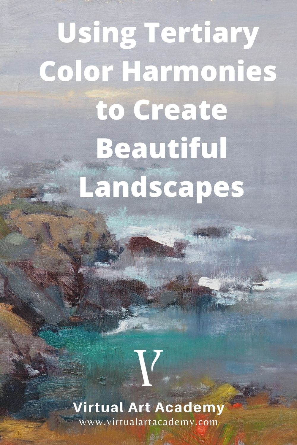
Secrets to achieving stunning tertiary color harmonies
Much of the pleasure from viewing a painting is derived, to a large extent, from the harmony of the colors used in it. This harmony is basically an orderly relationship of colors, just as a musical harmony is an orderly relationship of notes. This is part of the music of the painting. One easy method for achieving a harmonious landscape painting is to use the tertiary color harmony.
The tertiary harmony uses all six tertiary hues. You can think of these six tertiary hues as a warm and cool version of each of the three secondary hues.


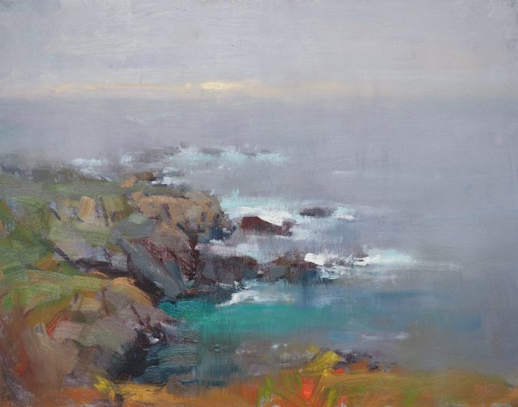
You create the six tertiary colors by mixing the secondary colors (orange, green, and violet), with the adjacent primary colors (yellow, blue and red). so you get yellow-orange, red-orange, red-violet, blue-violet, blue-green, and yellow-green.
Use the tertiary color harmony in a similar way to how you would use the secondary and adulterated primary color harmonies. However this color harmony is much more useful in that it provides a warm and cool version of each of the secondary colors.
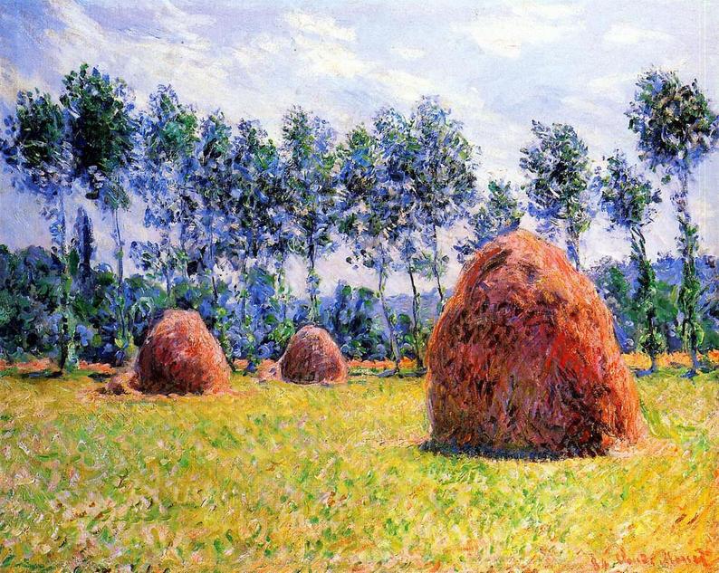
In a landscape, the warmer yellow orange and red orange colors are usually seen in the foreground, together with yellow greens in the vegetation. The cooler blue greens are seen more in the middle distance. The red violet and blue violets are seen in distant hills and mountains, and in the near shadows, with the coolest blue violets being seen in the far distance.
More examples of tertiary color harmony
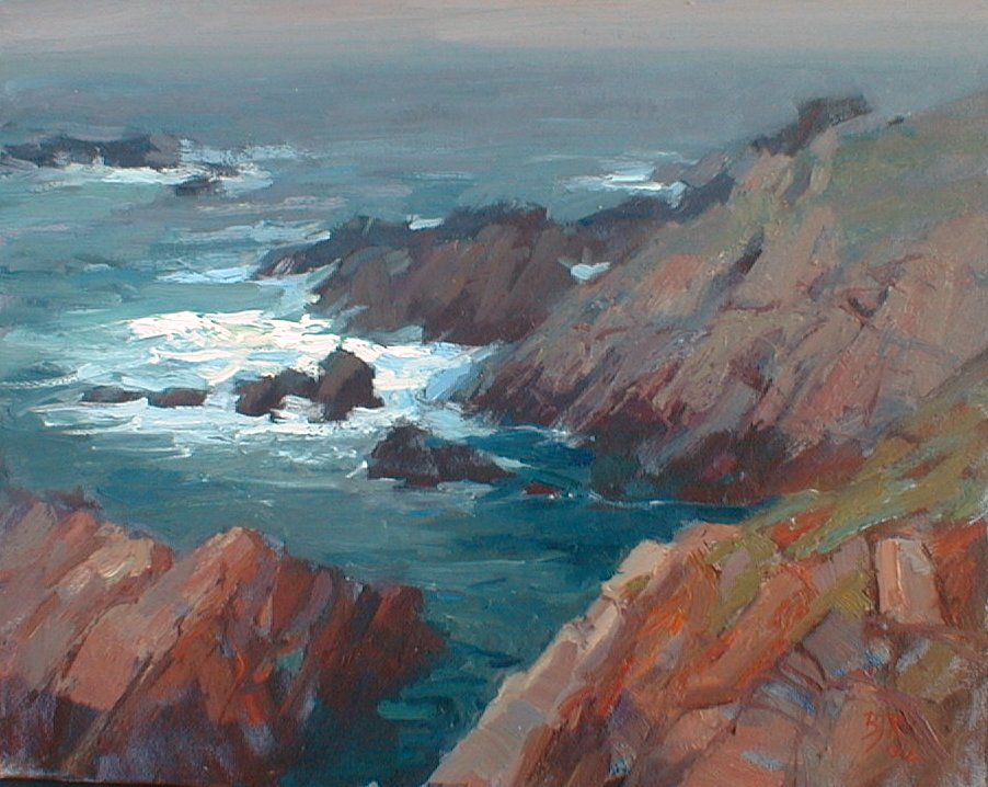
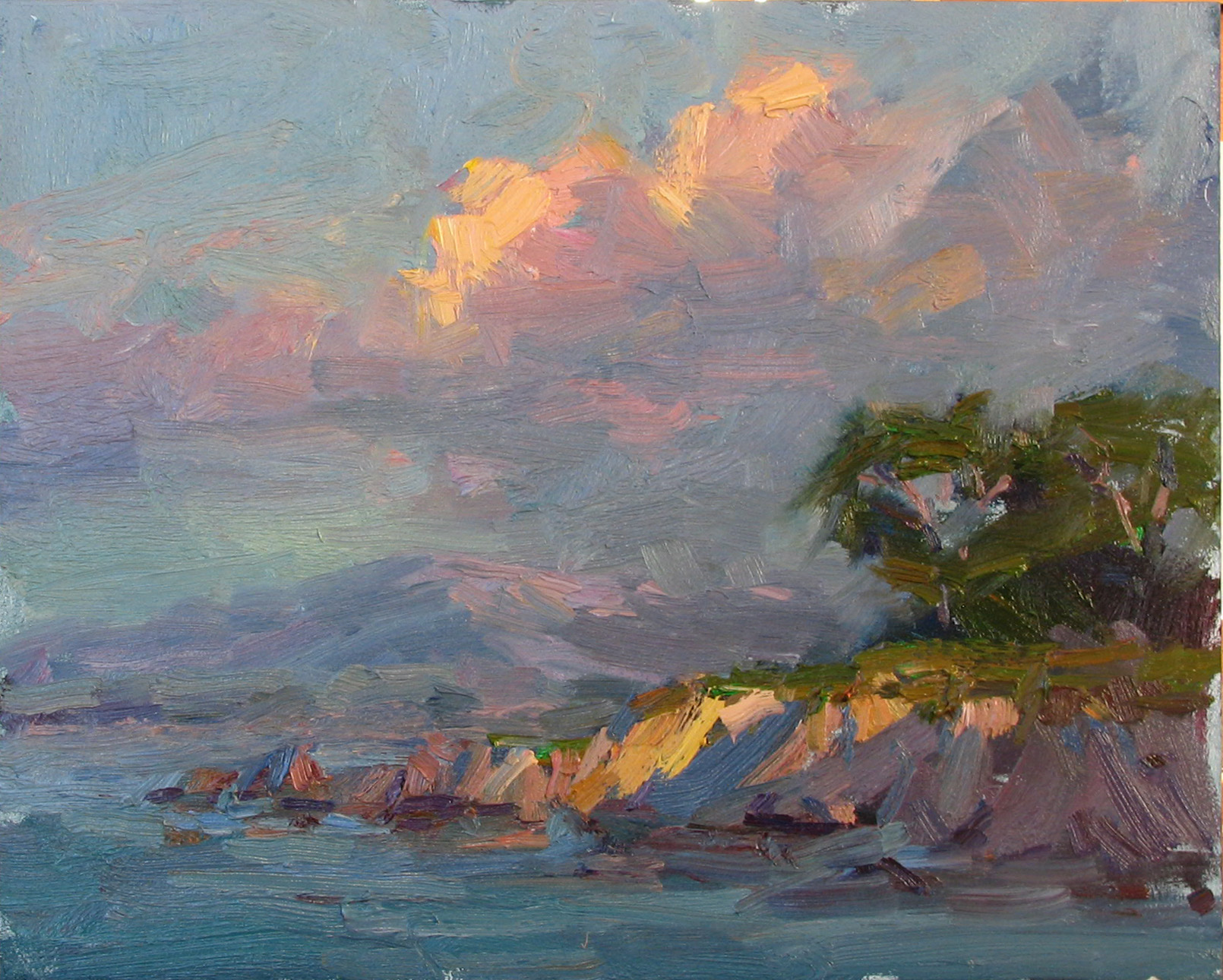
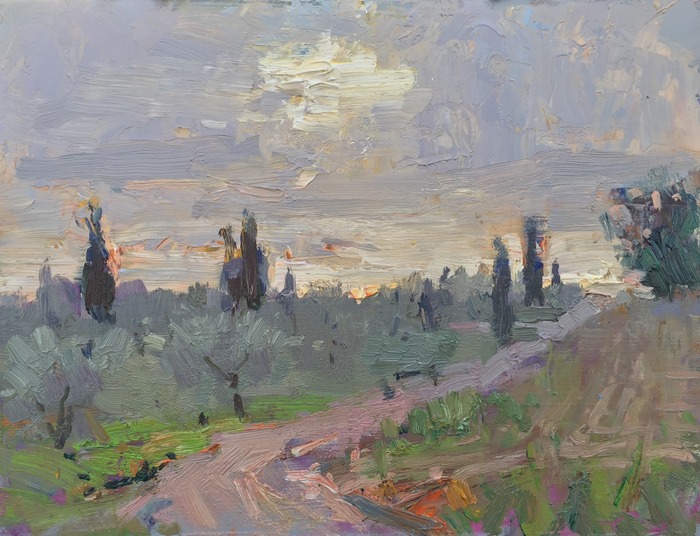
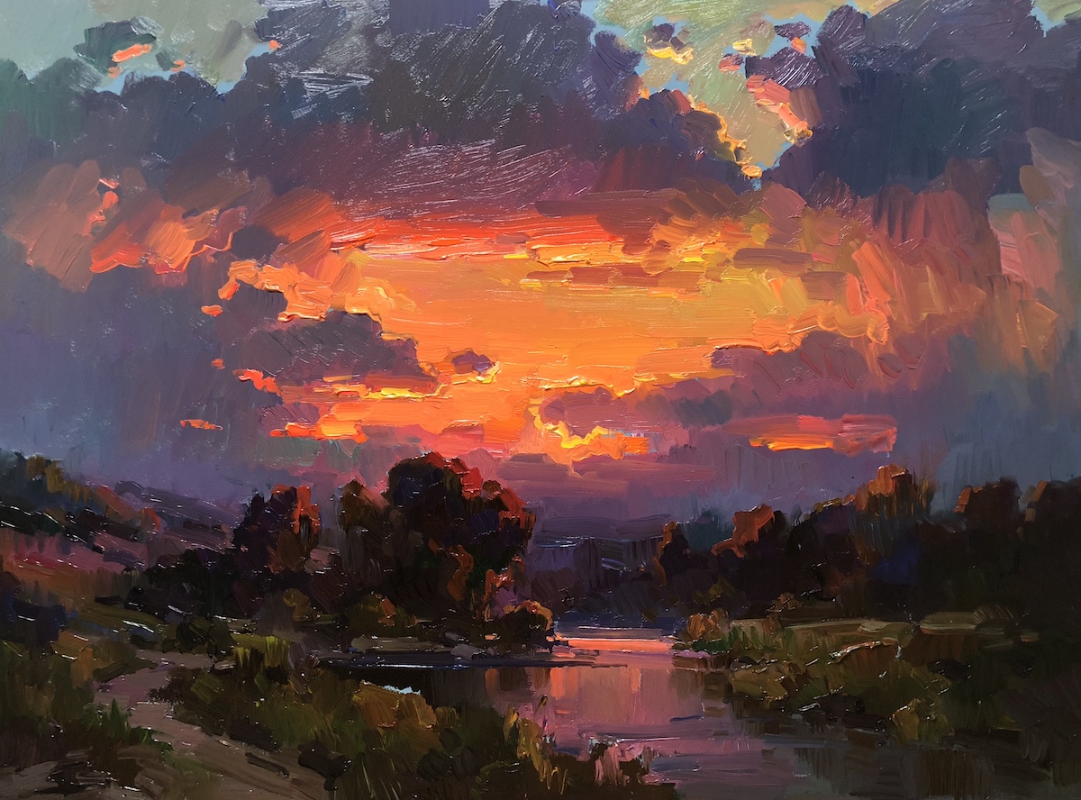
You can see the same tertiary color harmony in more of my paintings.
Old Master tertiary color harmony paintings
To learn more
To learn more discoveries about how you can look for different color harmonies to give variety to your paintings, see the Virtual Art Academy® Apprentice Program.
Thank You
Thank you for taking the time to read this article. I hope you find it useful. If you would like to get free painting tips by email, please sign up for my free tips newsletter.
If you are interested in a structured approach for learning how to paint, take a look at my online painting classes.
Happy painting!
Barry John Raybould
Virtual Art Academy
What The Students Are Saying
The equivalent of a 4 year art education at a fraction of the cost

This is a great course for anyone who is serious about improving their painting. I have been a student here for several years. When I am finished, I will have the equivalent of a 4 year art education at a fraction of the cost. I can do the lessons anywhere and at my own pace.… Read more “The equivalent of a 4 year art education at a fraction of the cost”
The sky’s the limit

This course was exactly what I’d been looking for as a recent “empty-nester.” The Virtual Art Academy coursework taught me not only HOW to paint well, but also how to SEE to observe a scene more closely to interpret it effectively in paint, and what to look for to create an interesting composition. It helped… Read more “The sky’s the limit”
The course is for beginners, intermediate and advanced artists

I joined VAA in 2014, it seemed a perfect fit in content, ease of access and cost. It turned out to be all of this and much more. The wealth of information on all practical aspects of painting is invaluable and I think incomparable to anything else out there. The course structure is such that… Read more “The course is for beginners, intermediate and advanced artists”
It is impossible to fail or gain little through extensive 4 year study at VAA!
I would recommend taking VAA study to everyone who seriously strive of becoming exceptionally skilled professional artist. It gives more than you can ever imagine! The lessons structured in the best possible way that lead to understanding and skills you never acquired before which are so important in art. It is impossible to fail or… Read more “It is impossible to fail or gain little through extensive 4 year study at VAA!”
Building blocks of learning is the best I have seen

I joined 5 years ago when I didn’t know anything about oils, painting, composition, or drawing. Barry’s way of teaching is extremely well versed in many aspects of painting. His building blocks of learning is the best I have seen. The academy is designed well and the community of fellow students is engaging and friendly.… Read more “Building blocks of learning is the best I have seen”
‘Ladder of Learning’ adds to overall positive experience of this awesome course

The VAA course is built on four main building blocks including PROCESS, REALISM, MUSIC AND POETRY. These are further divided into topics that are continuously developed throughout the curriculum. Drawing, Form, Observation, Colour, Brushwork, Notan, Composition and Poetry are all thoroughly taught. Working on-line we meet students from all around the world, interacting with them… Read more “‘Ladder of Learning’ adds to overall positive experience of this awesome course”
Since I started the programme I can see improvements in my composition and use of colour

My painting “Primitive Pots” recently won the award given by the Royal Institute of Painters in Watercolour at the recent selected exhibition of the Society of East Anglian watercolourists. I have been working through the VAA course for over five years and would highly recommend it to anyone wanting to improve their painting. There is… Read more “Since I started the programme I can see improvements in my composition and use of colour”
No need to buy expensive art books…. Just do the VAA 4 year course. I still refer to it

I finished the VAA course a few years ago, but always refer to the notes, rereading the course many times. This is not a course the day you are finished, you are done. No, you keep practising the assignments getting better and better over time. When I look back at my work when I had just… Read more “No need to buy expensive art books…. Just do the VAA 4 year course. I still refer to it”
This is a far more superior school than anything I have seen being taught at colleges across the country

This is a far more superior school than anything I have seen being taught at colleges across the country and have learned much more from the Virtual Art Academy® than from any art course I have ever taken! I cannot begin to tell how the Virtual Art Academy has improved my observation of potential compositions… Read more “This is a far more superior school than anything I have seen being taught at colleges across the country”
The course has a steady learning curve that keeps revealing itself as you advance

The course is working great, the lessons are set out so well that every week I can see growth. In following the program it’s given me direction, and the information in the lesson plans are of a professional level. There is no way I would have tracked down the information by myself, and being in… Read more “The course has a steady learning curve that keeps revealing itself as you advance”
Barry gave me a fishing rod so I can catch my own fish

After weeks and even months of searching YouTube, “googling” and spending a fortune on art instructional books I finally came across the Virtual Art Academy®. When it comes to purchasing online I am always very careful how I spend my money. Especially when I already spent a small fortune on art books. They always seemed… Read more “Barry gave me a fishing rod so I can catch my own fish”
It is a real course that trains you in a structured way

The questions you ask yourself are,”Will it be worth the cost?” and “Will it be truly useful?”. After a couple of weeks working on/in Virtual Art Academy®, I can say that the amount of work it represents – by Barry – is incredible! The information presented alone is more than worth the price and, yes,… Read more “It is a real course that trains you in a structured way”
I’m Richard Robinson …. best online art training available on the internet today
Hi I’m Richard Robinson. I’ve been a professional painter since 2001. My claim to fame is only that I’m making a living as an artist and doing pretty well – something which I hear is not so easy to do, and I guess it does take a lot of work, but it’s work that I… Read more “I’m Richard Robinson …. best online art training available on the internet today”
The most comprehensive, in depth and well-organized painting course available online

After a thorough research, my personal conclusion is that the Virtual Art Academy (VAA) is, by wide margin, the most comprehensive, in depth and well-organized painting course available in the internet. Unlike most tutorials and color mixing recipes commonly found online, VAA’s philosophy is rather to provide the students with detailed information about all aspects… Read more “The most comprehensive, in depth and well-organized painting course available online”
An excellent foundation on so many aspects of painting

I never had formal training in painting and my style has always been very realistic, slow and not at all artistic, just a copy of a photograph. When I got word of the course available through Virtual Art Academy, I was very excited for the opportunity to learn what I never knew about painting. VAA… Read more “An excellent foundation on so many aspects of painting”
The small steps are easy to do

I am extremely impressed with the process that Barry has developed for VAA. Learning to paint can be intimidating, but when broken into many small projects it is very do-able. I just did my first live model painting session- a 5 hour, one day session. Thanks to VAA, I was able to break the painting… Read more “The small steps are easy to do”
The improvement in my own work reaffirms that I’ve found the right program to develop as an artist

I have been a student of VAA since 2011. I had been searching for an online art program that could assist in helping me develop as an artist. VAA is a complete program for beginners as well as advanced students of art. The course is well structured and takes you step by step so you… Read more “The improvement in my own work reaffirms that I’ve found the right program to develop as an artist”
I started learning oil painting with VAA from scratch. Just one year later my paintings started to sell

The Virtual Art Academy program is really comprehensive and gave me all the information and directives to learn painting in one package. The material is very well organized, just beautiful to look at and motivating to carry through. The online campus is a wonderful place to meet other artists and receive critical feedback on my… Read more “I started learning oil painting with VAA from scratch. Just one year later my paintings started to sell”
The most comprehensive art instruction I could find anywhere online, and trust me, I had been looking for a long time.

I joined 2 years ago with my daughter. We have both learnt so much and have enjoyed our VAA time together. My daughter is now 13 and already produces amazing paintings. The Virtual Art Academy is simply the most comprehensive art instruction I could find anywhere online, and trust me, I had been looking for… Read more “The most comprehensive art instruction I could find anywhere online, and trust me, I had been looking for a long time.”
Only online learning program I have ever discovered using a training industry best practice
Before repurposing my vocation into avocation, I spent 20 years in the corporate world as an instructional designer and performance consultant creating training curricula for diverse clientele from NASA to General Motors. I know curriculum development and how to guide a learner from beginning to certification. VAA is the only online learning program I have… Read more “Only online learning program I have ever discovered using a training industry best practice”
comprehensive art education

I wanted to get a comprehensive art education with the freedom to work at my own pace. I’m several years into the curriculum and I feel like my work has drastically improved. I’ve found holes in my knowledge that I didn’t know I had. Critiquing other students posts and reading their feedback to mine has… Read more “comprehensive art education”
It is wild to see how much I am learning in this course!

Five star rating from me for Virtual Art Academy (VAA)! I retired last year, and decided I wanted to spend my time in retirement learning how to oil paint. But having never painted before, I wasn’t even sure what to look for in an online painting course. However, I did some searches for “Best Online… Read more “It is wild to see how much I am learning in this course!”
A great learning platform

I have been working my way through the Virtual Art Academy for almost a year now, and cannot recommend it highly enough. The Workshops are thorough, structured and substantive. There is a logical and step by step progression that makes the learning process so much easier, with new concepts being introduced and then practiced along… Read more “A great learning platform”
VAA, the ultimate art course
Although still a novice, the Virtual Art Academy has taught me the skills needed, not only to produce reasonably good art but has given me an understanding of the complexities of art. All the basics of art, as well as composition and studies of master artists are covered in the course. No reason not to… Read more “VAA, the ultimate art course”
What I learned from 10 years with VAA
The VAA gives you a really solid foundation for learning and improving how to paint. When you’re frustrated with your work, it’s not getting accepted into exhibitions, you’re not selling and you’re just not happy with what you produce the VAA is the answer. It is explained easily with examples and exercises. It does mean… Read more “What I learned from 10 years with VAA”
gorgeous