


What is a color wheel?
A color wheel is generally shown as a circle divided into sections, as a means of organizing hues in a logical order. A color wheel is essentially the visible spectrum of colors arranged in a circle. They are very useful for recognizing different color harmonies, and help you create beautiful paintings.
A color wheel is also a useful tool which helps explain what happens when you mix tube paints. There are many color wheels, but the two most commonly used, are the triadic color wheel and the Munsell color wheel. These color wheels are the basis of creating beautiful color schemes in art. Color schemes are also known as color harmonies.
Munsell color wheel
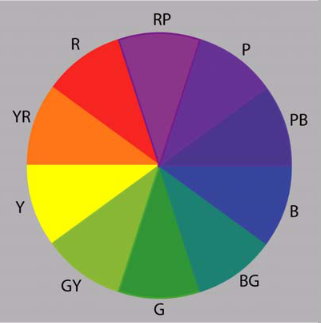
The positioning of the colors on the Munsell color wheel are considered to be a more accurate reflection of how colors are actually positioned on the visible spectrum of colors. It provides you with more easily recognizable mixing of colors. However for beginners, the Triadic color wheel is much easier to use. I use the Munsell color wheel because it has more accurate complements, but I only recommend it for more advanced artists.
Triadic color wheel
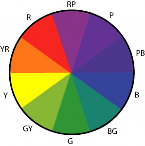
This is the Triadic color wheel, and is the one that is most often used by artists. We will use the Triadic color wheel to explain how to create different color harmonies, because it is easier for beginners to understand.
How To Use The Color Wheel
The color wheel is made up of the following:
The Primary Colors – Colors which, in theory, are able to mix most other colors in the visible spectrum. In art, the three primary colors are considered to be red, blue and yellow. However, some artists consider magenta, cyan and yellow to be more accurate primary colors, as they are able to mix a wider gamut of colors. For the purpose of this post, I will use red, blue and yellow as the primary colors.
When you mix all three primary colors together, you get mud or a dark gray color.
Secondary Colors – What you get when you mix two primary colors together (green, orange and purple).
Tertiary Colors – What you get when you mix a primary color with a secondary color.
Colors which are close to each other on the color wheel are considered to have a harmonious relationship and are known as analogous colors.

Claude Monet used analogous colors in many of his paintings, particularly in his water lilies series.
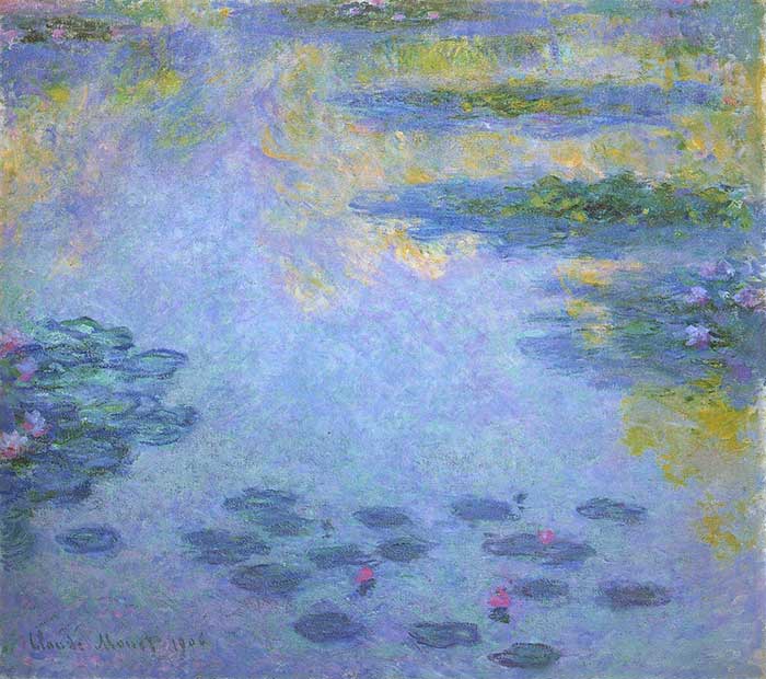
Claude Monet, Water Lilies, 1906
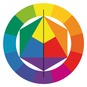
Colors which are opposite to each other on the color wheel are complementary colors. There is a striking contrast when you place two complementary colors next to each other. For example, yellow and purple, or orange and blue.
Vincent van Gogh was very fond of contrasting orange and blue in many of his paintings.
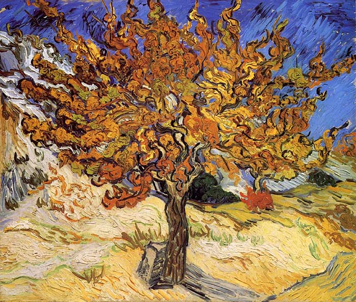
Vincent van Gogh, Mulberry Tree, 1889
When you mix complementary colors, you are essentially mixing all three primary colors together and the result is usually mud. For example, say you mix red with green (which are complements of each other). Green can be made by mixing yellow with blue. So by mixing red with green, you are essentially mixing red, blue and yellow (the primary colors).
Most artists break the color wheel into warm colors and cool colors. I prefer to think of color temperature as a relative term, rather than an absolute term. For example, a red color could be warmer or cooler than the color next to it.
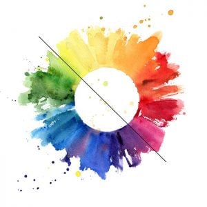
What About White And Black?
White and black do not have positions on the color wheel as they do not have direct positions in the visual spectrum of colors. As noted earlier, white is what you get when all the colors of light are combined. This is different from the way our paints work – when we combine all the colors we get mud rather than white light.
When you add white to your colors, you increase the value (make the color lighter). In other words, you create tints of the colors.

Black on the other hand, is the absence of color. When you add black to your colors, you decrease the value (make the color darker). In other words, you create shades of the colors.

When you add white or black to a color, you reduce the saturation of the color (make it less vivid). So although white and black do not have positions on the color wheel, they do have the power to alter the value and saturation of the colors (and hue to a small extent as white and black paint usually have a slight bias towards another color).
How do you mix colors?
There are two types of color mixing: Additive color mixing, and Subtractive color mixing.
Additive color mixing
Additive color mixing is what occurs when you mix visible light wavelengths. If you mix all visible light colors, you get white. This kind of mixing is used whenever you have light sources directed towards the same area, such as in theaters, concerts, circus shows, and night clubs.
Additive color models are used in the design of electronic displays that render realistic images, such as in TVs, computer monitors, tablets, etc. Each pixel in most types of color video displays is composed of a red, green, or blue light, which appears as a variety of single colors when viewed from a normal distance.
The primary colors of light are different from the primary subtractive colors of paint. When you mix all the colors of light together, you get white light. This is why it is referred to as additive color. When you mix two of the common three additive primary colors (red, blue, and green in lightwaves) in equal proportions, they produce an additive secondary color: cyan, magenta or yellow.
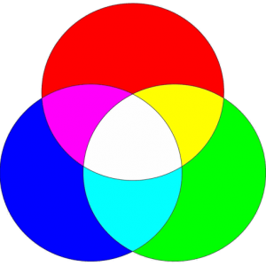
This is an additive color wheel. This color wheel is only used for mixing lightwaves. It is not used in painting.
Subtractive color mixing
Subtractive color mixing is what you get when you mix paints, dyes, or pigments. Subtractive color mixing is the color we see after light has passed through layers of something that absorbs some of the lightwaves. You perceive a paint color because light has passed through microscopic “stacks” of partially absorbing media, so some wavelengths of light reach the eye but not others.
When you mix all the primary colors of tube paints together, you get mud instead of white.
Recommended Color Wheel
Option 1 – Create Your Own Color Wheel
In my opinion, the best color wheel to use as a reference is one you have made yourself. Here is a simple process for making your own color wheel:
Step 1: Draw an outline of a simple color wheel on a canvas board or some other surface.
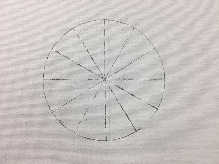
Step 2: Paint in the primary colors (red, blue and yellow). You should use the highest chroma primary colors which you have. For example, cadmium red would be more suitable than alizarin crimson. Place the primary colors at equal spaces apart on the wheel (assuming you are creating a traditional color wheel). I like to apply the paint using a palette knife for most of this, as it is easier to keep the knife clean between strokes. You can use a brush to clean up any edges if needed.
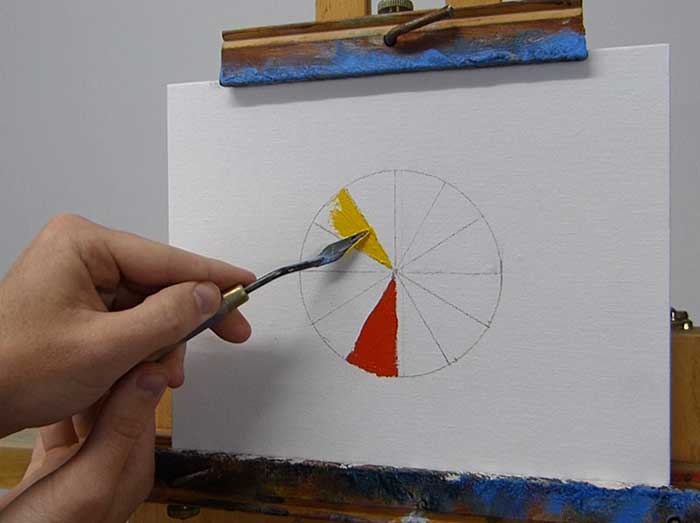
Step 3: Use the primary colors to mix the secondary colors. The secondary colors will be directly in-between the primary colors on the wheel. For example, to mix the secondary color green, you would combine blue and yellow.
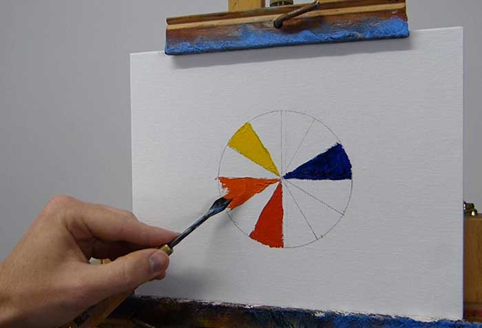
Step 4: Use the primary and secondary colors to mix the tertiary colors. The tertiary colors will make up all the remaining spaces.
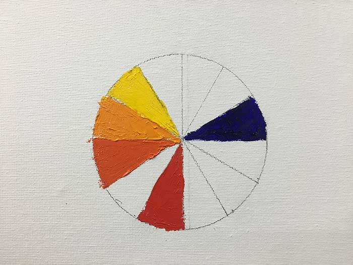
Step 5: Clean up the edges and make any adjustments to the colors.
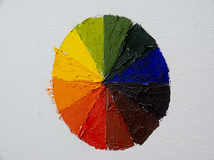
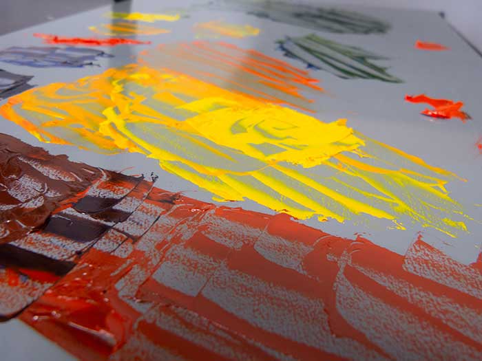
Step 6: Clean up the mess on the palette.
Option 2 – Purchase A Color Wheel
If you do not want to create your own color wheel, then you should just purchase one to keep as a handy reference in your studio.
Limitations Of The Color Wheel
Here are some of the limitations of the standard color wheel:
- It does not take into account white and black (as noted above).
- It does not take into account color saturation.
- The color wheel is not a perfect science, especially in painting. For example, the primary colors of red, blue and yellow are not actually able to mix the full visible spectrum of colors as the color wheel suggests. Instead, you should treat the color wheel merely as a guide to assist with your color mixing.
Add comment