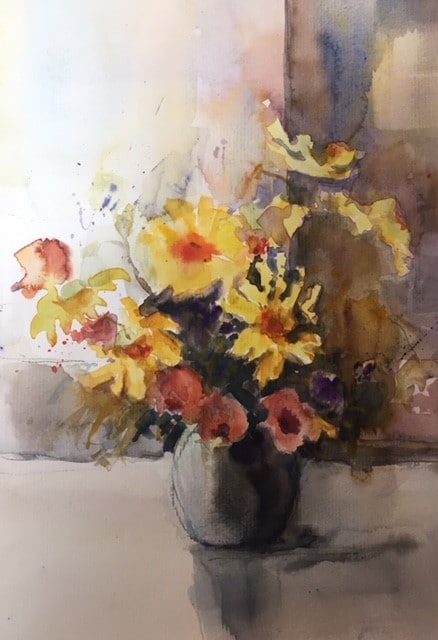
In “Bouquet” Chantal incorporated the principles of Workshop H for her summary painting:
- contrast of brushwork
- contrast of shape
- right angles
- tie together
- complementary or balanced color harmony
“I cannot show my preliminary work, I used an old watercolour to try and make it better. Unfortunately, I forgot to take a photo. It was way paler and had no clear background or foreground and seemed to float on the page. Now the bouquet overlaps the window, which suggests some perspective, I think.
Different shapes describe the different flowers, I mostly used a big brush to add a background and foreground, shadow, etc, in order to keep my painting loose and not to get into details too soon. Though you might not see it very well on this small picture, I used a small brush in the bouquet to describe a few details in the centre of the bouquet. The bouquet is mainly warm, with dark cool greens, and violets in the shaded parts and some blue at the back, for contrast. The bouquet is linked to the foreground and to the background, and the square form of the window, table and wall ground (??) the bouquet.”
Chantal