(Get free painting tips and plein air painting techniques sent straight to your inbox or on my social media.)
Why use more grays?
One of the strangest discoveries I made was that it is the dull gray colors that give a painting its beautiful color.
It is not the nice clean color you get directly out of the tube. This discovery took me a long time to make. It is only when your painting has a lot of grays in it that you can make your color accents really stand out.
This article will give you some color harmony examples using grays.
How to make grays
You can make grays in one of four ways:
- add black and/or white to your paint pile
- mix two complements. For example, you can mix red and blue-green, yellow and purple-blue, purple and green-yellow, blue and yellow-orange
- use your leftover muds – these are the piles of gray paint you end up with after you have finished a painting
- buy a tube of gray and modify it
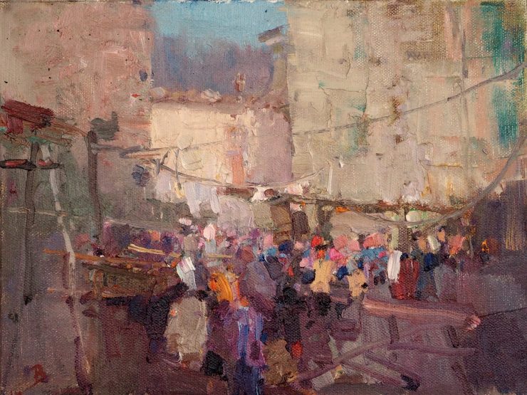
In “The Chestnut Festival, Licciana Nardi, Italy” I used all of the above except for using bought tube grays. The main secret to this painting was to paint it using all of these muddy colors. When I added a touch of pure color to the foreground, it really stood out beautifully against all of that mud! I painted this work outdoors. Painting under natural light outdoors is the best way to learn color and was a key part of the color learning program that I was taught.

In this painting “The Garden”, note how the patches of color stand out against the more subdued and grayer colors in the background. This also gives the painting depth and atmosphere.
More color harmony examples of how to use grays
Here is some more of my work where you can see I use a lot of grays:
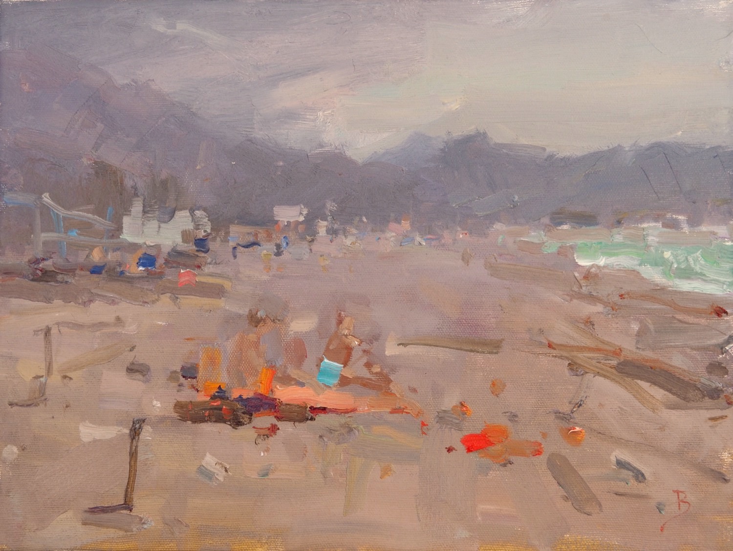
In the above painting that I did on a beach in Montenegro, you can see that the sand colors are very neutral. The colors of the bathing suits of the people on the beach, and of their towels provided the color accents to contrast with these muted grays.
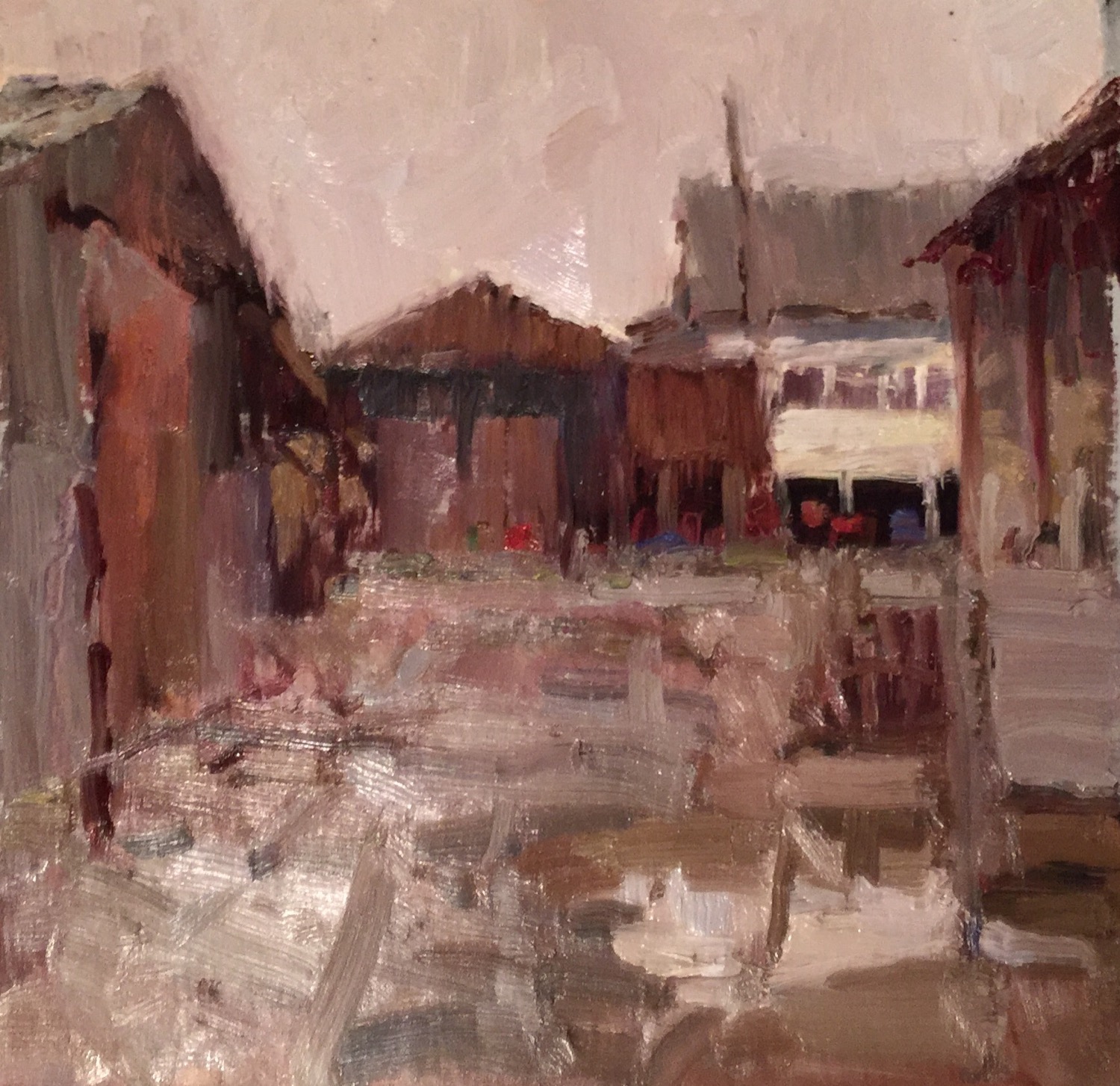
I painted the above work on a cold winters day in England. The few saturated color spots of red and blue stand out against the backdrop of grayed browns.
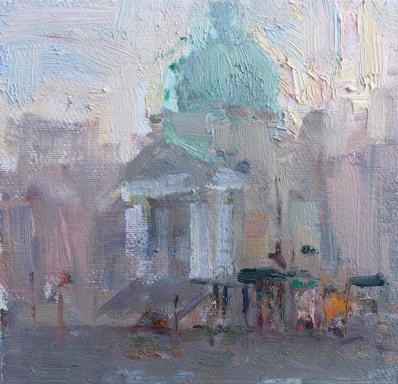
I painted this work in Venice. It was very early morning and the buildings were just emerging out of the mist. I painted the church very suggestively, and focused my color interest on the emerald green roof with a few color accents of the people and shops underneath.
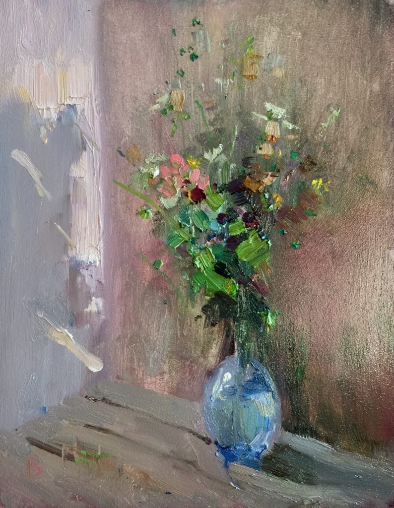
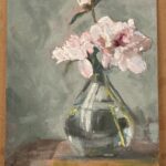
The background to this still life is painted mostly in neutral colors. This way, the more saturated greens, pinks, and yellows of the wildflowers stood out more clearly, and gives attention to the focal area of the painting.
How Old and Contemporary Masters use grays to make outstanding works of art
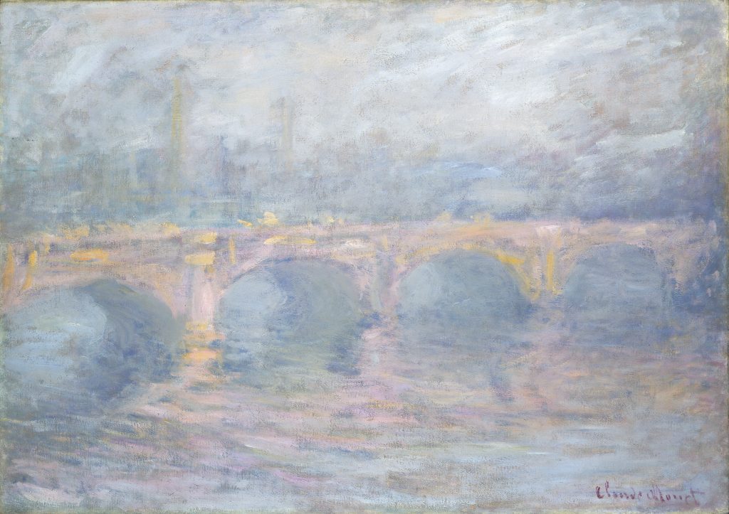
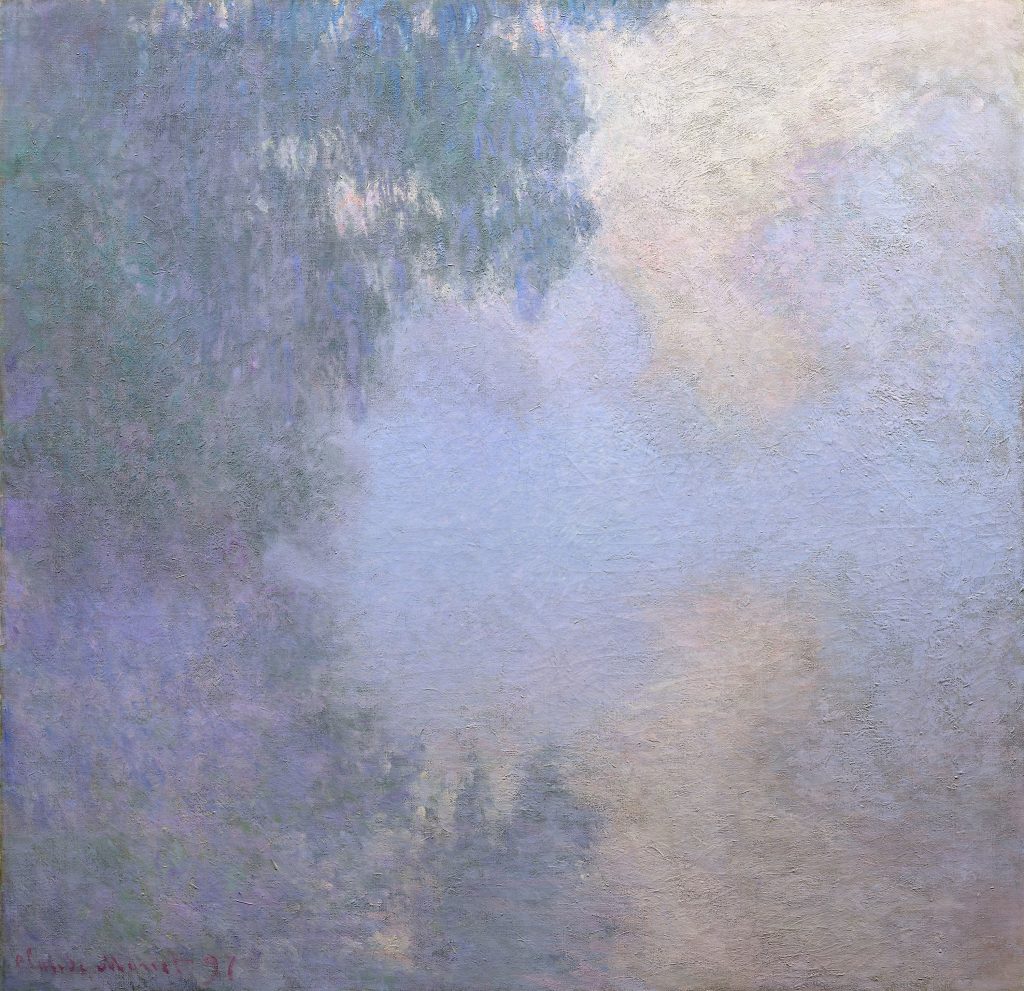
Color harmony examples using grays: Claude Monet
Although Monet was renowned for his colorful garden and figure paintings, he also created some beautiful artwork that were predominantly painted in muted grays.
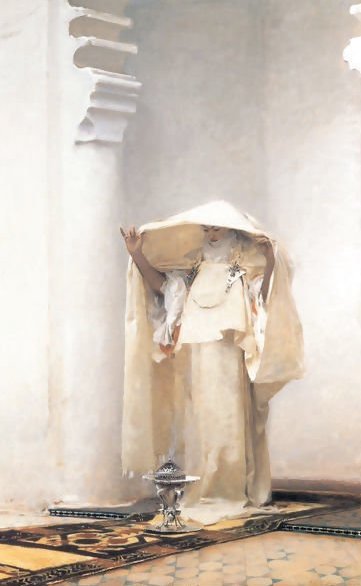
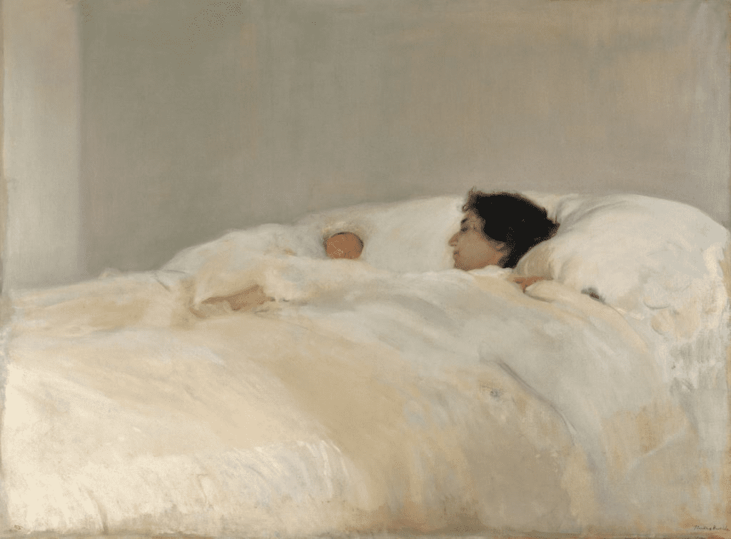
Color harmony examples using grays: John Singer Sargent
Another master of mostly gray paintings is Sargent. Look at these diverse paintings, which evoke emotions and capture the mood of the day. This is a different use of grays compared with how I use them. In my work I use them to contrast with more saturated colors and to create a color harmony. Sargent however, is mostly painting in values, and color does not take such a priority in his work. His paintings rely for their effect on superb drawing, subtle value changes, solid notan structure, high degree of control of edges, and good compositions.
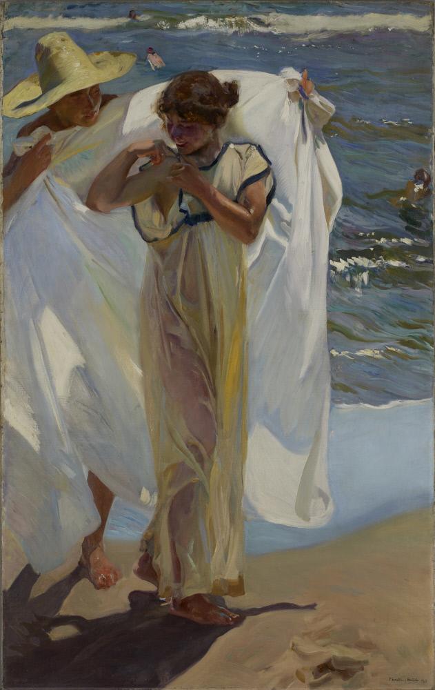
Color harmony examples using grays: Joaquin Sorolla
Sorolla is another artist who created many beautiful paintings, using mostly grays with dabs of pure color. Unlike Sargent, Sorolla uses grays mainly to enhance the color harmony in his work. His grays are much more colorful than those used by Sargent. I talk a lot about these techniques for color in the various workshops in the Apprentice Program painting classes, and in particular in the Color Building Block.
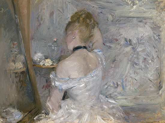
Color harmony examples using grays: Berthe Morisot
Bato Dugarzhapov
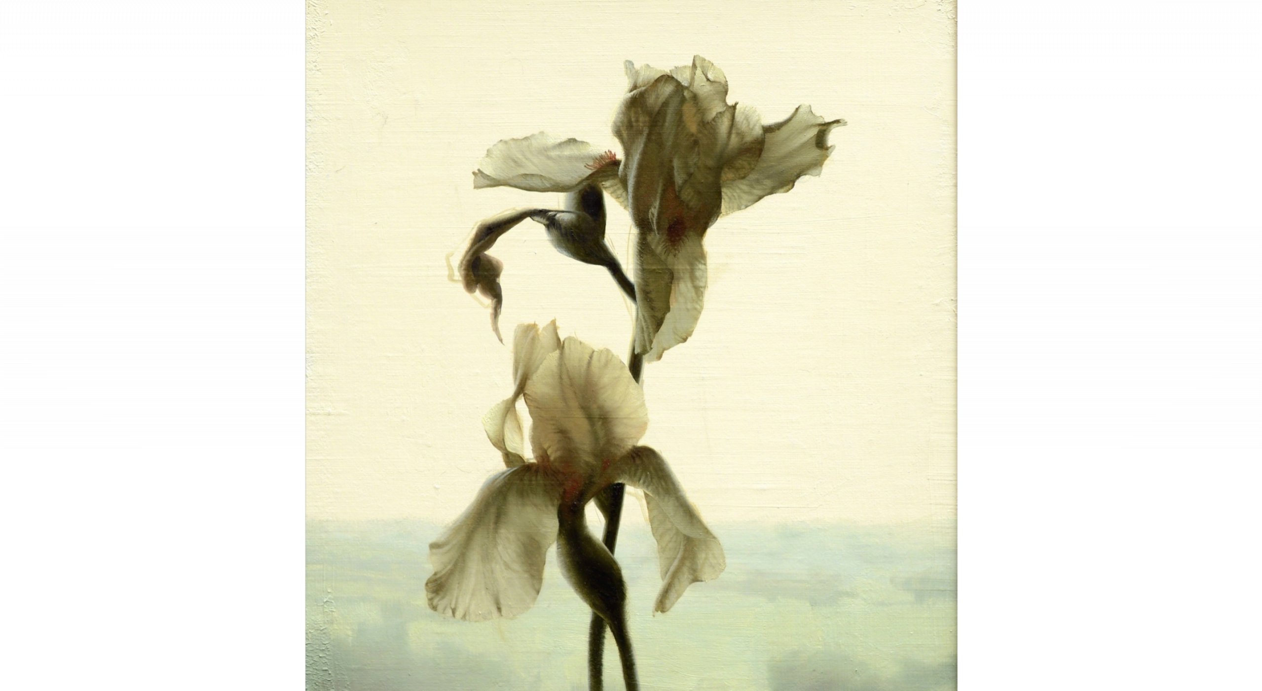
Color harmony examples using grays: Daniel Sprick
In Dan Sprick’s beautiful work, we see the use of more saturated colors contrasting with subtle grays to give stunning effects.
Thank You
Thank you for taking the time to read this article. I hope you find it useful. If you would like to get free painting tips by email, please sign up for my free tips newsletter.
If you are interested in a structured approach for learning how to paint, take a look at my online painting classes.
Happy painting!
Barry John Raybould
Virtual Art Academy
What The Students Are Saying
This is a far more superior school than anything I have seen being taught at colleges across the country

The course is for beginners, intermediate and advanced artists

Read more “The course is for beginners, intermediate and advanced artists”
It is wild to see how much I am learning in this course!

I retired last year, and decided I wanted to spend my time in retirement learning how to oil paint. But having never painted before, I wasn’t even sure what to look for in an online painting course. However, I did some searches for “Best Online Oil Painting Courses,” and found several references to VAA.
I signed up for VAA’s ongoing Apprentice Program last October (2023), and I am incredibly glad I did! As a beginner, I didn’t know what I didn’t know, but I didn’t have to: VAA has already mapped it all out for me. It starts out with basic, fundamental stuff, but also teaches me the THINKING that goes in the painting: the composition, my color choices, how to consciously select which darks and lights need to be emphasized, etc.
Bottomline, I am learning how to create paintings that have both visual music and poetry, and it is super fun to see my growth! I cannot recommend this course enough!
Read more “It is wild to see how much I am learning in this course!”
No need to buy expensive art books…. Just do the VAA 4 year course. I still refer to it

Read more “No need to buy expensive art books…. Just do the VAA 4 year course. I still refer to it”
A great learning platform

The sky’s the limit

It is a real course that trains you in a structured way

Read more “It is a real course that trains you in a structured way”
The course has a steady learning curve that keeps revealing itself as you advance

Read more “The course has a steady learning curve that keeps revealing itself as you advance”
Barry gave me a fishing rod so I can catch my own fish

Read more “Barry gave me a fishing rod so I can catch my own fish”
The equivalent of a 4 year art education at a fraction of the cost

Read more “The equivalent of a 4 year art education at a fraction of the cost”
Since I started the programme I can see improvements in my composition and use of colour

I have been working through the VAA course for over five years and would highly recommend it to anyone wanting to improve their painting. There is a huge amount of information on the site and it is well presented and regularly updated and added to. When other members have commented on work I have posted I have found it really useful. When I review my work over the time since I started the programme I can see improvements in my composition and use of colour.
Read more “Since I started the programme I can see improvements in my composition and use of colour”
It is impossible to fail or gain little through extensive 4 year study at VAA!
Read more “It is impossible to fail or gain little through extensive 4 year study at VAA!”
I’m Richard Robinson …. best online art training available on the internet today
In my opinion Barry has created the best online art training available. I found the Virtual Art Academy course of painting lessons many years ago and was so inspired by it that I contacted the author and got to know him personally.
Two Critical Keys
If you are looking (like I did) for the best painting course available there are two key things you should know about the Virtual Art Academy course which make it stand out above the other online painting courses available today:
1. It’s Comprehensive.
It covers ALL the key painting concepts and then goes further, revealing more and more painting insights. Most courses miss a LOT out – this one doesn’t.
2. It’s easy to understand.
All that information could easily become confusing, but each piece is laid out clearly and concisely using Information Mapping® making it a pleasure to learn.
If you can find another painting course which does these 2 things better, please let me know. As I said, I have been searching for many years and continue to do so, so you could save yourself a lot of precious time and money by joining the Virtual Art Academy today.
Read more “I’m Richard Robinson …. best online art training available on the internet today”
An excellent foundation on so many aspects of painting

When I got word of the course available through Virtual Art Academy, I was very excited for the opportunity to learn what I never knew about painting. VAA has provided me an excellent foundation on so many aspects of painting. The course is organized very logically, provides great examples, diagrams, thorough explanations and worthwhile assignments. I highly recommend this course to anyone with a desire for an in-depth education of art.
Thank you again, Barry, I love this course Jeanne
Read more “An excellent foundation on so many aspects of painting”
The improvement in my own work reaffirms that I’ve found the right program to develop as an artist

comprehensive art education

VAA, the ultimate art course
‘Ladder of Learning’ adds to overall positive experience of this awesome course

Read more “‘Ladder of Learning’ adds to overall positive experience of this awesome course”
Only online learning program I have ever discovered using a training industry best practice
VAA is the only online learning program I have ever discovered using a training industry best practice of incorporating Knowledge and Skills to support learning a new activity. Every building block (Drawing, Form, Observation, Concept, Notan, Composition, Colour, Brushwork) incorporates a “spiral learning” approach where you are introduced to the Knowledge/Skill at one level and then reintroduced to it again elsewhere in the curriculum. Sure genius.
I’ve attended workshops, read books, and watched YouTube videos — and none of them provide the scaffolded approach to learning the VAA offers. If you are just starting your painting journey, start here. If you are a mid level or advanced painter, start here. There is a sense of community with artists around the globe. You are part of a peer to peer learning process bigger than yourself.
As a result of the VAA, I have been juried into several shows, am represented by a local gallery and have been selling my paintings on a consistent basis. VAA curriculum’s approach will grow your ‘artist’s brush’ and aid you in finding your artistic voice. As your basics improve, your art improves. Henry Hensche said, “There is study and there is performance, and we should not confuse the two, study is done for perceptual development, our performances show us where we are in that development, and we must have both…”. VAA curriculum offers both.
I went through the entire curriculum, did every every exercise, and today review my printed books/exercises on an annual basis to keep myself fresh and ready for my next painting adventure.
Onwards/Sideways,
Jay “jbird” Holobach
https://www.jayholobach.com/
I started learning oil painting with VAA from scratch. Just one year later my paintings started to sell

The small steps are easy to do

The most comprehensive, in depth and well-organized painting course available online

Read more “The most comprehensive, in depth and well-organized painting course available online”
The most comprehensive art instruction I could find anywhere online, and trust me, I had been looking for a long time.

The Virtual Art Academy is simply the most comprehensive art instruction I could find anywhere online, and trust me, I had been looking for a long time.
Even art schools and academies I’ve been exposed to are nowhere near as thorough, VAA is just amazing!
Most paintings I see where the artist clearly has some skill still lack in either the values or notan department, or fall down on composition – it’s baffling that VAA seems to be the only program that goes into detail on this. Therefore, if you are new to painting or an experienced artist, studying with VAA will get you to that next step.
I also find that Barry is always interested in what we students do and is at hand with great advice. Worth every penny, Thank you Barry!!
Building blocks of learning is the best I have seen

Read more “Building blocks of learning is the best I have seen”
Really interesting article that I can’t wait to learn more about it 🙂
Really interesting article that I can’t wait to learn it more about it 🙂
Wonderful insights !!! A blessing for us all. Thank you
Great article!
I love this. I actually bought this course years ago but after a time I have lost the website to look at it. I don’t know if you can help or not. Mitzi Undesser Thanks. Best course ever.
thanks Mitzi for your nice words. Since you bought the original course, I’ve made a lot of improvements and built a new online school, with an active art community. Contact me via the contact form on this website and I’ll give you the details.