Why Create a Color Map?
There is one technique that will help you learn more about a color in a few months than many people learn in a lifetime. Not only will it help you learn color but it will help you come up with a much more interesting compositions. This technique is called a color map.
What is a Color Map?
A color map is a very quick small abstract painting that consists of just a few, perhaps four or five, color spots of approximately the right size and placement. Use the color map to:
- Capture your first impression of a scene so you do not lose sight of what attracted you to it in the first place.
- Capture the exact relationship between the planes of the light and shade.
- Work out what gray to use to best show off your main color accent. As with a mass notan painting, the contour is not important.
- Help you work out a major color strategy quickly
Examples of Color Map:


How To Create A Color Map
Materials Needed:
Paper: Almost any paper will do. The thickest papers are better since they do not buckle as much. I do not gesso the paper and just use my regular notan sketchbook (Strathmore 400-I medium 80lb (130 g/m) drawing paper)
Paint: Just use your regular oil paint with no medium.
Steps:
1. Paint the gray background very thinly.
2. Add your more saturated color spots on top of the gray background using slightly thicker paint.
Key Discoveries In Practice – After the Party


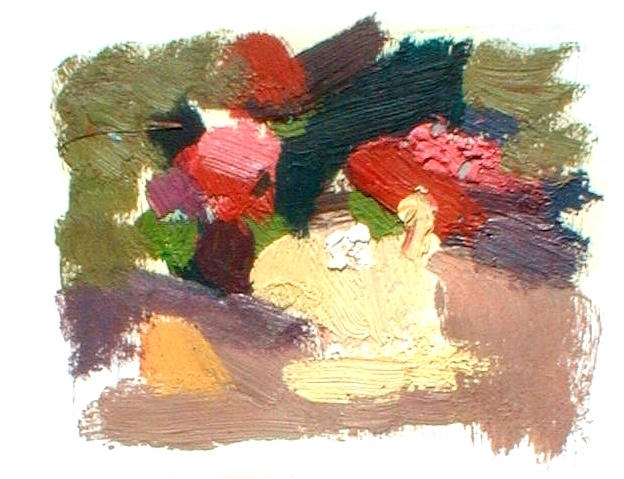
I painted “After the Party” while I was in a remote area of China called Xinjiang. I always plan a painting as an abstract design even though my paintings are representational. However, there are sometimes when I find there is no point taking the painting any further and I just leave it as an abstract painting. Here is an example of when that happened.
I was painting in a picnic area in the countryside and came across a pile of discarded wine bottles and their red packaging. The late evening light created a warm orange shaft of light on the ground, creating some wonderful complementary contrasts. Also, note the use of contrast of detail between the distinct spots of color that represent the discarded items and the more blended and less distinct areas that represent background foliage.
There is also a contrast of saturation between the vivid red color spots and the muted blue and green grays of the foliage. I used the principle of brushwork variety to create near music in the painting. Note the difference in both the direction and size of the brushstrokes.
Note the use of contrast of detail between the distinct spots of color that represent the discarded items and the more blended and less distinct areas that represent background foliage. There is also a contrast of saturation between the vivid red color spots and the muted blue and green grays of the foliage