
If you view two adjacent color spots from a distance, the eye mixes them to form a third color. This is called optical color mixing, or broken color. It is also sometimes confusingly called mixing on the canvas, which strictly speaking is not true – the colors do not actually mix on the canvas, they remain separate and mix only in the viewer’s eye. The result of physically mixing two saturated colors with your brush or palette knife creates a third, less saturated. This is not what we are doing here.
There are several benefits to optical color mixing:
Benefits of optical color mixing
- By letting the eye do the mixing, more light reaches the eye than if you were to fully mix the colors physically on the painting. This gives the painting luminosity and makes the color in the painting carry further into the distance.
- The color vibration created by this approach adds visual interest to otherwise flat areas of color in the painting.
- Optical color mixing adds realism to flat areas of color. This is because it mirrors the actual warm/cool color variations created by light falling on a textured surface, and simulates the tiny shadows where a textured surface blocks the light.
Approaches to optical color mixing
Here are two of the different ways you can do this. The first is to use colors on opposite sides of the color wheel, placing spots of the same value on the painting next to each other (complementary color mixing). The second is to use colors more evenly spaced across the color wheel (triadic color mixing).
- To learn more about optical color mixing see the lessons on Brushwork in our Virtual Art Academy® Apprentice Program.
- To learn more about different color harmonies, see the lessons on Color in our Virtual Art Academy® Apprentice Program.


Old Masters who used optical color mixing
There were many Old Masters that used optical color mixing to create beautiful paintings. Here are a few:
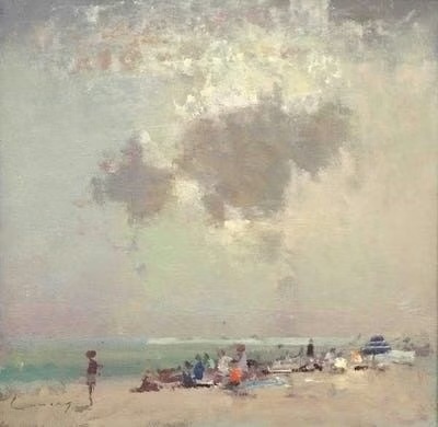
“Fred Cumming used complimentary optical mixing in the clouds in this painting. The gray is a combination of muted shades of green and red creating vibrancy in the painting.” Rob Ingram
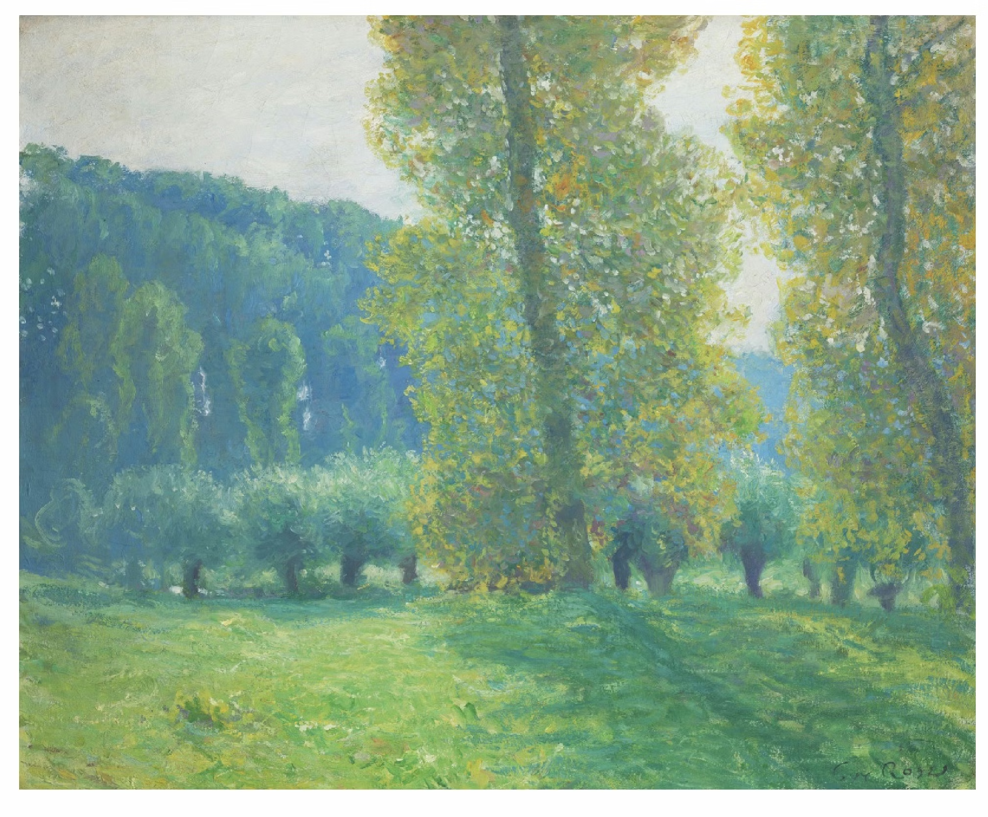
“Guy Rose used complimentary colors for optical mixing on the trees which are in the sun . Yellow/green and red/purple colors are used next to each other to create vibrancy and to show transparency on backlit leaves. The areas in shadow show less complimentary and more analogous optical color mixing.” Deepali Deshpande
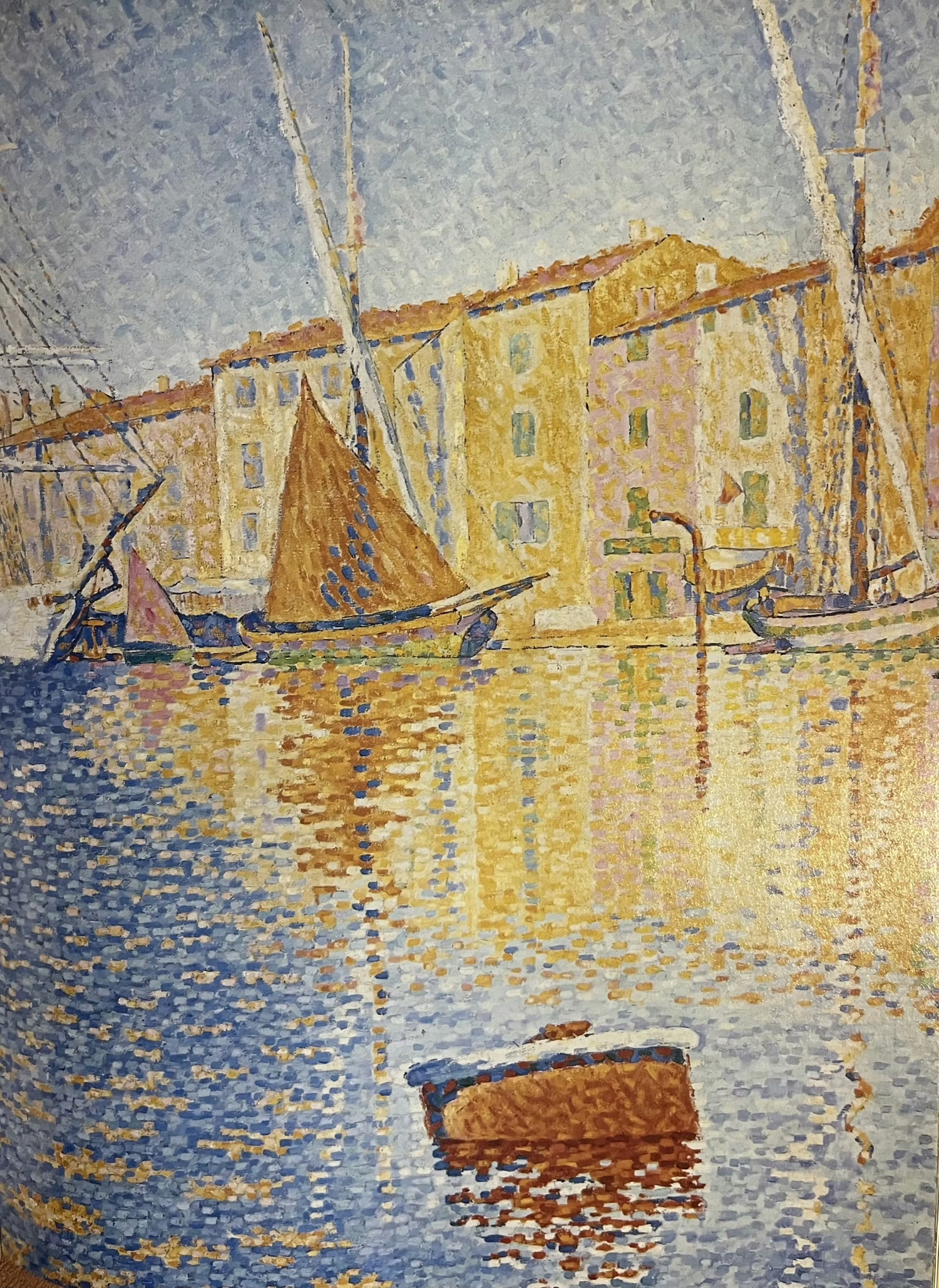
“The “neo-impressionists” preferred the optical combination of colours to mixing pigments on a palette. They separated and divided their brushstrokes to achieve maximum luminosity.
In this painting, Paul Signac used the complimentary colours of purple/blue and red/yellow, resulting in iridescent, sparkling water and reflections. It also has the effect of creating greyed colours.” Ann Cahill
“Henri Martin painted a mountain with brushstrokes of triadic optical color mixing. Orange and violet are placed next to green, appearing to extend from his palette. The sky and his apron displays complementary color mixing with yellow and violet.” Raquel Tripp
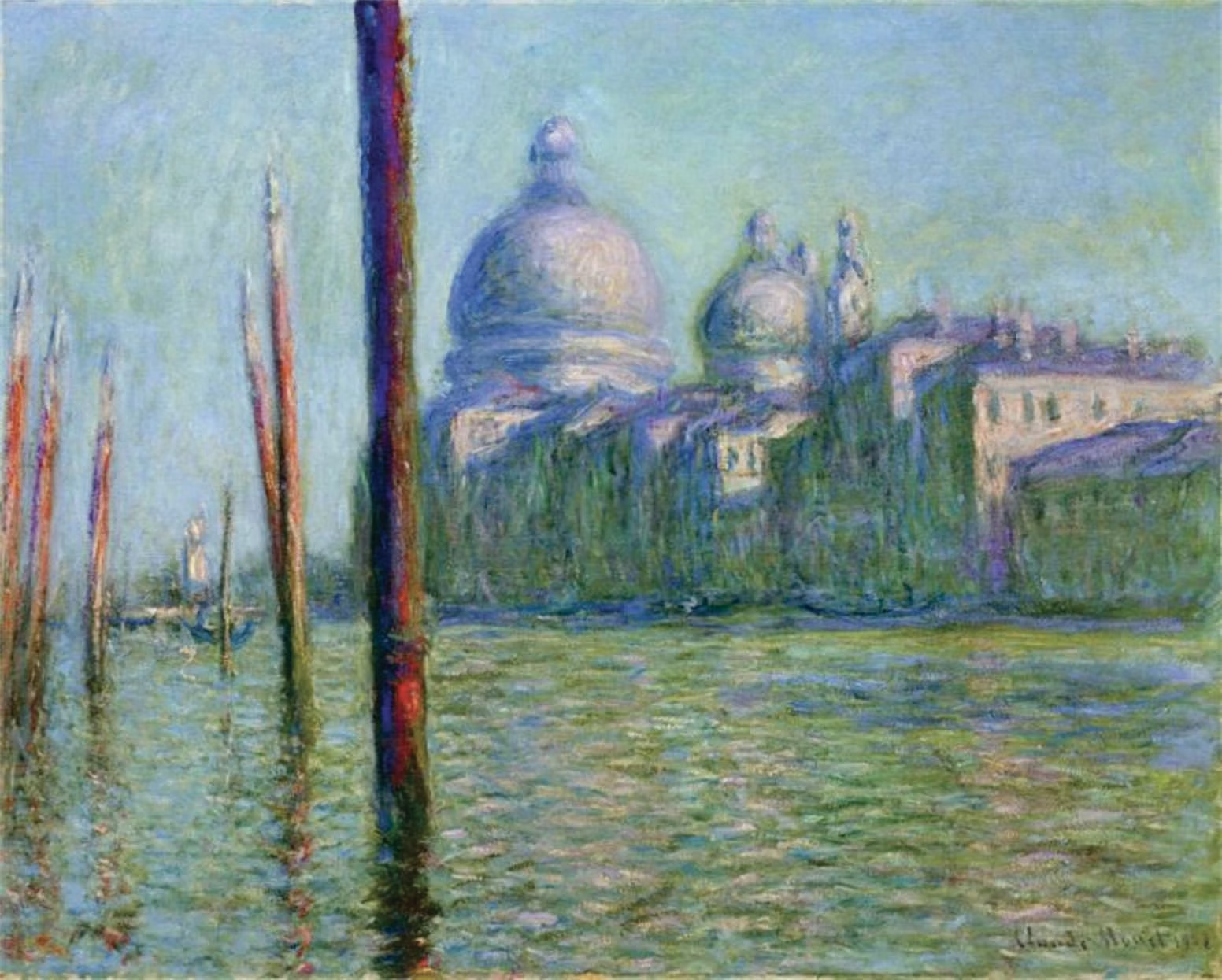
“Claude Monet painted the complementary colors yellow and purple, as well as red/orange and blue/green adjacent to each other, in the same value.” Karen Smit
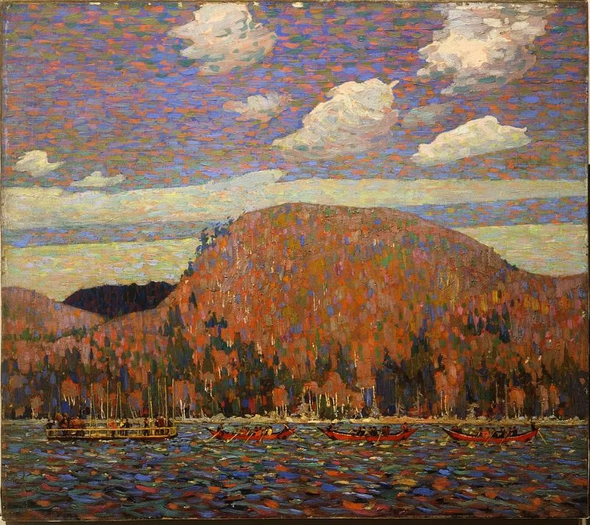
“Optical mixing between combinations of green/red violet and blue/orange in this painting by Tom Thomson give an impression of grey in areas that recede into the distance to accomplish atmospheric perspective using a decrease in saturation.” Andrew Dean
Thanks to our VAA students for finding these beautiful examples.
Bonjour! A chaque article, de nouvelles découvertes, quel bonheur de vous lire. A 81 ans et débutante, vous m’apportez tellement de joie que j’oublie tout le reste. Mil et mil fois merci. Marie
Merci Marie 🙂