(Get free painting tips and plein air painting techniques sent straight to your inbox or on my social media.)
Contrast is an important principle in art that helps create visual interest and emphasizes differences between elements of your painting. Some of the main principles of contrast in art include:
1. Value Contrast
Value contrast in art involves variations in light and dark, where light values contrast with dark values to create depth and form.
2. Color Contrast
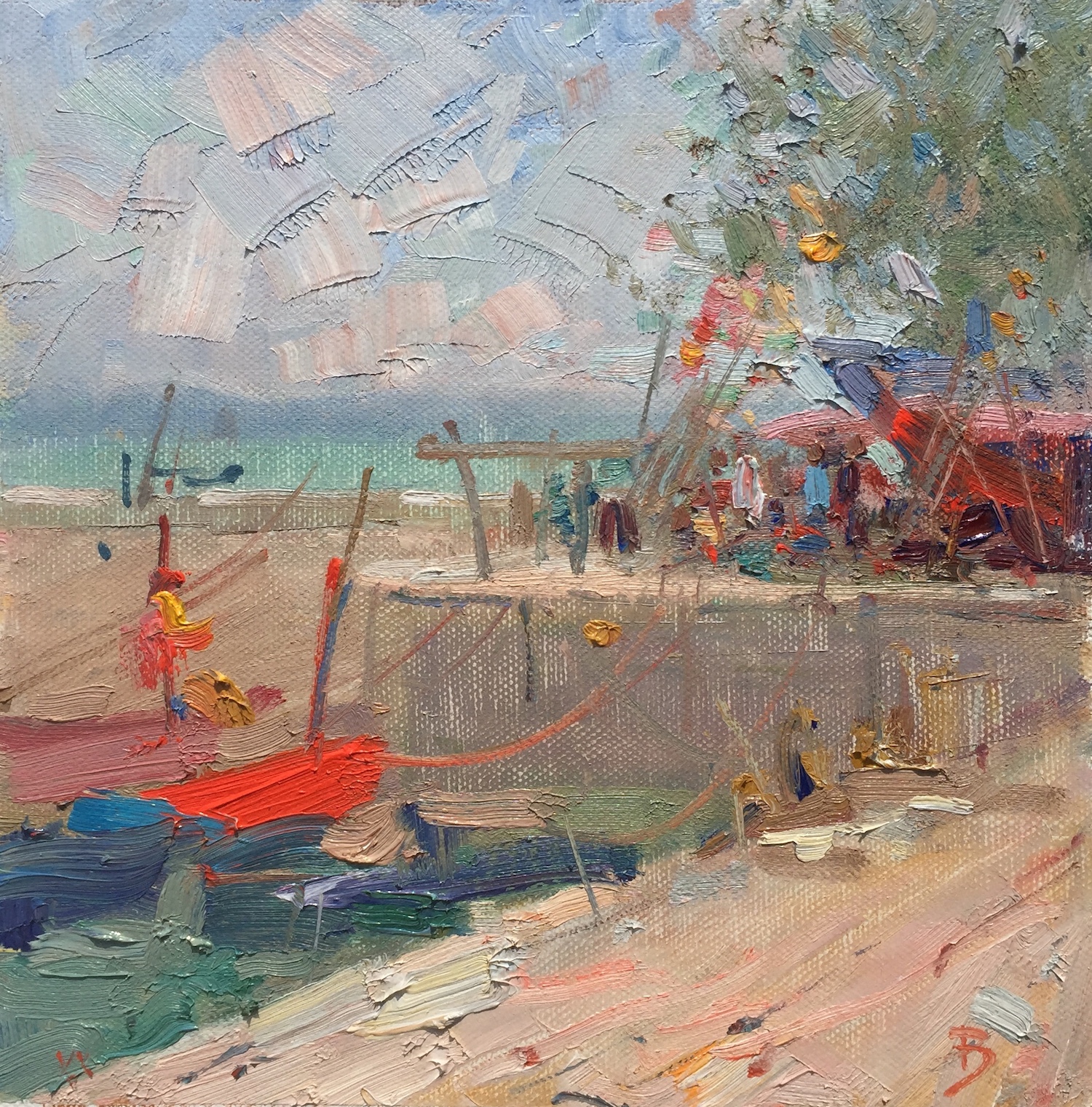
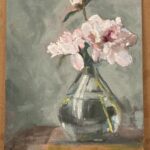
Color contrast utilizes differences in color, such as complementary colors (opposite on the color wheel), to make elements stand out and create visual excitement.
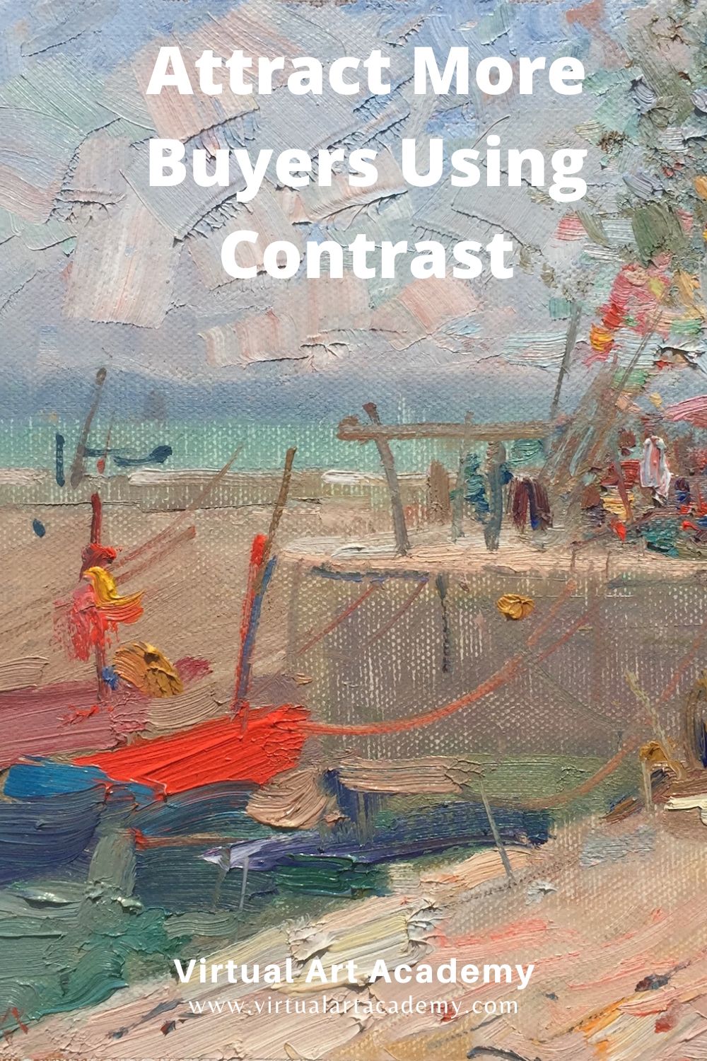
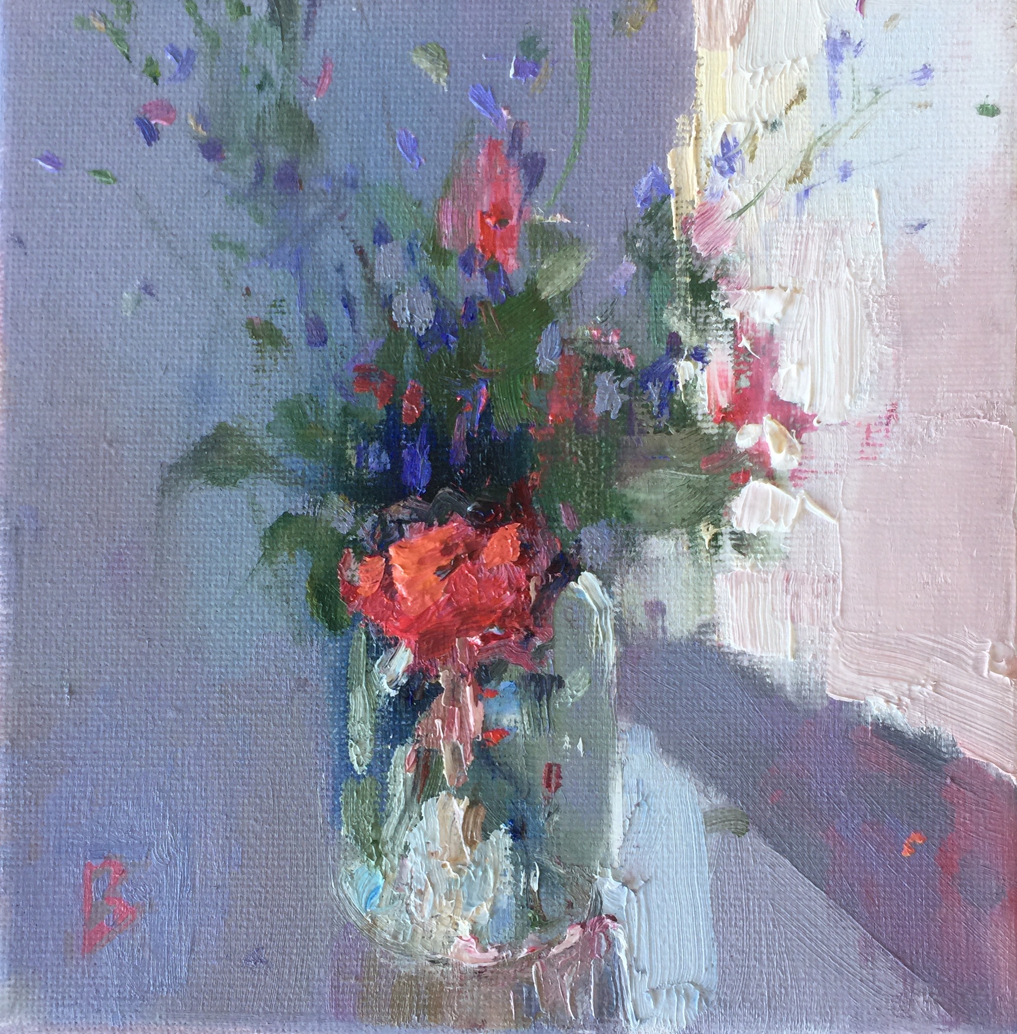
In the painting below there is a strong color contrast between the saturated reds and oranges, and the dull blue grays and beige colors.
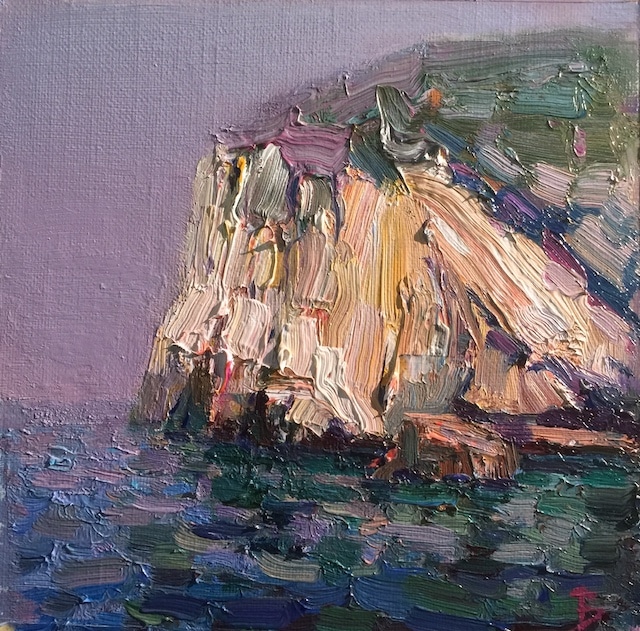
3. Texture Contrast
Texture contrast in art is the juxtaposition of different textures, such as smooth and rough, to add tactile interest and depth to the artwork.
In this painting you can see the sharp contrast between the jagged, rough textured rocks, and the smoothness of the sky on a hot and humid day.
4. Size and Scale Contrast
Size and scale contrast in art refers to the varied sizes and proportions of elements within a composition to draw attention and create a sense of hierarchy.
Here, I added several different sized flowers to create a sense of scale and emphasize the delicacy of the small blue flowers.
5. Shape and Form Contrast
Shape and form contrast in art uses the differences in shapes and forms, such as organic and geometric shapes, to create visual tension and balance.
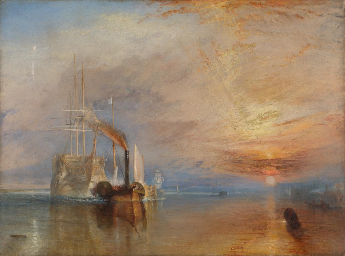
This incredible painting by JMW Turner contrasts the serenity of the natural forms in the sky and water, and the geometric forms of industrialization.
6. Temperature Contrast
Temperature contrast in art uses warm and cool colors to create visual impact and enhance the emotional quality of the artwork.
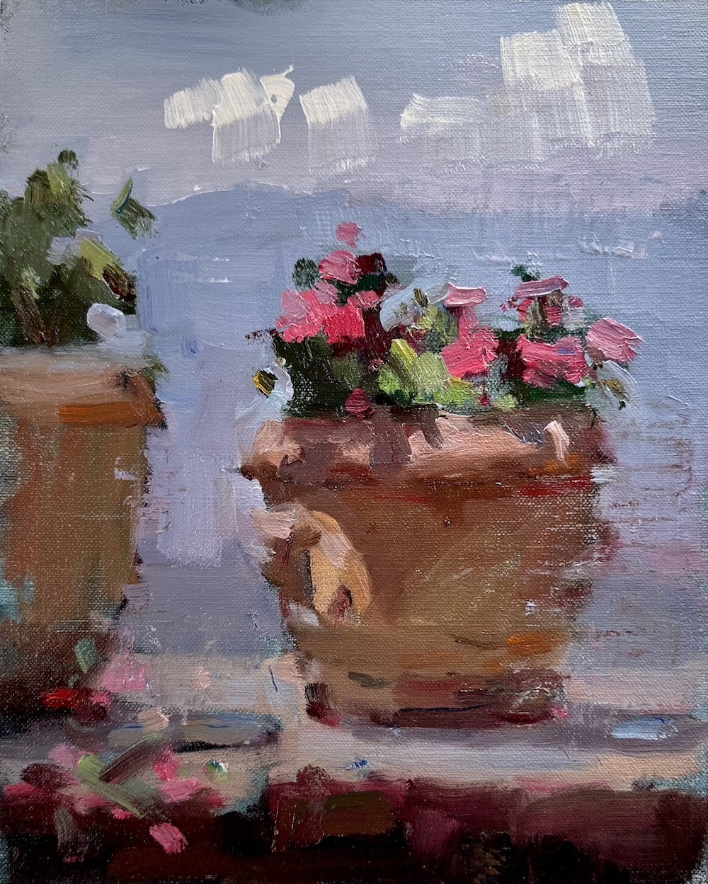
In the painting below, the warm colors of the pot and pink geraniums contrast with the cool colors of the background Ligurian mountains.
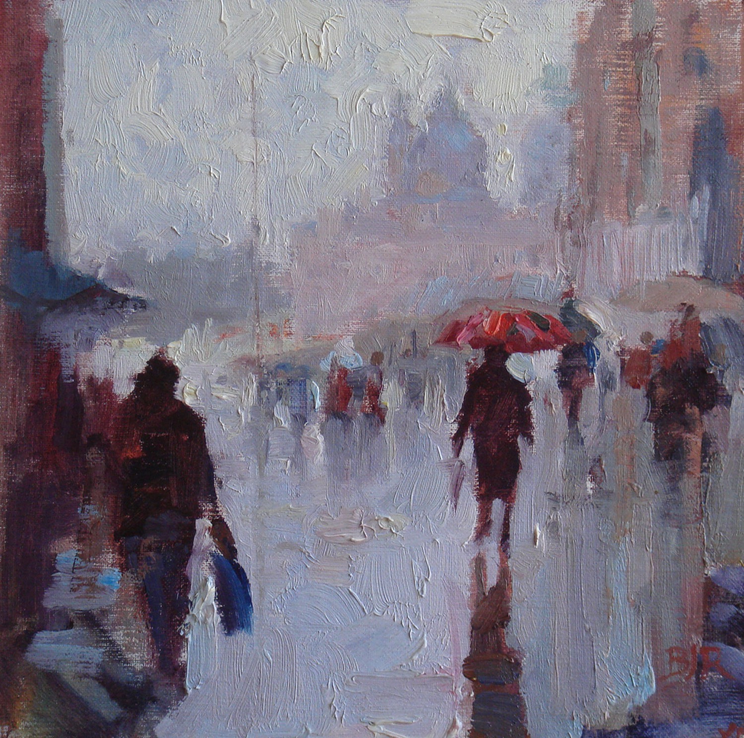
7. Line Contrast
Line contrast in art employs different types of lines (e.g., straight, curved, jagged) to create visual movement and to emphasize focal areas.
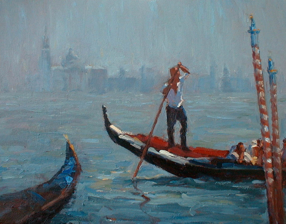
You can see how contrast of line is used in my painting of a gondolier in Venice. The straight lines of the mooring poles and the steering oar held by the gondolier, contrast with the graceful curved lines of the gondola. These lines lead the eye to the face and action of the gondolier – the focal point of the painting.
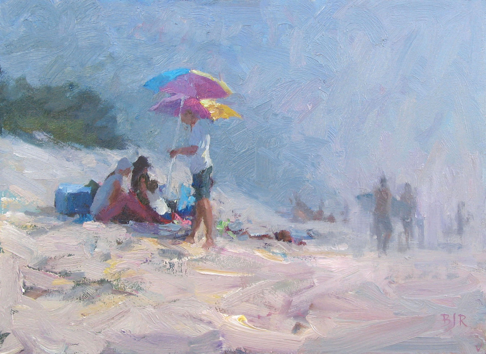
8. Space Contrast
Space contrast in art involves varying the use of positive and negative space to establish balance and create visual interest. You can create contrast in space by placing elements far away from each other, to draw attention creating a hierarchy of the elements. The empty space around the elements is called negative space.
In this painting you can see the main element is the group on the left, and other elements are further away, with the space between them comprising the negative space. This negative space also allows the eye to rest briefly before moving back to the focal areas.
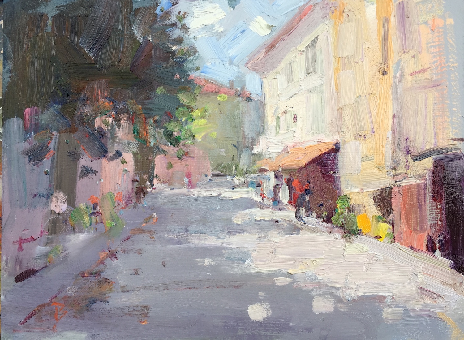
9. Directional Contrast
Directional contrast in art is the use of lines, shapes, or other elements that guide the viewer’s eye in different directions, adding dynamism to the composition.
Look at the different directions the eye follows in this painting, going along the straight line from the bottom left of the foreground road, and creating a zigzag to the left with the horizontal line of the wharf. The curved line of the rope holding the boat contrasts in direction to the sweep of the tree, and the slant of the poles. I also varied the direction and size of the impasto brushstrokes to create a sort of dance in the painting.
10. Style Contrast
Style contrast in art involves experimenting with different artistic styles within the same artwork or between elements to create diversity and stimulate the viewer’s perception.
I love to blend abstraction with reality. I believe it makes a more interesting painting because the mind has to work a little bit harder to make sense of the subject matter, creating a more intriguing composition.
Conclusion
You can use these principles of contrast in art to enhance the visual impact and meaning of your work, and to make your compositions much more engaging and expressive.
What is contrast in art?
Contrast in art is a principle that involves the juxtaposition of different elements within a composition to create visual interest, emphasize differences, and enhance the overall impact of the artwork. It is an essential concept that adds variety, depth, and dynamism to artistic creations.
What is value contrast in art?
Value contrast in art refers to the differences in the lightness and darkness of tones or shades within a composition. It is a fundamental element of visual art that involves manipulating the range of values from very light to very dark. Value contrast is used by artists to create depth, form, and visual interest in their work.
What is color contrast in art?
Color contrast in art refers to the juxtaposition of different colors in a composition to create visual interest, emphasize differences, and enhance the overall impact of the artwork. It’s a fundamental principle used by artists to make elements stand out, evoke emotions, and create a dynamic visual experience. Color contrast can be achieved through various color combinations and relationships.
For more information
For more information, see the lessons on contrast in the Composition Building block of the Virtual Art Academy® Apprentice Program.
Also see contrast in vision in Wikipedia.
Thank You
Thank you for taking the time to read this article. I hope you find it useful. If you would like to get free painting tips by email, please sign up for my free tips newsletter.
If you are interested in a structured approach for learning how to paint, take a look at my online painting classes.
Happy painting!
Barry John Raybould
Virtual Art Academy
What The Students Are Saying
The equivalent of a 4 year art education at a fraction of the cost

This is a great course for anyone who is serious about improving their painting. I have been a student here for several years. When I am finished, I will have the equivalent of a 4 year art education at a fraction of the cost. I can do the lessons anywhere and at my own pace.… Read more “The equivalent of a 4 year art education at a fraction of the cost”
The sky’s the limit

This course was exactly what I’d been looking for as a recent “empty-nester.” The Virtual Art Academy coursework taught me not only HOW to paint well, but also how to SEE to observe a scene more closely to interpret it effectively in paint, and what to look for to create an interesting composition. It helped… Read more “The sky’s the limit”
The course is for beginners, intermediate and advanced artists

I joined VAA in 2014, it seemed a perfect fit in content, ease of access and cost. It turned out to be all of this and much more. The wealth of information on all practical aspects of painting is invaluable and I think incomparable to anything else out there. The course structure is such that… Read more “The course is for beginners, intermediate and advanced artists”
It is impossible to fail or gain little through extensive 4 year study at VAA!
I would recommend taking VAA study to everyone who seriously strive of becoming exceptionally skilled professional artist. It gives more than you can ever imagine! The lessons structured in the best possible way that lead to understanding and skills you never acquired before which are so important in art. It is impossible to fail or… Read more “It is impossible to fail or gain little through extensive 4 year study at VAA!”
Building blocks of learning is the best I have seen

I joined 5 years ago when I didn’t know anything about oils, painting, composition, or drawing. Barry’s way of teaching is extremely well versed in many aspects of painting. His building blocks of learning is the best I have seen. The academy is designed well and the community of fellow students is engaging and friendly.… Read more “Building blocks of learning is the best I have seen”
‘Ladder of Learning’ adds to overall positive experience of this awesome course

The VAA course is built on four main building blocks including PROCESS, REALISM, MUSIC AND POETRY. These are further divided into topics that are continuously developed throughout the curriculum. Drawing, Form, Observation, Colour, Brushwork, Notan, Composition and Poetry are all thoroughly taught. Working on-line we meet students from all around the world, interacting with them… Read more “‘Ladder of Learning’ adds to overall positive experience of this awesome course”
Since I started the programme I can see improvements in my composition and use of colour

My painting “Primitive Pots” recently won the award given by the Royal Institute of Painters in Watercolour at the recent selected exhibition of the Society of East Anglian watercolourists. I have been working through the VAA course for over five years and would highly recommend it to anyone wanting to improve their painting. There is… Read more “Since I started the programme I can see improvements in my composition and use of colour”
No need to buy expensive art books…. Just do the VAA 4 year course. I still refer to it

I finished the VAA course a few years ago, but always refer to the notes, rereading the course many times. This is not a course the day you are finished, you are done. No, you keep practising the assignments getting better and better over time. When I look back at my work when I had just… Read more “No need to buy expensive art books…. Just do the VAA 4 year course. I still refer to it”
This is a far more superior school than anything I have seen being taught at colleges across the country

This is a far more superior school than anything I have seen being taught at colleges across the country and have learned much more from the Virtual Art Academy® than from any art course I have ever taken! I cannot begin to tell how the Virtual Art Academy has improved my observation of potential compositions… Read more “This is a far more superior school than anything I have seen being taught at colleges across the country”
The course has a steady learning curve that keeps revealing itself as you advance

The course is working great, the lessons are set out so well that every week I can see growth. In following the program it’s given me direction, and the information in the lesson plans are of a professional level. There is no way I would have tracked down the information by myself, and being in… Read more “The course has a steady learning curve that keeps revealing itself as you advance”
Barry gave me a fishing rod so I can catch my own fish

After weeks and even months of searching YouTube, “googling” and spending a fortune on art instructional books I finally came across the Virtual Art Academy®. When it comes to purchasing online I am always very careful how I spend my money. Especially when I already spent a small fortune on art books. They always seemed… Read more “Barry gave me a fishing rod so I can catch my own fish”
It is a real course that trains you in a structured way

The questions you ask yourself are,”Will it be worth the cost?” and “Will it be truly useful?”. After a couple of weeks working on/in Virtual Art Academy®, I can say that the amount of work it represents – by Barry – is incredible! The information presented alone is more than worth the price and, yes,… Read more “It is a real course that trains you in a structured way”
I’m Richard Robinson …. best online art training available on the internet today

Hi I’m Richard Robinson. I’ve been a professional painter since 2001. My claim to fame is only that I’m making a living as an artist and doing pretty well – something which I hear is not so easy to do, and I guess it does take a lot of work, but it’s work that I… Read more “I’m Richard Robinson …. best online art training available on the internet today”
The most comprehensive, in depth and well-organized painting course available online

After a thorough research, my personal conclusion is that the Virtual Art Academy (VAA) is, by wide margin, the most comprehensive, in depth and well-organized painting course available in the internet. Unlike most tutorials and color mixing recipes commonly found online, VAA’s philosophy is rather to provide the students with detailed information about all aspects… Read more “The most comprehensive, in depth and well-organized painting course available online”
An excellent foundation on so many aspects of painting

I never had formal training in painting and my style has always been very realistic, slow and not at all artistic, just a copy of a photograph. When I got word of the course available through Virtual Art Academy, I was very excited for the opportunity to learn what I never knew about painting. VAA… Read more “An excellent foundation on so many aspects of painting”
The small steps are easy to do

I am extremely impressed with the process that Barry has developed for VAA. Learning to paint can be intimidating, but when broken into many small projects it is very do-able. I just did my first live model painting session- a 5 hour, one day session. Thanks to VAA, I was able to break the painting… Read more “The small steps are easy to do”
The improvement in my own work reaffirms that I’ve found the right program to develop as an artist

I have been a student of VAA since 2011. I had been searching for an online art program that could assist in helping me develop as an artist. VAA is a complete program for beginners as well as advanced students of art. The course is well structured and takes you step by step so you… Read more “The improvement in my own work reaffirms that I’ve found the right program to develop as an artist”
I started learning oil painting with VAA from scratch. Just one year later my paintings started to sell

The Virtual Art Academy program is really comprehensive and gave me all the information and directives to learn painting in one package. The material is very well organized, just beautiful to look at and motivating to carry through. The online campus is a wonderful place to meet other artists and receive critical feedback on my… Read more “I started learning oil painting with VAA from scratch. Just one year later my paintings started to sell”
The most comprehensive art instruction I could find anywhere online, and trust me, I had been looking for a long time.

I joined 2 years ago with my daughter. We have both learnt so much and have enjoyed our VAA time together. My daughter is now 13 and already produces amazing paintings. The Virtual Art Academy is simply the most comprehensive art instruction I could find anywhere online, and trust me, I had been looking for… Read more “The most comprehensive art instruction I could find anywhere online, and trust me, I had been looking for a long time.”
Only online learning program I have ever discovered using a training industry best practice

Before repurposing my vocation into avocation, I spent 20 years in the corporate world as an instructional designer and performance consultant creating training curricula for diverse clientele from NASA to General Motors. I know curriculum development and how to guide a learner from beginning to certification. VAA is the only online learning program I have… Read more “Only online learning program I have ever discovered using a training industry best practice”
comprehensive art education

I wanted to get a comprehensive art education with the freedom to work at my own pace. I’m several years into the curriculum and I feel like my work has drastically improved. I’ve found holes in my knowledge that I didn’t know I had. Critiquing other students posts and reading their feedback to mine has… Read more “comprehensive art education”
It is wild to see how much I am learning in this course!

Five star rating from me for Virtual Art Academy (VAA)! I retired last year, and decided I wanted to spend my time in retirement learning how to oil paint. But having never painted before, I wasn’t even sure what to look for in an online painting course. However, I did some searches for “Best Online… Read more “It is wild to see how much I am learning in this course!”
A great learning platform

I have been working my way through the Virtual Art Academy for almost a year now, and cannot recommend it highly enough. The Workshops are thorough, structured and substantive. There is a logical and step by step progression that makes the learning process so much easier, with new concepts being introduced and then practiced along… Read more “A great learning platform”
VAA, the ultimate art course
Although still a novice, the Virtual Art Academy has taught me the skills needed, not only to produce reasonably good art but has given me an understanding of the complexities of art. All the basics of art, as well as composition and studies of master artists are covered in the course. No reason not to… Read more “VAA, the ultimate art course”
What I learned from 10 years with VAA

The VAA gives you a really solid foundation for learning and improving how to paint. When you’re frustrated with your work, it’s not getting accepted into exhibitions, you’re not selling and you’re just not happy with what you produce the VAA is the answer. It is explained easily with examples and exercises. It does mean… Read more “What I learned from 10 years with VAA”