(Get free painting tips and plein air painting techniques sent straight to your inbox or on my social media.)
What is color harmony?
Much of the pleasure from viewing a painting is derived to a large extent from the harmony of colors used in it. Creating this harmony is the key to beautiful color work and a major part of the visual music of the painting. Harmony in art is basically an orderly relationship of colors, just as a musical harmony is an orderly relationship of notes, or rhythmic harmony that creates a masterful poem. The primary color harmony in art is: red, blue, and yellow. These three hues are the bases of all other hues.
In art, harmony is something that is pleasing to the eye. The human brain requires an inner sense of order, it prefers to see something it recognizes as balanced, not jarring. If the painting is not harmonious, the viewer perceives it as boring or chaotic. We reject under-stimulating information, and conversely if it is too chaotic we can’t stand to look at it. The artist’s task is to present a logical structure for our viewers. Color harmony delivers the visual interest and a sense of order.
What is a secondary color harmony and when is it used?

The secondary color harmony is made by mixing together each of the primary colors. So the three secondary hues are orange (red + yellow), green (blue + yellow), and violet (blue + red).
This harmony is sometimes used in landscape work, as it is so often seen in nature. The warm oranges occur in the foreground, the greens in the foreground and middle ground, and the violets in the distance. This harmony it is not as flexible as the tertiary harmony.
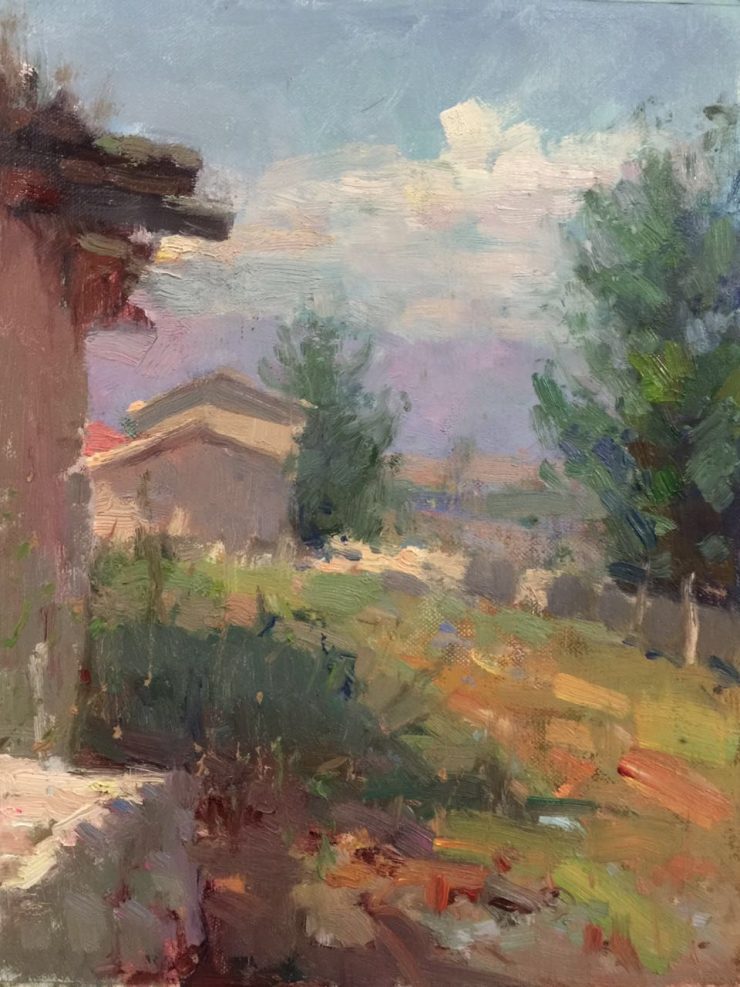
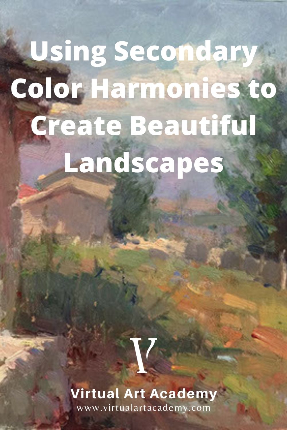
Secondary color harmony in practice
In this small Kasakh village in the province of Xinjiang, in the far northwestern reaches of China, many of the original mud and straw buildings are still left.
This gives the village a warm and welcoming feeling. With the areas of grass to provide some green color spots, I included an area of the mountains in the distance to provide a violet color spot and complete a secondary color harmony composed of the secondary colors: orange, green, and violet.
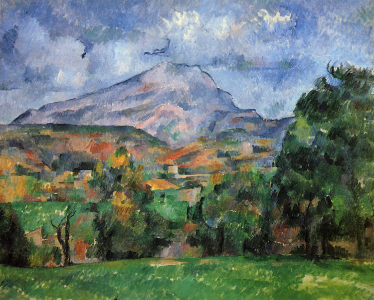
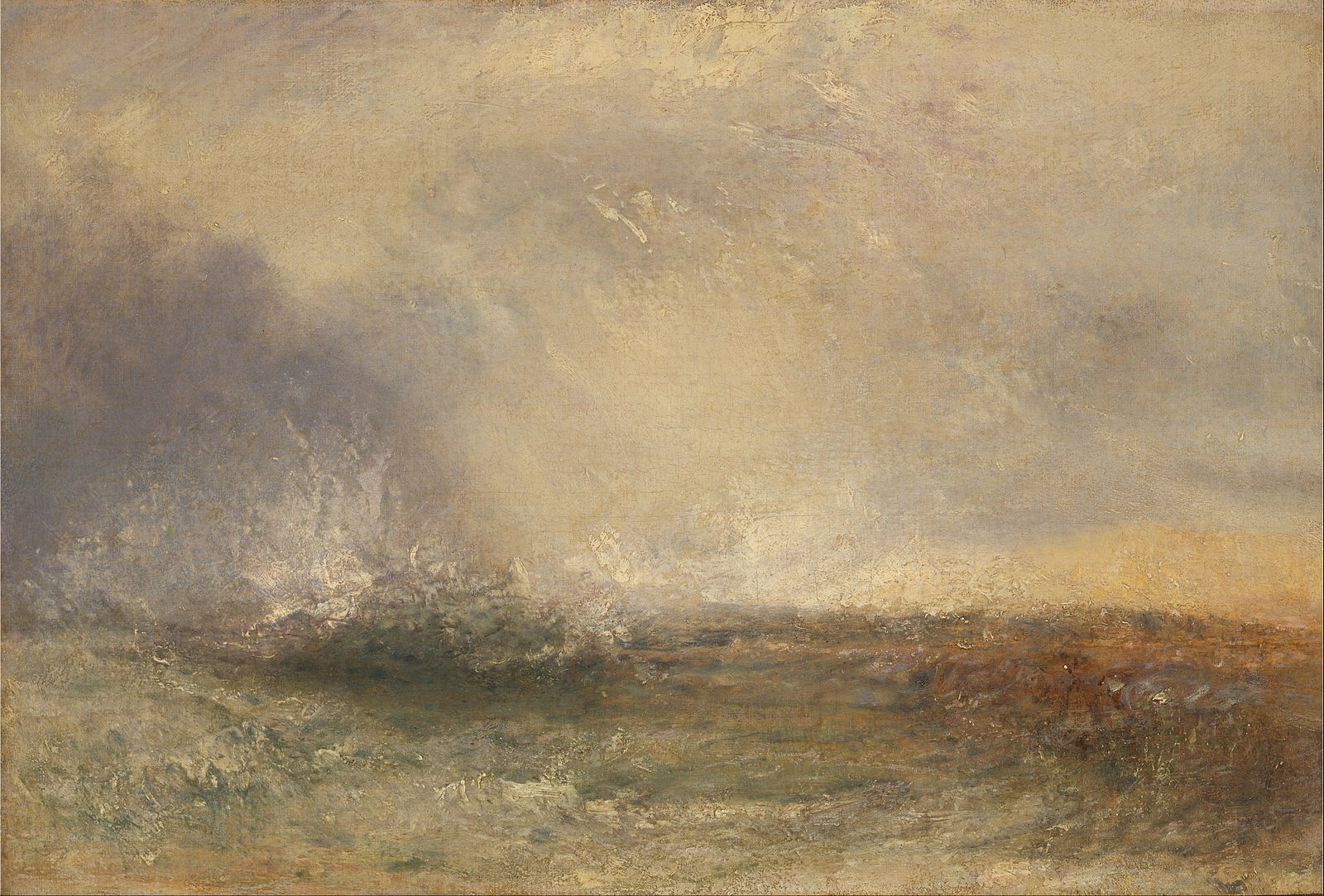
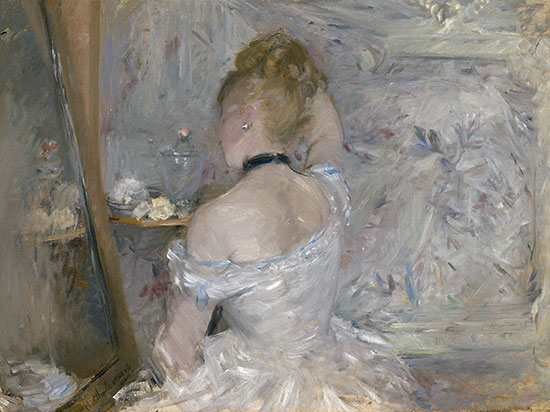
Secondary color harmony paintings by Old Masters
Notice in these Old Master paintings that some of the colors are very saturated, and some are less saturated, but the secondary color harmony still works.
To learn more about different color harmonies
To learn more about the concept of balanced color harmonies, see Workshop H of the Virtual Art Academy® Apprentice Program.
Thank You
Thank you for taking the time to read this article. I hope you find it useful. If you would like to get free painting tips by email, please sign up for my free tips newsletter.
If you are interested in a structured approach for learning how to paint, take a look at my online painting classes.
Happy painting!
Barry John Raybould
Virtual Art Academy
What The Students Are Saying
This is a far more superior school than anything I have seen being taught at colleges across the country

This is a far more superior school than anything I have seen being taught at colleges across the country and have learned much more from the Virtual Art Academy® than from any art course I have ever taken! I cannot begin to tell how the Virtual Art Academy has improved my observation of potential compositions… Read more “This is a far more superior school than anything I have seen being taught at colleges across the country”
No need to buy expensive art books…. Just do the VAA 4 year course. I still refer to it

I finished the VAA course a few years ago, but always refer to the notes, rereading the course many times. This is not a course the day you are finished, you are done. No, you keep practising the assignments getting better and better over time. When I look back at my work when I had just… Read more “No need to buy expensive art books…. Just do the VAA 4 year course. I still refer to it”
The course has a steady learning curve that keeps revealing itself as you advance

The course is working great, the lessons are set out so well that every week I can see growth. In following the program it’s given me direction, and the information in the lesson plans are of a professional level. There is no way I would have tracked down the information by myself, and being in… Read more “The course has a steady learning curve that keeps revealing itself as you advance”
An excellent foundation on so many aspects of painting

I never had formal training in painting and my style has always been very realistic, slow and not at all artistic, just a copy of a photograph. When I got word of the course available through Virtual Art Academy, I was very excited for the opportunity to learn what I never knew about painting. VAA… Read more “An excellent foundation on so many aspects of painting”
The most comprehensive, in depth and well-organized painting course available online

After a thorough research, my personal conclusion is that the Virtual Art Academy (VAA) is, by wide margin, the most comprehensive, in depth and well-organized painting course available in the internet. Unlike most tutorials and color mixing recipes commonly found online, VAA’s philosophy is rather to provide the students with detailed information about all aspects… Read more “The most comprehensive, in depth and well-organized painting course available online”
The most comprehensive art instruction I could find anywhere online, and trust me, I had been looking for a long time.

I joined 2 years ago with my daughter. We have both learnt so much and have enjoyed our VAA time together. My daughter is now 13 and already produces amazing paintings. The Virtual Art Academy is simply the most comprehensive art instruction I could find anywhere online, and trust me, I had been looking for… Read more “The most comprehensive art instruction I could find anywhere online, and trust me, I had been looking for a long time.”
The equivalent of a 4 year art education at a fraction of the cost

This is a great course for anyone who is serious about improving their painting. I have been a student here for several years. When I am finished, I will have the equivalent of a 4 year art education at a fraction of the cost. I can do the lessons anywhere and at my own pace.… Read more “The equivalent of a 4 year art education at a fraction of the cost”
Barry gave me a fishing rod so I can catch my own fish

After weeks and even months of searching YouTube, “googling” and spending a fortune on art instructional books I finally came across the Virtual Art Academy®. When it comes to purchasing online I am always very careful how I spend my money. Especially when I already spent a small fortune on art books. They always seemed… Read more “Barry gave me a fishing rod so I can catch my own fish”
Add comment