(Get free painting tips and plein air painting techniques sent straight to your inbox or on my social media.)
One of the secrets to great color harmony is how you organize your palette. Laying out your palette might seem simple, but many beginners do not do this in the right way. It is important to have a logical organization and flow to the sequence of colors on your palette. If you organize your palette logically, you will find color mixing much easier and you will end up with much more beautiful color in your paintings. This is how.
Color harmony secrets
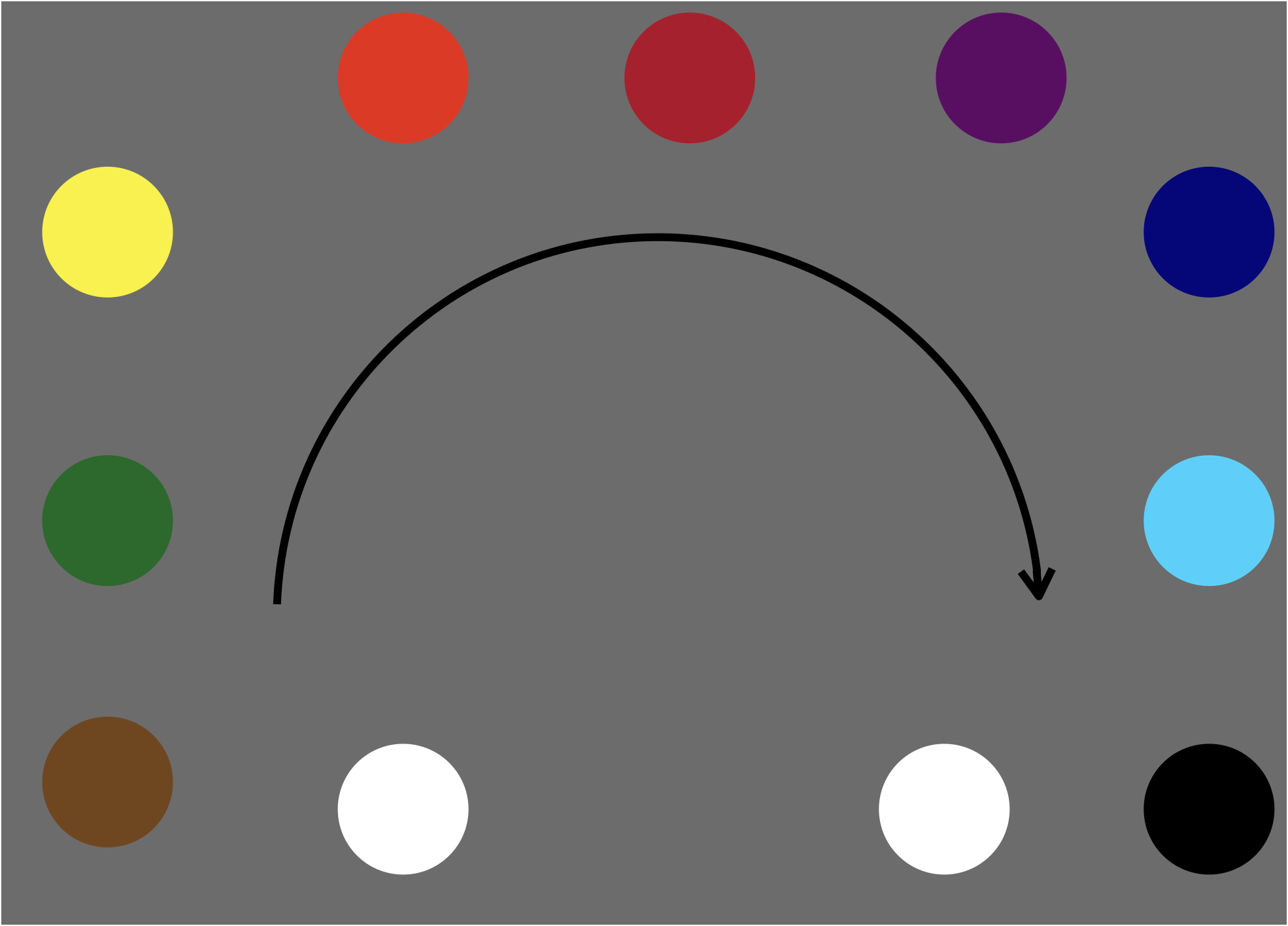
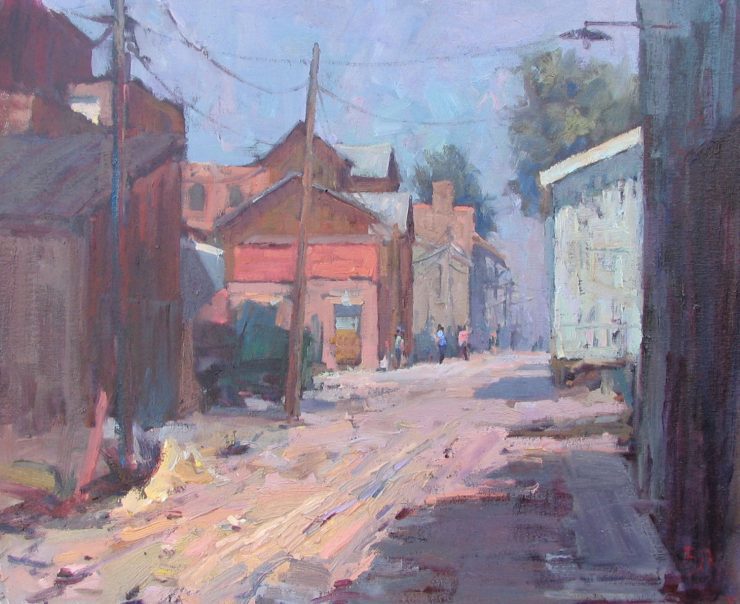
One of the best ways to layout your palette is to arrange the hues in a spectral order. In other words, lay the colors out in the order of a rainbow. Then if you want to make a color warmer or cooler, you simply mix a little of the adjacent color into your mix.
Another tip is to organize your mixing areas logically. Reserve areas on your palette for dark colors, light colors, and grays.
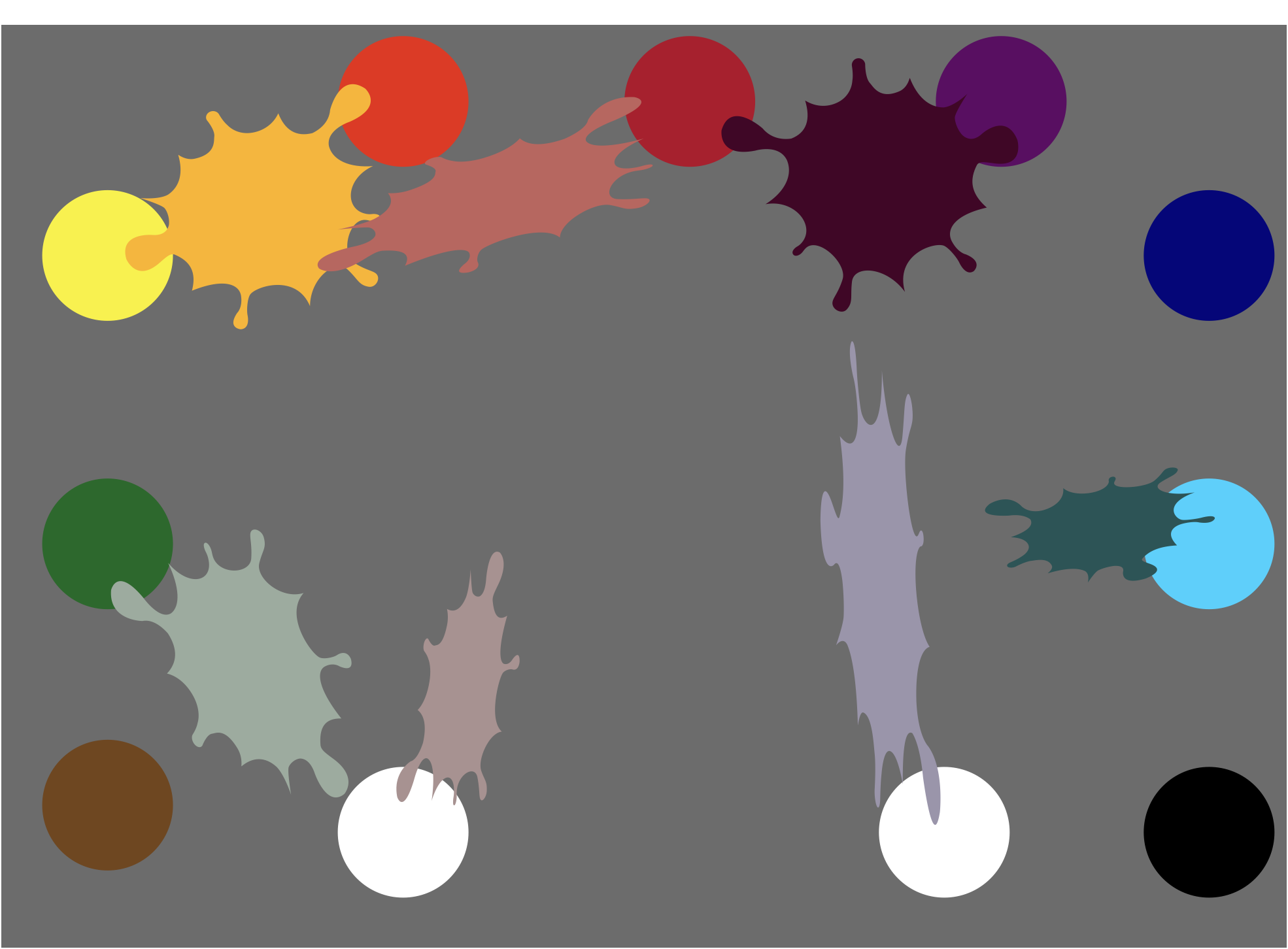
When you are mixing colors, drag them into the mixing area to make colors that harmonize well. Do not pick up small amounts of color and create lots of small color mixing areas. You can easily lose harmony that way.
A beginner palette
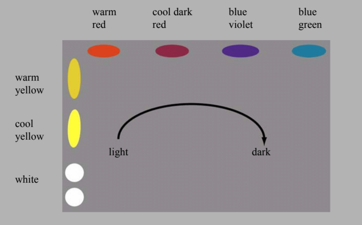
It is best for beginners to start off with a simple palette like this warm/cool primary palette. This is a logical layout of colors organized by value from light colors on the left to darker colors on the right. When you are starting out, these are all the colors you will need. There are two of each of the three primary colors: a cool (bluer) version and a warm (redder) version of each.
To learn more
We have built an advisor tool to help you choose oil colors. There are a lot of potential palettes you can use, and this tool will help you decide.
Beginners can see more lessons on color and palette layouts in our Virtual Art Academy® Apprentice program.
To learn much more about how to achieve beautiful color harmony in your paintings, as well as learn about other extremely useful tube colors you can add later on to your palette, see the Virtual Art Academy® Apprentice Pro Program.
Thank You
Thank you for taking the time to read this article. I hope you find it useful. If you would like to get free painting tips by email, please sign up for my free tips newsletter.
If you are interested in a structured approach for learning how to paint, take a look at my online painting classes.
Happy painting!
Barry John Raybould
Virtual Art Academy
What The Students Are Saying
The most comprehensive, in depth and well-organized painting course available online

After a thorough research, my personal conclusion is that the Virtual Art Academy (VAA) is, by wide margin, the most comprehensive, in depth and well-organized painting course available in the internet. Unlike most tutorials and color mixing recipes commonly found online, VAA’s philosophy is rather to provide the students with detailed information about all aspects… Read more “The most comprehensive, in depth and well-organized painting course available online”
It is a real course that trains you in a structured way

The questions you ask yourself are,”Will it be worth the cost?” and “Will it be truly useful?”. After a couple of weeks working on/in Virtual Art Academy®, I can say that the amount of work it represents – by Barry – is incredible! The information presented alone is more than worth the price and, yes,… Read more “It is a real course that trains you in a structured way”
This is a far more superior school than anything I have seen being taught at colleges across the country

This is a far more superior school than anything I have seen being taught at colleges across the country and have learned much more from the Virtual Art Academy® than from any art course I have ever taken! I cannot begin to tell how the Virtual Art Academy has improved my observation of potential compositions… Read more “This is a far more superior school than anything I have seen being taught at colleges across the country”
The course has a steady learning curve that keeps revealing itself as you advance

The course is working great, the lessons are set out so well that every week I can see growth. In following the program it’s given me direction, and the information in the lesson plans are of a professional level. There is no way I would have tracked down the information by myself, and being in… Read more “The course has a steady learning curve that keeps revealing itself as you advance”
I started learning oil painting with VAA from scratch. Just one year later my paintings started to sell

The Virtual Art Academy program is really comprehensive and gave me all the information and directives to learn painting in one package. The material is very well organized, just beautiful to look at and motivating to carry through. The online campus is a wonderful place to meet other artists and receive critical feedback on my… Read more “I started learning oil painting with VAA from scratch. Just one year later my paintings started to sell”
The small steps are easy to do

I am extremely impressed with the process that Barry has developed for VAA. Learning to paint can be intimidating, but when broken into many small projects it is very do-able. I just did my first live model painting session- a 5 hour, one day session. Thanks to VAA, I was able to break the painting… Read more “The small steps are easy to do”
Since I started the programme I can see improvements in my composition and use of colour

My painting “Primitive Pots” recently won the award given by the Royal Institute of Painters in Watercolour at the recent selected exhibition of the Society of East Anglian watercolourists. I have been working through the VAA course for over five years and would highly recommend it to anyone wanting to improve their painting. There is… Read more “Since I started the programme I can see improvements in my composition and use of colour”
Only online learning program I have ever discovered using a training industry best practice
Before repurposing my vocation into avocation, I spent 20 years in the corporate world as an instructional designer and performance consultant creating training curricula for diverse clientele from NASA to General Motors. I know curriculum development and how to guide a learner from beginning to certification. VAA is the only online learning program I have… Read more “Only online learning program I have ever discovered using a training industry best practice”
The equivalent of a 4 year art education at a fraction of the cost

This is a great course for anyone who is serious about improving their painting. I have been a student here for several years. When I am finished, I will have the equivalent of a 4 year art education at a fraction of the cost. I can do the lessons anywhere and at my own pace.… Read more “The equivalent of a 4 year art education at a fraction of the cost”
No need to buy expensive art books…. Just do the VAA 4 year course. I still refer to it

I finished the VAA course a few years ago, but always refer to the notes, rereading the course many times. This is not a course the day you are finished, you are done. No, you keep practising the assignments getting better and better over time. When I look back at my work when I had just… Read more “No need to buy expensive art books…. Just do the VAA 4 year course. I still refer to it”
THANK YOU. PERFEKT.
I’m beginning to paint in soft pastels. Is there an instructor of these pastels in the virtual art academy?
Hello Bonnie, thank you for your question. Let me first say that the Virtual Art Academy does not employ instructors – it is a comprehensive and systematic 4 year curriculum that will build your skills in all the areas that you need to master in order to paint well, whatever medium you choose to work in. Combined with that is a community platform that lets you work together with other serious students, and to communicate with each other in order give each other feedback that will help you master those key skills taught in the curriculum, as well as give you mutual support and motivation. 99% of the course content applies to all media. The differences in technique are actually not that important in the big scale of things. Technique will not make you a better painter. Understanding the whys of what makes a master painting will. We have students at the Virtual Art Academy using all kinds of media, including pastels. Soft pastels can produce beautiful work, but what you need to understand the most is how to control the values, build a design and notan structure, create a color harmony, design the key concept behind your painting, and what the design approach is going to be in terms of shapes and contrasts. That is whaht is going to determine whether you end up with a beautiful painting or not. Notice there is nothing specific to soft pastels in that list. There are a lot of courses now you can choose on the internet. The only reason to choose the Virtual Art Academy course is if you don’t want to waste time by potentially learning from material created by amateur or self-taught artists and that misses some key principles of painting. If you have gaps in your education or learn from amateur sources, you are going to struggle in the long term. The VAA is not a quick fix – it takes a lot of work. But it is thorough and if you work hard, you will see results. We have students who started from being an absolute beginner to becoming a full time professional painter, as well as many who, although not professional artists, and more hobby artists, have nevertheless managed to sell paintings and get accepted into various art organizations and societies. I hope that helps. Please feel to drop us a line if you have any more questions, via our contact us page.