Creating Poetry
Armin C. Hansen (1886-1957), one of the founders of the Carmel Art Association in Carmel, California, was renowned for his ability to use brushwork to capture the vitality of life by extracting the essential visual elements, or the “itness,” as one of my teachers, Rodney Winfield, used to call it. That quality is essential for giving a painting its “poetry” — a feeling of a specific time and place. There are many other artists whose paintings capture the “itness” of a scene, including the California Impressionists Franz Bischoff (1864-1929), who fully represented the Carmel coastline in his depictions of the twisted gestures of the Monterey cypresses, and Percy Gray (1869-1952), who accurately represented the graceful gestures of the boughs of the eucalyptus trees of California.

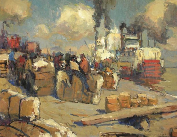
The loose brushwork in the Hansen painting On the Levee — New Orleans, of workers on a wharf in New Orleans, Louisiana, beautifully captures the hustle and bustle of activity, as well as the sense of confusion. What is particularly interesting about this painting is how well the artist conveys the feeling and atmosphere of the place with such an economy of brushwork.
Hansen’s “Near Music”

Look at the looseness in the representation of the fisherman (Figure 1). By avoiding too much rendering, Hansen gives the painting a beautiful abstract quality. This is what I have been referring to in this series of critiques as “near music” — the brushwork in a representational painting that maintains an abstract quality, and thereby conveys more than the identity of the subject. Even with these loose strokes, one can see Hansen’s accuracy in the proportions and gestures of the workers.
Another feature of Hansen’s work I admire is his use of grays, which establish a beautiful color harmony.
I tried to make this more apparent by creating a simplified analysis of Hansen’s painting using just the key color spots (Figure 2). In my sketch, I show how Hansen used a pattern of gray shapes to set off his more highly saturated color patches.

Applying Visual Music & Poetry™
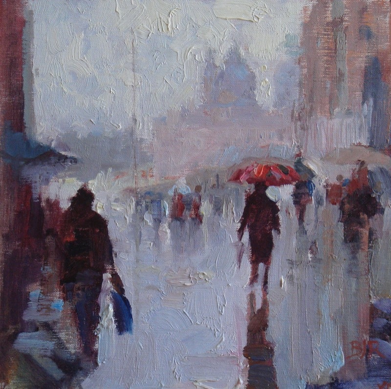
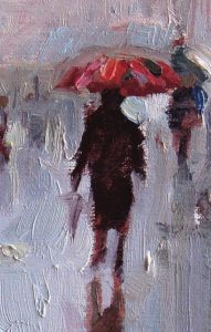
I faced a similar challenge when creating my sketch A Rainy Day in Venice. I kept the brushwork as abstract as possible, yet retained accuracy in the proportions of the figures. Loose painting, somewhat counter-intuitively, is actually much harder to handle than tight rendering.
That is because painters only have one shot at getting the proportion and placement of the strokes accurate if they want the brushstrokes to be loose and yet read correctly.
In my painting, I used the grays of the sky, wet pavement, and distant buildings to establish a contrast with the beautiful, highly colored umbrellas.
To Learn More
To learn more about creating Visual Music & Poetry® in your work, see: A Guide To Critiquing Master Paintings